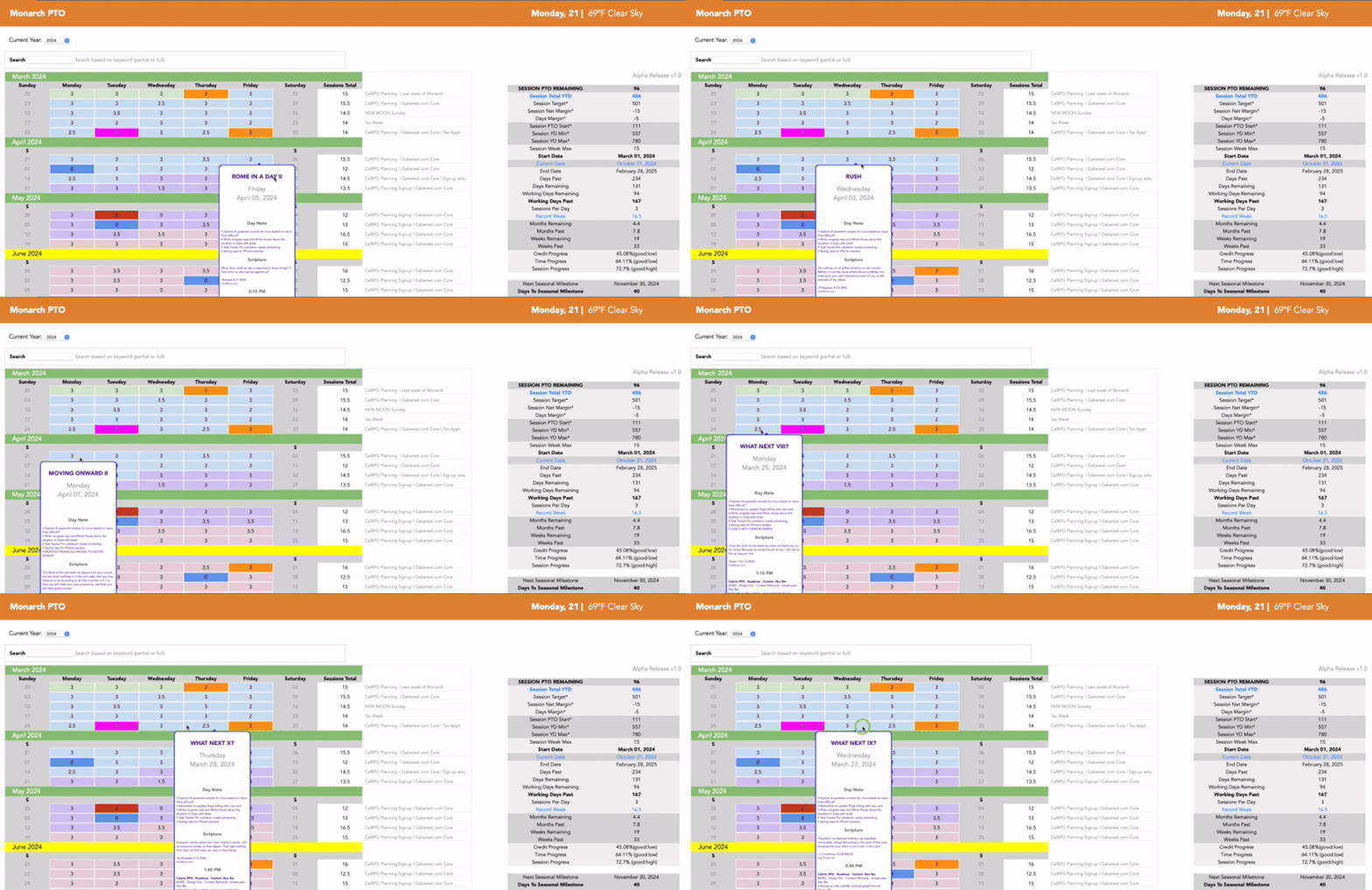
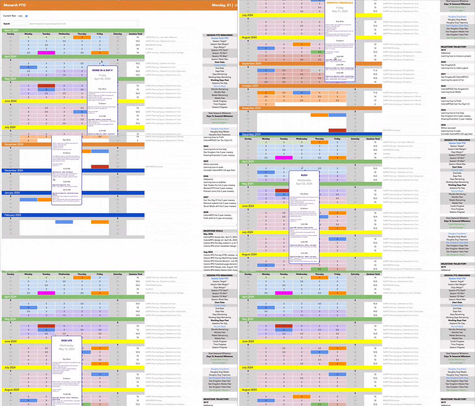
We initially started building this calendar app as part of a fitness role-playing game we were
working on. At the time, we were diving into web programming, and frankly, didn’t know the
first thing about making a virtual calendar. The plan was to have health tracking as a focus,
thinking our calendar would just be a core feature. But as we progressed, it was realized how
getting a solid one up and running was more complex than expected. It also became clear the calendar
itself was more than enough for a standalone program, and honestly, the idea of tracking our time—beyond
just what we ate—grew appealing. That’s how Monarch PTO was born!
We can't emphasize enough how much of a lifesaver this has been. We rely on it daily, and
it’s hard to imagine life without it. It's a journal, budget, and time tracker. While not available
to the public, we might consider a demo to show how it works. Unfortunately, due to time constraints
and limited support, we had to pause as our focus shifted toward
Task Tracker Pro, which anecdotally was born
out of this app as "Bug Tracker PTO", and spawned into its own project. Interestingly
enough, both tools work well together and share data to help us stay organized.
Maybe someday we’ll release Monarch PTO as a full app, but for now, it remains in our private
collection.
Calendar
The learning curve for database programming was a steep. Initially, we thought Javascript would suffice, but it
quickly became clear that building an interactive calendar—complete with dates and months—was far more
crazy than expected. It wasn’t just about constructing a simple table; calendars require
tricky calculations, especially when accounting for things like leap years. On
top of that, saving data from and to a super array proved to be another hurdle. But once it
was solved, the app became a dream. Each day stored representations of hours
worked as well as images and daily anecdotes—originally intended for health data. Figuring out how
to get, set, and save those values was a major dream come true. Once it was cracked, our code became
the foundation for every app we've built since.
Day View
Once the calendar was finished, looking at numbers wasn’t enough. We started imagining the
ability to click on any day and zoom into that moment in detail—complete with hours, comments, and
images. Since we wanted to pair it with our journal, adding titles granted the ability to understand
or remember what each day was about, based on a particular theme or event. Later, when we added a
search bar, this proved incredibly useful.
One of the biggest challenges was getting Next and Previous buttons to work,
along with auto-sorting time entries. A lot of complex date-time calculations were
required to predict what data the next or previous day should display. Although it became a
major source of frustration, it eventually proved invaluable. Being able to browse through
days like flipping a book, without leaving Day Mode, was a huge convenience. An even bigger
timesaver was the "Import Yesterday" button, which allowed us to build on the prior day’s entry and
update as needed, saving loads of time.
Another bonus was the ability to auto-generate hours of a day and use them as presets. While we
won’t go into too much detail about our three-session rule for productivity, one
unintended benefit from copying a previous day’s input was seeing whether we were ahead or behind
schedule. On days when slacking off was tempting or on the feeling we were doing great, this daily
comparison proved to be a major wake-up call. It reminded us when it was time to buckle down or, on
better days, take a well-deserved long lunch break.
The Day View's Notes sub-feature also became invaluable. It replaced our post-its used to jot down
things needed for the week but didn't feel like tackling. Altogether, it turned our
planner into a critical tool for staying focused and organized.
A few extra features worth mentioning: the edit button allowed for altering entries, and any time an
hourly combo box entry was changed, the order auto-sorted. So, a 10 p.m. entry would jump after earlier
times accordingly. We also added an "Update Scripture" button for daily motivation, which we used as
a gentle reminder to stay inspired.
The biggest payoff from this came later when combined with the
search and tooltip features.
Login
The login system started off simple, from a tutorial that gradually evolved over time. While
it wasn’t necessary, it became an opportunity to experiment. Having this made the
app feel more official, a ritual to get into the zone for work. Plus, it
laid the groundwork for all future logins.
One extra special feature of this was the automated seasonal update. Essentially,
styling changed to match the current term—summer, winter, spring, or fall. It added
a nice touch, making it feel like we were entering a dynamic, evolving domain each time we logged in.
It also helped mark the passage of time, especially when milestones or reviews came up, giving a
sense of rhythm and life.
Milestones
The Milestone widget started as a spreadsheet, the means to track seasonal progress. Fun fact:
Monarch PTO was originally a table document used for about a year before it expanded
into our calendar app. It was also our first time diving into dynamic web content. Learning AJAX
was interesting—being able to refresh part of a webpage without reloading the whole thing saved
time and effort.
But, it was also a mess. These widgets took weeks to clean up as we
juggled multiple languages to make it work. Once milestones were treated as their own
separate feature, everything got much easier. We ended up creating three versions—one for yearly
updates, another for seasonal progress, and a third for annual notes. It turned into a great
way to track progress and reflect on accomplishments for the year. It was also an important lesson
in breaking development down into reusable modules, and renewable elements, not just grand features.
Nav Bar
The nav bar started simple, with a link to the calendar. Over time, a Welcome
page was introduced as the first thing we saw when logging in, a concept that later carried over
into Task Tracker Pro. Many tabs from our old productivity spreadsheet were eventually coded into
the nav bar, which explained why some sections—like the countdowns and launcher—seemed a bit
unrelated.
Much like our login page, the nav bar got a seasonal auto-update. The welcome bar
changed colors with every term, giving our interface a refreshing look every
few months. We later added current date and weather, which weren’t part our
original spreadsheet but ended up being useful.
If this ever became a standalone app, we’d probably strip down most links and
look into integrating it with Task Tracker Pro since they complement each other. For now, it
serves as a nice way to track progress and remain on target.
Menu
Right-mouse menu functionality was one of the toughest features to implement. When the calendar
system was first created, we loved tracking our days but dreamed of replicating the same
color-coding and note-taking functions of our spreadsheet. That’s when we began experimenting
with right-click actions.
Our approach involved building a separate sandbox page to figure out how HTML and JavaScript would
interact. Diving deep into event handling and mouse actions—was confusing at first, but after a few weeks,
we got the hang of it. For a while we weren't sure if we could figure it out until the last minute
when we understood the way browsers tracked clicks.
Adding color was a final touch. Coming from graphic design, it seemed fitting to
create presets for phases and special events. Alternating hues for groups of days and months marked
different milestones. We saved time on daily entries by fetching colors from the Import
Yesterday feature of Day View. There’s even a button to clear
hues if need be. Also, expanding this down the line would easier if we ever wanted to add more in the
future.
Ultimately, this became one of our favorites, and was hard to imagine living without. If Monarch
PTO ever went public, this would definitely be one we’d be proud to share. Hopefully, there's a
chance to roll it out in future updates or projects.
Search
The search bar became indispensable for navigating years of work with the click of a button, helping us track
dates, events, and deadlines with ease. There were countless times we wondered what happened to a task or if
we’d already done something similar. Our search system turned out to be more powerful than expected,
especially since we could reuse tooltip previews for listings.
Initially, the idea of running database queries was intimidating. We wanted this
badly but weren't sure if it was feasible. After some investigation, we were pleasantly surprised
how easy it was. Most of the work went into filtering queries. As we dug deeper, it
became clear why engines like Google were so powerful—predicting query context was another matter and
would take a decades to master. But for quick results and simple phrases, our system was more than enough.

One major bonus was the ability to reuse tooltips. As mentioned before, from
Day View listings, this allowed us to preview what an entry
was about, revolutionizing our task research, turning hours into seconds. It’s why we’ve been able to
keep consistency with notes and journal entries. It’s also what helped spot trends and
patterns over years that might otherwise have gone unnoticed. It’s easily one of our app's most
powerful features.
Side Bar
During 2019's sabbatical, we wanted to rethink how we used our time and money, hoping to find a way to measure
if we were on track or not. Thus, with our productivity spreadsheet, we kept notes on milestones
and progress. Going indie made it easier to slack without the structure of an office, or
conversely, push too hard and burn out. Relying on feelings wasn’t going to cut it—we
needed a real way to gauge progress and pacing.
PTO, or paid time off, was the term used by our industry referring to the number of vacation days
allocated within a year, paid for, recognizing everyone needs a break, and was the standard measure
we wanted to adopt for indie life. Developed as a means to track
annual progress, each work session counted as a block of time. We determined after much testing and
iteration, three daily was the optimal, multiplied by 52 weeks, minus two for standard
vacation time. Finally, we arrived at a rough 512 session target total estimate to aim for
the year.
From there, we compared time against work completed,
allowing us to preview if we were on track, falling behind, or ahead. If we were trailing, it meant
stepping up the pace. If ahead, we knew to ease up. Interestingly, it was discovered
taking a day off per month improved our overall productivity. It didn’t add up statistically, but
in theory, having a recharged battery made the rest of the month more invigorating and
less draining.
This concept was so essential, it made perfect sense to integrate into our app. The added
advantage of HTML was to easily reset and append all data moving forward when a new year
started, with the click of a dropdown menu, eliminating the hassle of copy-pasting values every year like
we did with spreadsheets. Also, we could integrate tooltips to remind us of what certain attributes
meant. All in all, it was a great way to keep track of how far we came and how much more we
had to go. The sidebar had become one of the app’s most useful widgets, one we couldn't live without.
Weather
Most calendar apps come with a weather widget, which was how we found ourselves wanting one. So,
toward the end of this project, we thought about adding something extra to the nav bar next
to the date. Including a weather stat felt like a great way to compliment the nav UI with a more dynamic and
purposeful feel, so we gave it a shot.
It was surprising to learn Yahoo’s once free API was no longer available. After some digging,
we found that OpenWeatherMap API provided similar services. Though comparisons with other
weather apps gave mixed results, there were times when our chosen API seemed closer to what we
saw and felt outside. It wasn't perfect, but accurate enough.
The weather widget turned out to be a simple but effective way to know what to expect—rain, hot
summers, or cold winter mornings. Ultimately, we ended up grateful not to have to
pay for services thanks to this free alternative. In the future, we’d love
to add icons and a bit more styling that changes background color based on weather.
For now, it’s a nice touch that adds life to the app’s functionality.
Misc
There were a few other features worth mentioning, like the session calculator, countdowns, project
archive and launcher, briefly showcased with the Navbar. Though they
ended up being used less than core features, the extras remained an
interesting part of our journey. At times, it felt like we were throwing spaghetti at the wall to
see what would stick. Other times it was like we knew exactly what we were doing.
Unexpectedly, what started as a simple spreadsheet turned into a full-fledged app, and in
trying to replicate it, we realized there wasn't always a 1:1 parity.
Spreadsheet prototyping remained one of our most powerful tricks in testing if an app worked or not,
especially over time. Once it was coded, however, other unexpected considerations popped-up. There were
moments where web code was limiting, and others when its potential was fully realized, all
because of what we were used to from experience as we moved ahead. In the end, it was a reminder
that the path to finishing a project was never straightforward and that success was often down
persistance, time, and chance.

