Splash
Why?
Probably the first question anyone would ask is why? For what reason would any human embark on writing an app for
tracking bugs and tasks when there are already so many out there? Seriously!?
For example:
- Bugzilla
- Mantis
- Redmine
- Trac
- GitHub
- Bitbucket
- DevTrak
- Fog Bugz
- Jira
- Trello
- Asana
- Monday
- ClickUp
- Wrike
- Basecamp
- Todoist
- Slack
- And the list goes on and on...
Necessity was the mother of invention—and the father of lies. Back in 2019 after publishing
Rise of The Star Kingdom on Mac OS,
we needed a way to track bugs and tasks for our game. We loved spreadsheets
but at some point needed the power of sorting and filtering to prioritize our work.
From working in AAA games, we got used to DevTrak but it wasn't available to the public. As we kept
looking for a solution, our options dwindled. Bugzilla, Mantis, and others like it were
too cumbersome to set up and bloated with features we didn't need. Other apps online
focused on charts, graphs, and centered design around schedules and time management.
We needed something simple, easy to use, quick to update, and as close to a bug tracking app
as possible. GitHub's wasn't bad but very limiting and constraining; we wanted our lists to be
centered around priorities—not time or anything else. That's why we opted to make our own.
Transition
That's how Task Tracker Pro was born. Initially, we kept it private, but once it reached critical mass,
the point where we couldn't live without it, we decided to share it with others.
Then we spent the next year after, in 2021, developing it further with PHP, MySQL, CSS, and JavaScript.
It has been our de facto tool for tracking bugs and tasks ever since.
Transitioning from game development to web apps was daunting. While the processes were similar,
execution was entirely different. We had to throw away conventional wisdom and start from scratch.
It was a humbling experience.
Process
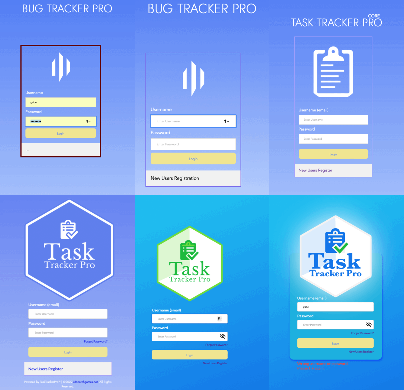
As for design, the Splash Page went through a lengthy process.
These works in progress led to our final version. We liked keeping a visual record of achievements and iterated
as we went along. Work-in-progress screenshots were a great way to gauge and witness productivity.
Starting with Photoshop, we laid out our design, and then broke it down
into objects before coding in HTML. When building this app for the public, we never
wanted to give anyone an excuse not to engage. That's why we did everything we could to polish and perfect the
Splash page. We were proud of producing both code and art from scratch. It was a herculean effort.
Argument
In the time it took to develop Task Tracker, we could've probably made more progress on other game
projects. One of the major setbacks to our production was being split between game and web
development. However, in truth, one complimented the other. Once our app was completed, game development
became faster and much easier in a shorter time.
Today we have over 20 projects, all queued up with time frames and design docs available for the day
we're ready to go. Realistically, our focus is on the top two or three, at most. Not
to sound like an infomercial, but thanks to our app, it's never a worry to pick up where we left off.
It's totally worth it.
To see it in action, visit the Splash Page >
Mobile
Porting for mobile was by far one of the biggest challenges. We wanted to keep the same look and feel
of the Splash Page as our desktop edition but with a compact layout. Using a one-column table as
the core of our mobile design was a great way to keep the page clean, simple, and flexible.
It was responsive, ensuring it looked its best on any device.
Responsive: A design that will adjust to the
size of the screen it's being viewed on.
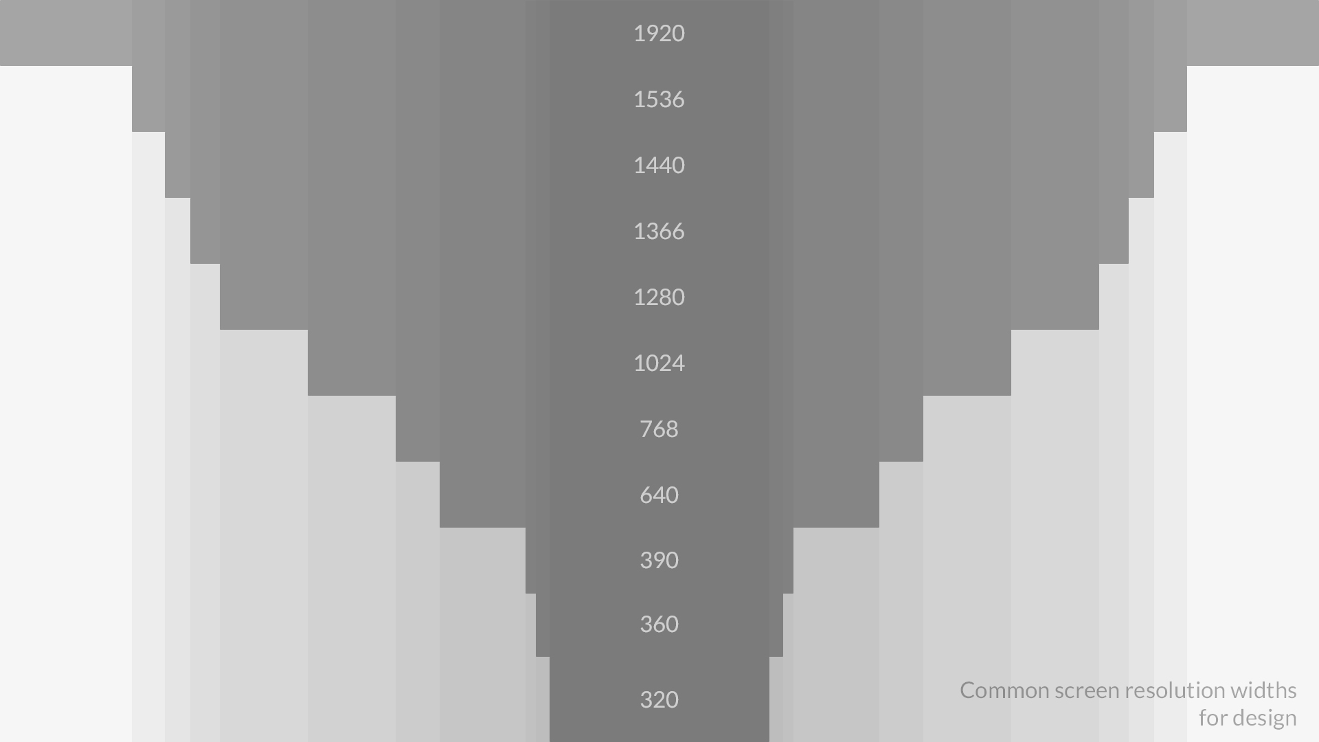
We developed a device guideline through a series of trials. With so many specs and dimensions to test,
it took weeks to figure out. Using this template, we established a standard for positioning key elements
of the splash page, then adjusted for viewport variations as we went along.
Responsive design is a pain. But with planning, it gets easier. We blueprint four presets: Desktop, Tablet,
Mobile Large, and Mobile Small. This approach simplifies both the art and coding implementation.
Afterward, we blend transitions for other device resolutions in between.
Our Presets
Note: Viewport width is the most important part of our responsive design.
- Desktop: 1920 x 1080
- Tablet: 768 x 1024
- Mobile Large: 480 x 926
- Mobile Small: 320 x 568
Design
In previous pages we discussed Palette Box.
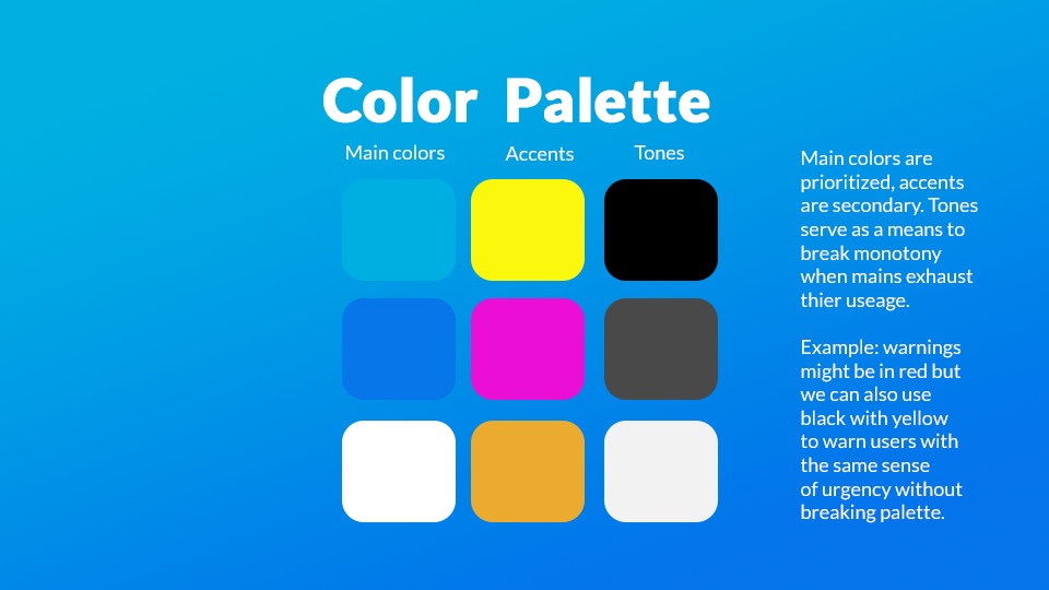
For the design document, we used our 9-color swatch to ensure color coordination, style, and consistency.
This palette wasn't created until later in production, when it was time to gather feedback. The lack of graphical
appeal kept many from wanting to provide feedback, making it clear how getting people to use it would be
one of our biggest challenges—a common problem in the early stages of software creation.
Therefore, we felt the need to go the extra mile to make it look as good as possible, reducing
friction and increasing engagement. This need was a part of how the design guide was born.
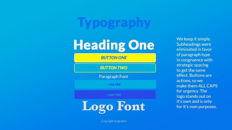
We aimed for fonts and colors that were bright and inviting. The logo was designed with simplicity in mind.
Aside from converting green to gold, the majority of our color scheme remained unchanged.
MORE INFO
To see the original design, click here.
To see more of the early development process, check out Early Development
The Power of Limits
As volunteers for Saddleback Church, we learned to formulate rules, conventions, shapes, colors,
and the do's and dont's of art direction through their graphics ministry. Joining a team of
professional designers with diverse backgrounds, tastes, and walks of life made it clear how
imperative it was to have everyone adhere to one vision and understand the reasons why. For larger
campaigns, consistency was key. As a result, every creation made by the team always felt cohesive. This
experience deeply inspired us to make design guide templates the core of our workflow.
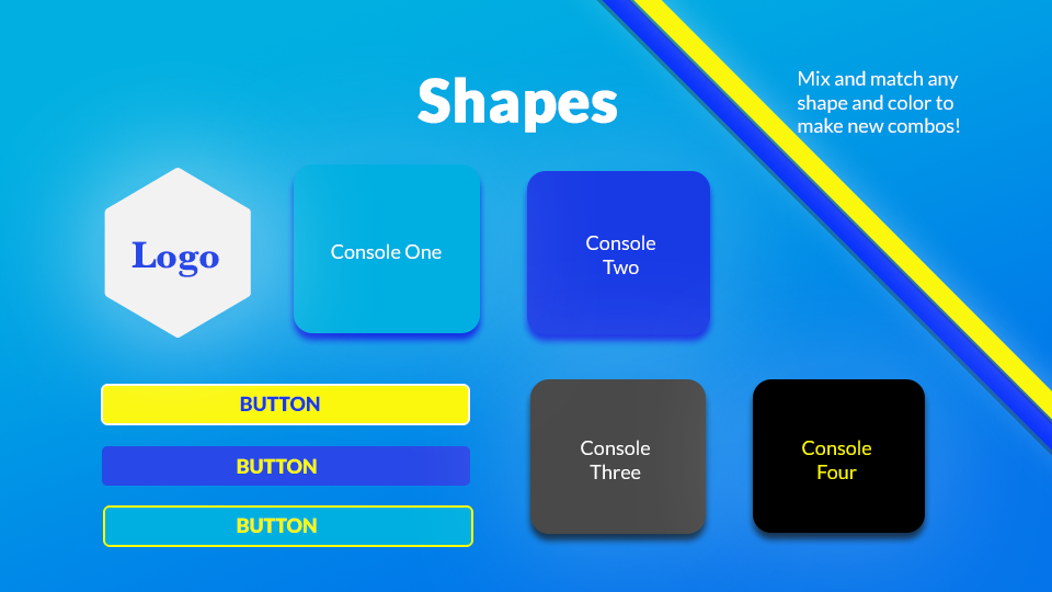
Limits are our friend, especially in art. Strong guidelines urge us to think outside the box,
leading to new ideas and unconventional approaches that define identity and make it memorable.
That's why it's cool to create presets and assemble them in varying ways without worrying about breaking
uniformity. For scripting, this approach is particularly helpful because it allows you to achieve the
most appealing results with the least amount of code.
Registration
The background strip for our Registration design was an added touch. Every other element, including
buttons and links, adhered to our standard for user input, similar to the
Login and Password Reset pages. Originally, we kept
the design bare, but the layout felt empty. While it was a pain for mobile, one solution
for misalignment was to make the background strips disappear after a certain viewport size. Some users
won't see them and don't need to; it’s optimal for larger screens.
Insecurity
Arguably one of the toughest parts of web programming is cybersecurity. We spend a great
deal of time protecting user data by filtering names, emails, and passwords. It takes a lot of work to ensure a system
is stable, free from SQL Injection and able to prevent it. Juggling multiple
languages at once can be daunting, it takes time to get accustomed to database engineering. Encryption,
hashing, and salting passwords are a key part of that.
SQL Injection:A hacking technique that tricks a
database into outputting private data by embedding malicious database commands into user input.
Prevention was better than cure. That's why we did everything we could to parse data as much as possible,
to protect against malicious spam and bots. While it was never 100% guaranteed, security was all about layers.
We also avoided cookies and found them unnecessary. Managing sessions became a priority, making us
appreciate the importance of hitting the "log out" button on any website whenever possible. It reminded how important it
was to ensure safety of personal information.
In truth, hacking is unavoidable. There's no perfect solution. The more mechanisms in place to prevent
exploitation by malicious users, the better. The best one can do is deter. That's why we also
recommend two-factor authentication whenever possible.
No Passwords
In future apps we intend to get rid of passwords altogether. They're cumbersome, easy to forget,
and unnecessary. What we'd like to use is a combination of email, phone number, OS, location,
and graphics card info via User Agent data to create a special hash code for for each individual.
Combined with two-factor authentication, this could offer a simpler and more effective security measure.
A first-time user would be registered but unable to log from anywhere else until they approve access.
Otherwise, an email, number, or username should suffice to gain entry. A pin number could be
enabled as an option if clients share a computer with someone else.
While hackers might be able to spoof their way in, it should prove more difficult. Decrypting stolen
hash code and masking one's browser, OS, and hardware to match would be daunting. This approach allows users to
forget about passwords and focus only on their login credentials. We can also set limits to ensure bots aren't
able to easily spam the system. While we haven’t tested this concept yet, we’re eager to develop it
further in future updates. We’ll see how it goes.
Confirmation
Once registered, users received a confirmation email. But we thought it would be cool to turn it into a
membership card, which is why we added this design motif. Depending on the tier, the color of the card
would change—a feature that was planned for further implementation in future updates. It was something
we were excited to expand on in upcoming releases.
From other screenshots you might have noticed our iteration process. Initially we went for something simple
and functional. But once the Splash Page came together, we knew we had to expand on it.
Lesson Learned: Photoshop First
When we started working on Task Tracker, we believed if we iterated on design through coding and
browser tweaking, we could achieve the best possible look. At first we were content with our
progress. But then we noticed many great-looking websites using beautiful templates. We realized they
couldn't have achieved their quality without being put together on a limitless canvas. Since our
site was custom-built from the ground up, we couldn't take advantage of pre-made bootstraps or
similar frameworks. It had to be done from scratch.
It didn’t have to be Photoshop, but creating pages in an app focused on art without constraints made a
night-and-day difference. Coding somehow got in the way. Once we had a design we loved, it was clear the
whole was better than the sum of its parts. By prototyping the site in an art program first, especially
after drafting all the content, we ended up with a better product, made from modular pieces that came
together with ease. Not only did the site look better, but we also achieved the greatest quality with
the least amount of code. "Plan first, program later" became our new motto.
While this isn't always the case, there are many occasions where function is all that
matters. A lot of iteration occurs during creation of a site, and aesthetics aren't always the
priority. At times, it's better to get something out there and improve it later.
We started Task Tracker this way but it was due to difficulty with user feedback we adapted a design-first
paradigm. Over time, we evolved our tactics depending on the project, moving toward documenting first,
designing in Photoshop second, and coding last. While this philosophy bloated our projects, it allowed
us to complete a whole product at once, rather than improvising in bits and pieces that didn’t always
fit together. Every endeavor required its own approach.
Email
We also learned to improve our send-mail system. Back at Naughty Dog, we coded something similar
using Python's SMTP protocol for Bake Notifications but
it was through a private network. This meant we didn't have to worry about various service providers and web hosts.
Unlike Python's robust library, PHP's lackluster offerings meant we didn’t have an easy-to-use solution.
We had to find one among third-party projects, import, and integrate into our system. Writing our own
from scratch would have been too time-consuming. For something as simple as sending an email, there was a
lot of toil involved. In addition, with Task Tracker, we had to consider formatting for Gmail, Hotmail, and
other commercial services, as well as connect our system to a mail server so users could receive
updates for reset passwords without having them ending up in junk or trash folders.
Spamming Planning
The importance of email security was underscored during this experience. SPF, DKIM, and DMARC
protocols helped ensure our emails were delivered and not marked as spam. It took some time to guarantee
newsletters always delivered.
Styling email art to make sure Gmail would accept them was tricky, as they have some of the strictest
policies for STMP exchanges. All other providers worked out well, despite some hassles. It was reassuring to
have an affirmative confirmation page after emails were sent. User addresses were highlighted in gold to
make them extra visible in case of a typo.
For more info, check out our Newsletter section
Reset
Creating a robust password reset system wasn’t as straightforward as following a web tutorial.
We explored sites like Gmail, Chase, CrunchyRoll, and others in order
to remember how they worked. Some were trickier than others but once we got their notifications,
it was a matter of reverse-engineering their approach, replicating it, and then adding improvements on top.
We followed a majority of standard conventions and security protocols behind the scenes. It was a
pleasant surprise to see our results align closely with industry standards. While no security is perfect,
our custom code prevented bugs and mishaps.
Goodbye
It's pesky when canceling subscriptions or closing accounts, many apps make it difficult, if not
impossible. For Task Tracker we aim to keep it simple. We hope by providing a smooth and positive
experience when closing an account in less than three steps, users will consider returning in the future. At the
very least, we want to avoid leaving a bad impression. Design-wise we expand on the same style as our
Registration Page and feel it's a great opportunity to solicit
feedback as well as bid a pleasant farewell.
Contact
It was also important to have a contact page for anyone interested in the Enterprise edition.
However, we expanded it further to serve multiple purposes. By adding a dropdown menu, users can select
from other inquiry types: general, technical, and personal.
We updated the Access Email and
Newsletter protocols to automate responses from queries. This
allowed us to quickly identify the nature of each message and respond accordingly. While there was
room for improvement, it worked well across the board and ensured delivery to the appropriate inbox.
Access
Login
Arguably, we considered the login page to be the most important on our site, second only to
the home page. Making sure it was secure—able to avoid bots, spam, and unauthorized
access—was a top priority. However, we later realized it also needed to be pretty. What began as a
straightforward template evolved into an opportunity to enhance user experience. Surprisingly, a lot
of work went into what seemed like a simple page.
Managing session data required significant trial and error to guarantee smooth entry and automatic
closure if users forgot to log out. We also ran into an issue when they hit the back button
to re-enter the page, which wasn't supposed to happen. Cleaning up data and ensuring the login page
worked well across all devices and browsers was a challenge, but in the end, it all worked out.
Features
- Hidden input display (user-requested feature)
- Password reset link
- Registration link
- User feedback notification for incorrect passwords
Logo Design
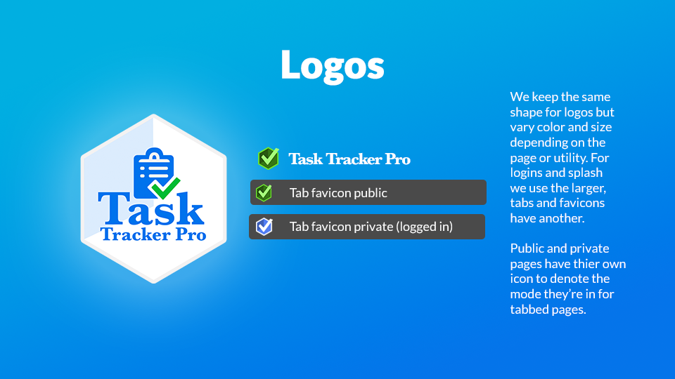
The logo went through several weeks of iteration before we settled on the final design. We tried
free AI-generated logo services to create different drafts, but eventually, the idea fell short.
Realizing there was a limit to variety and complexity one can get from such systems, ultimately,
this process helped spark our creativity. Even though the final design required a more hands-on
approach, it at least provided us with inspiration!
Eventually, we settled on a hybrid between our own design and one of the AI-generated options.
From all our choices, the hexagon stood out most, resembling a cube and inspiring the idea of using it
as a 3D checkbox. The serif font and clipboard were also derived from this design. Creating a checkmark that
overlapped the clipboard took some work in Photoshop, especially since it had to be vectorized, but it
was worth the effort.
Newsletter
Fraudulent emails abound. That's why paying extra attention to detail when generating templates is
as important as printing a dollar bill. Security officials often study the intricacies of an
authentic fiat note for weeks, if not months, to ensure they can distinguish it from a fake. As a
result, they detect counterfeits with frightening accuracy.
ART IS A SECURITY FEATURE TOO
Going the extra mile to ensure consistent styling, color, font, and layout became not just a
hallmark of our design, but also a security feature. Shamefully, the current
version followed our legacy style instead of the style guide we
created. While it worked, updating it was added to
our to-do list.
After this experience, it surprised us how obvious fake emails were, but also by the mediocre
to poor quality of legitimate ones from large corporations. It was risky not to have a well-designed
layout, as poorly designed ones could be easily spoofed, tricking users into giving away their
personal information. According to the FBI's
2023 report, phishing
still made up 22% of cyber attacks, making it the number one complaint on their list of all cyber
crimes.
More Info