Welcome to the Welcome page! It's the first thing you see when logging in. Each time a user enters,
we check their details and calculate progress. The latest project is displayed under membership, and
when clicking "Start", users are forwarded to their current work.
The Welcome page didn't come together until the end of the dev cycle, but despite being a
last-minute idea, we felt it was a great way to make users feel welcome, keep them informed about their
usage and subscription status. We also included examples of public lists, global data, and an invite
feature for sharing with friends. The invite mechanic was a bit tougher to set up due to its
connection with SMTP scripts, but we worked it out. We also added auto-refresh for the page after
a referral to let users know their invites were sent.
Navigation
The nav bar was kept simple. We followed an "update only as needed" philosophy before the Splash page
became a priority. If we didn't need it, we wouldn't add it. We considered adding a Help menu with a
search bar to address common user queries, but since every UI element had a tooltip, we decided it
wasn’t necessary. But since every UI element had a tooltip we figured it wasn't necessary. If we
received feedback otherwise, we would have added a help page, but our goal was to keep our UI minimal.
Seasonal Color Change
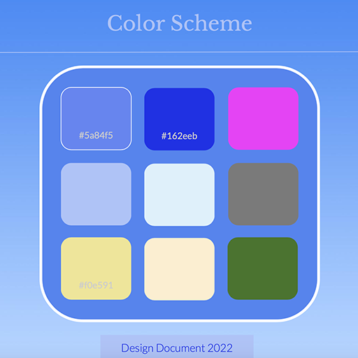
One major perk, an Easter Egg if you will, is an auto-update of the Welcome tab's
color based on the seasons. You can see hues change for summer, fall, winter, and spring. It's a
fun way to keep the app fresh and interesting. In the future, we'd love for the entire
app's design to update accordingly. We enjoy automating seasonal changes in all our layouts to reflect the
time of year and add a sense of life.
Tab Count
Inspired by Facebook and LinkedIn, we often pay attention to the number of inquiries and notifications
in our tabs. We’ve implemented a similar feature in our app, allowing you to preview the number of tasks
remaining on a project page. On load, we dynamically update the browser content by counting the remaining
tasks and updating HTML accordingly. It's tricky because we’re not sure how other developers handle it. If it
fails, it can freeze the rest of the page from loading. However, with a workaround, it's patched, working well,
and has become one of our favorite features.
This feature is available for both private and public lists.
Projects
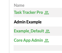
If you want to know the status of all of your projects, look no further than the Add a Project page.
We’ve expanded modules from the project dropdown menu into their own dedicated page. We also added a
special icon for projects with invited team members, which turns green to indicate which ones have
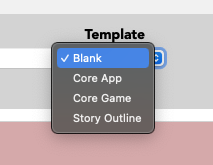
invites and which don't. There's also a menu for templates to help
users get started.
Technically we reused the same code from Add A Task and repurposed it for projects. This saved us
time and prevented vulnerability. As a bonus, the same enter hotkey used for task entry also works
or projects, making it as easy as typing and hitting enter.
Features
- Name and Description: Every project on your to-do list.
- Progress Summary: Percentage and progress bar, sorted furthest to least.
- Completion: Number of tasks total versus completed.
- Start Date: When the project started or was created.
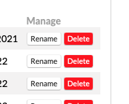
- Manage: Edit, rename, or delete projects. You type must "DELETE" to remove projects,
ensuring safety against accidental activation.
- Team Membership: Preview projects where you’re a team member.
- Choose Templates: Select from Blank, App, Game, or Story templates for a basic structure,
ideal for saving time or getting started.
More Info
Switching Projects
Team Titles
As mentioned before, we appended the Projects list with those that users were part of. Even if
someone missed notifications, they could still get status updates from the Invited Team
Project section. From a programming standpoint, it was trickier because several loops had
to be created to check for various conditions before appending to the user’s personal table.
Luckily, we didn’t encounter any performance issues as a result.
Edit Projects
The rename, delete, and update buttons were reused from our list mechanics. A simple press of the enter
key was all it took to update. One of the great advantages of clean, modular code was the ability to
inherit familiar modules from other sections. The hard part was ensuring the UI made sense
and prevented any database errors from occurring due to faulty user input. It worked well ... mostly.
Templates
With time and practice, we find ourselves resorting to templates less often. Automating the creation
of default lists with projects is a lot of work, but it gives users a chance to see
how Task Tracker can be used. We take this opportunity to embed templates with tutorial
messages and tasks to inspire organization.
We were surprised how useful this was for beginner users who weren't familiar with the app nor sure how
to organize a project. But over time, we became less reliant on it. Our personal favorite was the
story template, which we used to keep track of novel writing on the side. We loved the idea of someday
repurposing Task Tracker into a site for novelists who wanted to organize their works into chapters,
characters, scenes, and locations with a simple drag-and-drop outline and templates for classic
storylines. We weren't sure when it would happen, but added it to our list of many ideas for the future.
Image Gallery
The image gallery was one of the biggest challenges because it worked almost the exact opposite of
our list scripting. It presented an entirely different UI experience. We had to invent unique mechanics
for managing images, including fetching, displaying, and arranging them. Our favorite part was the
ability to track which tasks were using which images and highlighting them. If an image was used in
multiple areas, we indicated where.
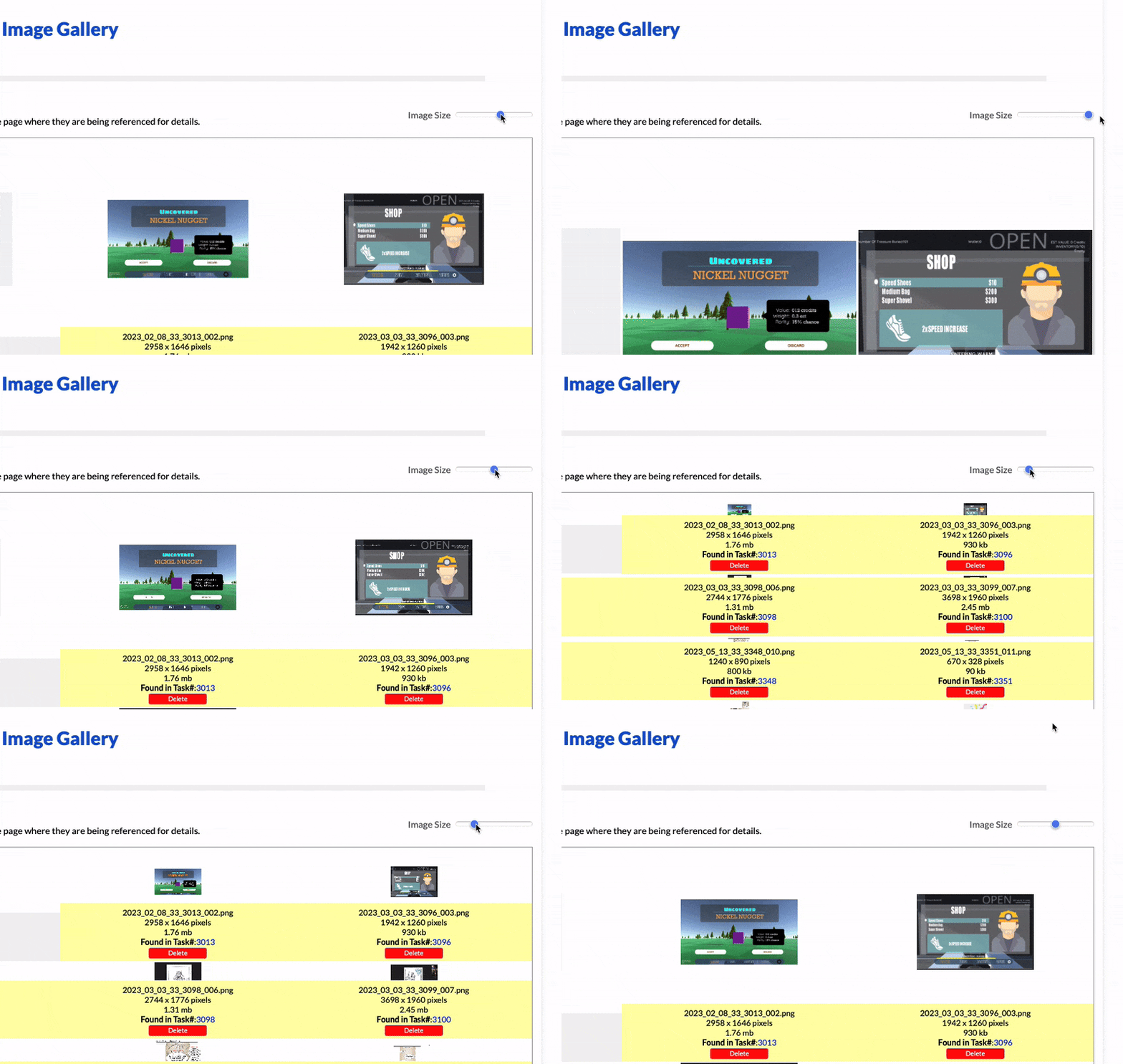
Going the extra mile, we provide links connecting tasks where images are used, append a delete button,
and display image size along with dimensions. It's fun to get a visual presentation of what you're
working on. Oddly, fetching size and resolution is tougher than expected since there's math involved
behind the scenes. Not all web languages provide this easily nor in the necessary format.
Ironically, date and time calculations are even worse—one of the trickiest variables to handle
in programming!
As a bonus, images used in tasks are accentuated in yellow, making it easy to spot the ones you
might think twice about deleting. The rest are in white, so it's easier to decide when you
need to save space. Above images, we calculate storage for you and display a progress bar, so
you always know how much space remains.
Features
- Image Name: Displays image file name, including extension.
- Resolution: Shows image size in pixels.
- File Size: Indicates file size in kilobytes.
- Link to Task: Provides direct link to associated task.
- Resize Slider: Allows adjustment of image size.
- Storage Use: Displays remaining usage based on subscription plan.
More Info
Image Import Tool
Adjust Image Sizes
Scripting a post effect to make an image slider work on a gallery proved tricker than expected. We
took longer than anticipated to make it work, not only due to browser compatibility but also
in terms of UI. We wrote the slider from scratch and calculated sizes on the fly
relative to each image's dimension. It sounded easy, but there was a bit of math and css trickery
involved to get it right.
As a bonus, we were able to reuse this module for task details. Any item with an image would auto-detect
when one was available, allowing users to slide sizes. The default was set to 50%.
Accounts
Managing user account information was a nightmare. But luckily, we found ways to keep it protected.
We made password updates easy. If users wanted to delete their account, they had to type
"DELETE" manually to confirm and prevent accidental loss. We also added a QR code for donations,
in case anyone felt inclined to contribute.
The ability to update names, emails, login credentials, and other account detail is embedded in one simple
UI menu. We keep it minimal, focusing only on what's necessary. You can also view usage, plan details,
and more, just like on the Welcome page.
Auto Upgrade
Because the app is officially in Beta, in need of further feedback, testing, and iteration,
we've decided to auto-upgrade accounts. Normally, this menu would include a UI to add payment info
and choose a plan. But since we're in a transition period for the site, users in this current
phase who exceed their account limits will be automatically upgraded to the next tier for free!
Plans
What to charge, how much to offer, and all that jazz is difficult to consider when it comes to
pricing. After looking at several sites that offer more or less the same things we did, our
model became a compromise of what's available in the market. While we believe in "charge for
wants, provide for needs", there may need to be some reconsideration as far as what our
supply and demand might be as more users come online to try it out. Pricing is
subject to change.
PLUS: Free
Gold release - $15 per seat/per month
- 10 GB Storage
- 7 Projects
- 25 Team Member Invites
- Basic priority email support during specific hours.
PRO: Auto Upgraded
Gold release - $24 per seat/per month
- 100 GB Storage
- 25 Projects
- 55 Team Member Invites
- Priority email support during specific hours.
ENTERPRISE: Contact for info
- Unlimited Storage
- Unlimited Projects
- Unlimited Team Member Invites
- Priority email, chat, & phone support during specific hours.
- Custom integrations, single sign-on (SSO), & API access on request.
Errors
Inspired by Ferrero Rocher's error page, we
decided to take it a step further and enhance the design of our error pages as well. GitHub also
had a great example, and we thought it was a good idea to follow suit. Errors never felt good to
receive, but whenever developers made them fun and interesting, it lightened the mood and made a
negative interaction a little easier to handle.
As for how it was executed, we had to create a separate page for each error, sharing only certain
elements from our design doc. Keeping within our shape and color limits, we reused the stripe and
console background theme, reserving the appropriate palette for warnings, neutral messages, and
status notifications. Blue was kept for the 500 error, indicating it wasn’t the user’s fault.
Warnings were given yellow and grey gradients in some cases; in others, we used yellow
and black, reminiscent of construction site caution signs or police investigation tape.
Mobile
On mobile, we had a hard time fitting the same design as on Desktop. We ended up making the stripes
disappear after a certain size, which worked out for the better since they likely wouldn’t be seen
or appreciated anyway. This experience led us to develop many of our standard mobile
template sizes. It wasn't easy, but a necessary step in
familiarizing ourselves with responsive design.
Vintage
Before creating our style guide, we started with a basic default design
based on our logo and its initial version. At first, it seemed ok, since most of it was created
using raw code and iterated upon as we progressed. But over time, we decided to try improving it
using an app like Photoshop to take advantage of the additional creative freedom. The art we
produced through graphic apps was far different from what was made through browser iteration.
That’s why we chose to design our layouts in graphic apps before coding. The extra effort was
totally worth the reward.


