The following are a series of details, techniques, approaches, and anecdotes from our time at Treyarch working on Call of Duty: Black Ops single player campaign.
Single Player
Khe Sahn
Khe Sahn, also known as S.O.G, had three major parts: the opening scene with desert colors out in the sun, the interior of the bunker, and the final scene on the side of a mountain. Each made use of the same color palette yet alternating based on location, a different hue per segment in order to make it feel cohesive overall while giving each part their own distinction. we didn't want a limited scheme to feel too repetitive and sometimes we would vary it by intensifying fog or raising sun intensity.
Since a portion of it takes place either in a trench or bunker interiors, there was some room to experiment with dark tones and deeper contrast to keep it moody. Other times we would break things up by adding fire in barrels, marking checkpoints in the game as we go. We also spaced runtime lights apart enough to create a smooth fade transition between them. This works out well in both improving performance and better visual rhythm. Done right, a game can feel more cinematic with this approach and it's used often, two birds with one stone.
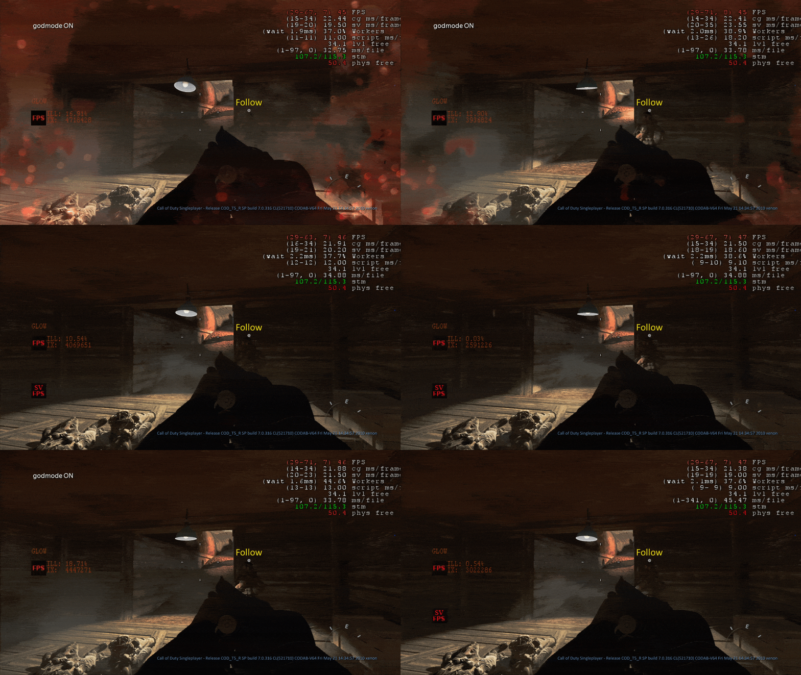
The swinging light fixture was a fun little detail we added to the level. It was a simple idea but it took a lot of work to get it right. We had to make sure it didn't interfere with gameplay and that it looked good in motion. It was a great way to add some extra atmosphere to the level and make it feel more alive.
Another major feature of this level were the dynamic rope lights. We collaborated with designers and FX artists to figure a way to get fixures and spots parented to swing and sway as the level shook. While a pain to implement and script, it was totally worth it. We made a prefab after the first one worked and used it all over. We're lucky it didn't kill frame rate. :)

To be clear, we didn't make a majority of the concept art used on this board but did cobble it together along with our PaletteBox tool to get an idea of the overall direction and get a feel for the level; a big part of how the game ended up looking close to the concept. By drag sampling pixels on gathered reference, we pasted literal values into sun, fog, and post effects, giving levels a sense of cohesion and taking us a quick step closer to believable atmosphere in a short amount of time. It wasn't easy but definitely fun. Thanks to the locale, there was freedom to push fog to get more depth and rendering range, a technique we used in later levels and further on The Last of Us.
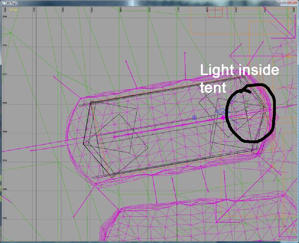
The tent flap was a major pain. We had to work out a way to script dynamic lights, post processing, and foreground ambient values in order to fake the illusion of a dark interior with a bright exterior and then switching the exposure to make it happen. Few people know it was a technical feat to pull off. Even now there's not a single pop in what took three different systems timed manually to make it work.
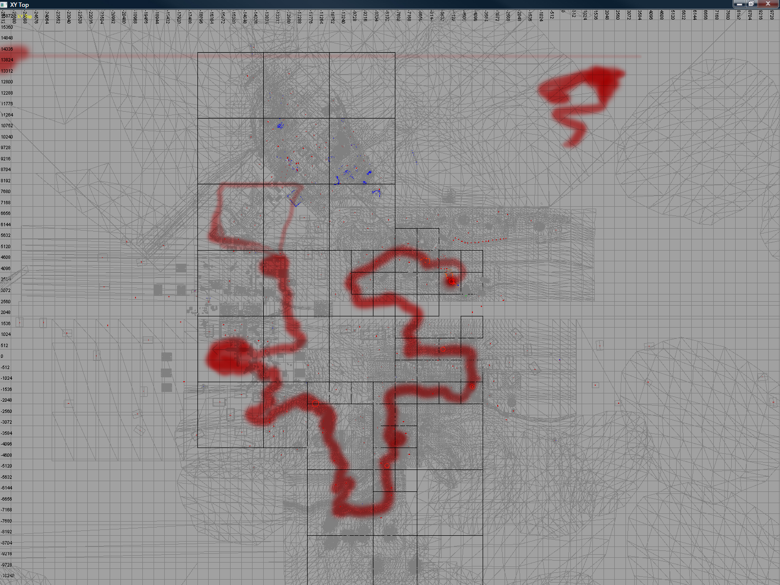
Good lighting takes planning, especially rigs that compliment gameplay. That's why sometimes it's good to map out the player's path. It's not done often but in this case, it was crucial to ensuring brightness, colors, tone, shadow, and atmosphere complimented the single player experience and make it as cinematic as possible. By planning the twists, turns, and what players will expect around corners, we can push the blockbuster action film to the utmost.
Quagmire
Also known as The Defector, or Hue City, for most of the production, Quagmire was slated to be a day map, then it was switched to night. Art direction by Colin Whitney and level designed by Adam Hoggatt, all the window lighting and materials had to be replaced, we were lucky most of this level took place during a long labyrinth of interiors. The look of each room was optimized based on the angle where the Player would enter and was art directed and polished almost moment to moment. We had to fake most of the rays in here due to a lot of gameplay changes necessary to its fun factor.
The opening cutscene with the helicopter was the craziest, it came in at the last minute and required a lot of scripting magic to make it work. But it paid off!
Lesson learned: gameplay is king. That's why no matter how tidy and final a level may appear, be ready for anything to change even to the last minute.
Quagmire went through several changes and multiple palettes due to conflict with other levels with similar schemes. We had to change sky domes a few times until we settled for cools and a later time of day, maybe even going as far as night. But it started as a day and afternoon map.
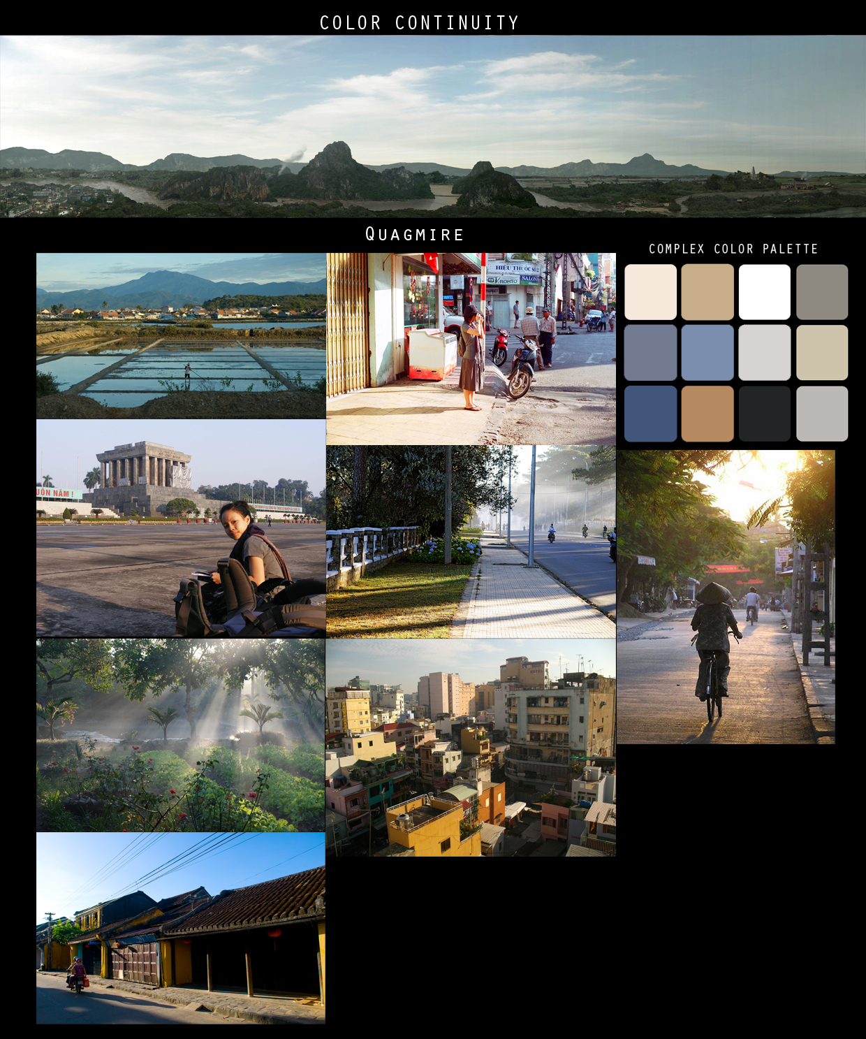
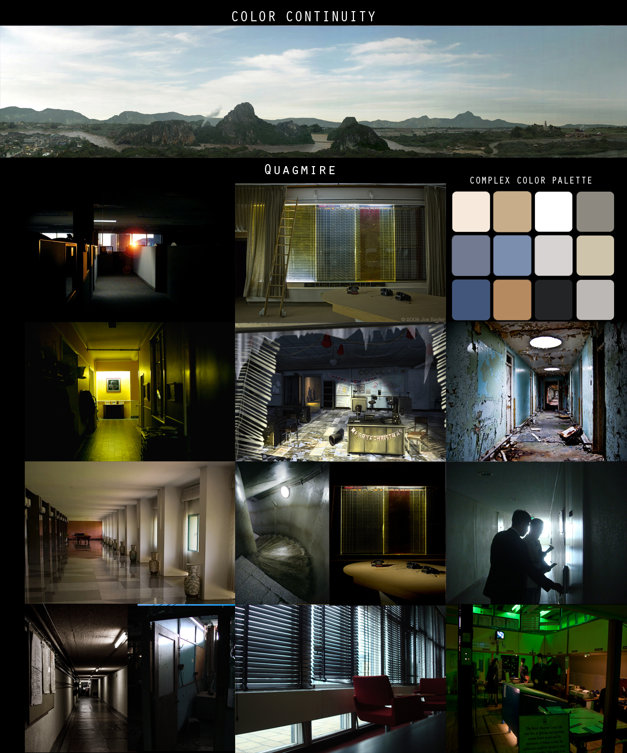
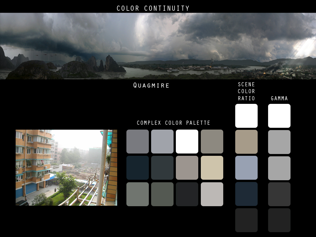
Taking reference from the Vietnam War given to us by Colin, we put together another mood board along with concept art, and figured out a good palette to work it. It's a shame we had to throw most of this out for exteriors and windowed hallways but was able to keep half of it for interiors. We studied quadratic falloff carefully to ensure the engine could produce believable results with runtime lights, especially since a lot of sources were going to come from self-illuminated object such as projectors, lamps, glass maps, and electronic devices.
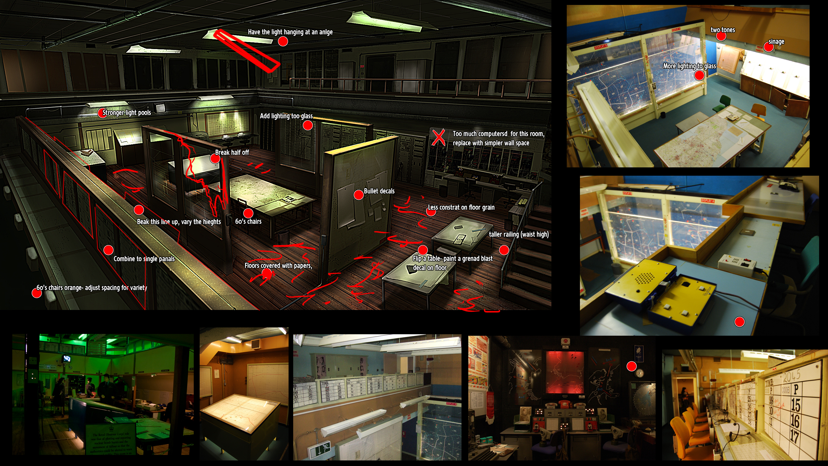
The Mac V planning room especially had some machinations of its own. We made sure to have both local objects and the overhead halogen lights work in tandem with runtimes. While it's tempting to make the ceiling our main source, since that's how it would be in real life, it would've made the scene flat and less exciting. Instead, we chose to use the light pools from cubical walls as our key to keep focus on the center of the room as well as provide dramatic depth.

These are a series of color scripts sent by concept artists to help figure out some of the dead spots in our level. In this case, it played a pivotal role with interiors but a shame we had to scap half of it once the level became a night mission. Nonetheless, in all labor there is profit and we were able to use some of the values in other levels.
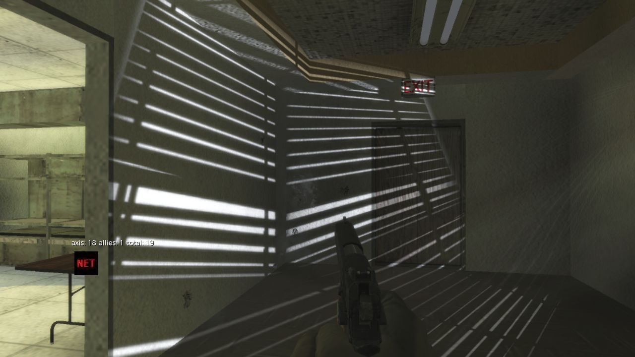
The power of gobos can't be understated. We took a screenshot from the game, carved out these blinds as a silhouette, exported as an image file, and then placed them in runtime lights to simulate the effect of them passing through blinds. Later in The Last of Us, we would use this technique more often with stain glass windows and foliage. This one technique helps with performance and creates a more believable atmosphere, since lights don't always have to cast shadows to be effective when used this way. Combined with shadows, they end up with a powerful, dramatic effect.
Gobos are a lighter's best friend. They can convey a lot of information to an audience with minimal environment assets. They can also be used to show when enemies are coming around the corner, as with Zombie maps. It's a great way to keep players on edge and gameplay more immersive.
Multiplayer
The following screenshots are for multiplayer maps we worked on for Call of Duty: Black Ops. We also share anecdotes and lessons learned from our time working on them.
Ingredients of a classic COD MP map:
- Small to medium sized
- Fast
- Strategic cover
- Five pillar landmarks in the four corners and center
- Resonating from real life, raw and risky locations
- Personal opinion: one randomized element that throw off pro players to keep it interesting.
Berlin Wall
While limited in certain aspects to keep it within 60fps, one important goal was to match values from photo reference to make it almost indistinguishable from an in-game screenshot. We use this technique a lot to get the initial color palette for a level before propagating it throughout the rest of it. With Berlin Wall it was a challenge to keep color and exposure consistent between interior and exterior.
Lesson learned: with overcast and night levels, it pays to max out reflective surfaces wherever possible, especially in large bodies of shadows and flat areas. It gives more depth and range to the scene and makes it feel more alive. It's also a great chance to pick one element with a strong saturated color to make it pop.
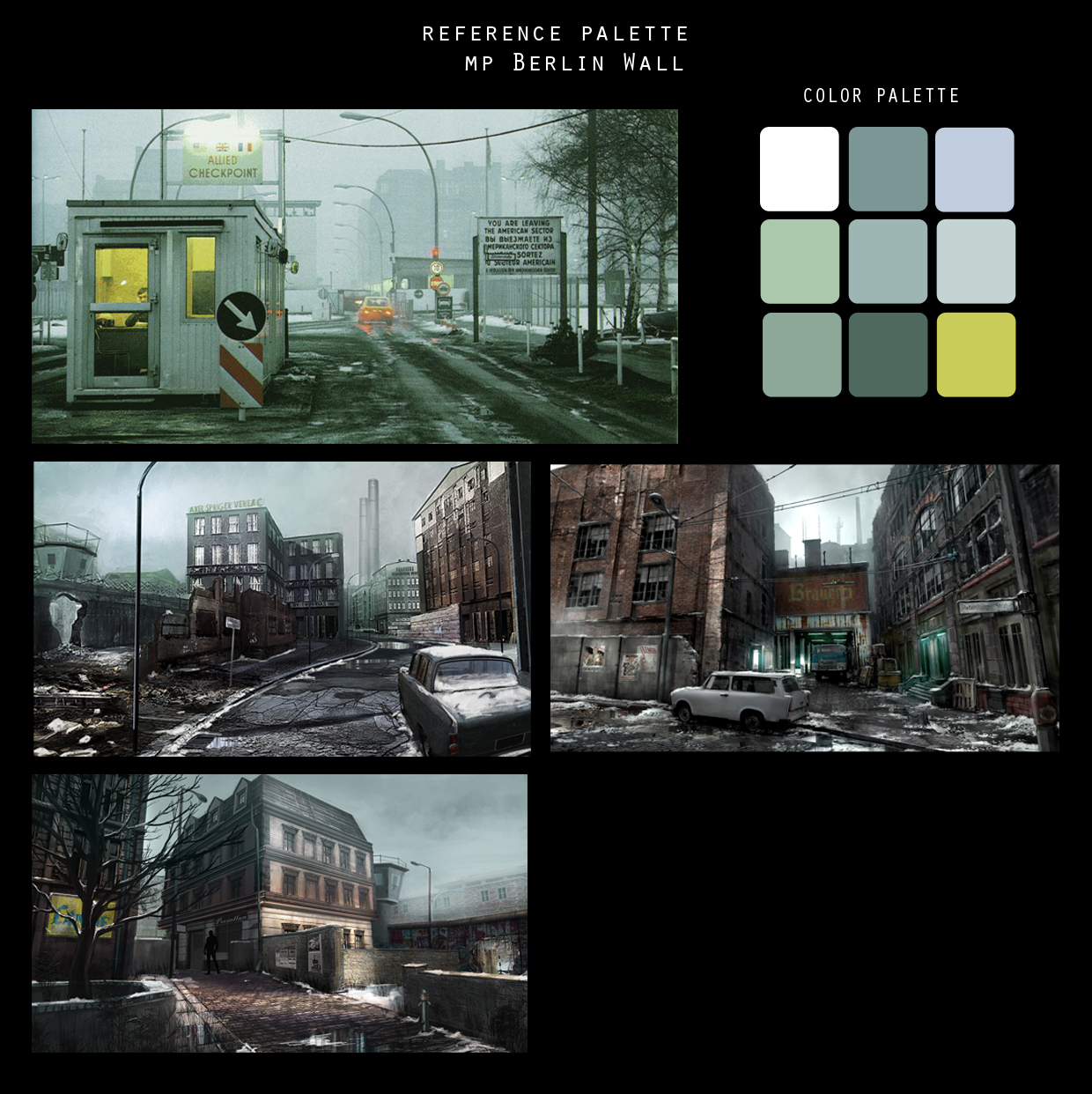
With our palette extracting what was available from a limited range, based on concept art, we put together this board to figure out the level's direction. Muted schemes actually work in our favor, even in situations like these. But with multiplayer, fog distance and weather present challenges to keep it from being too flat and bland. Depth is key.
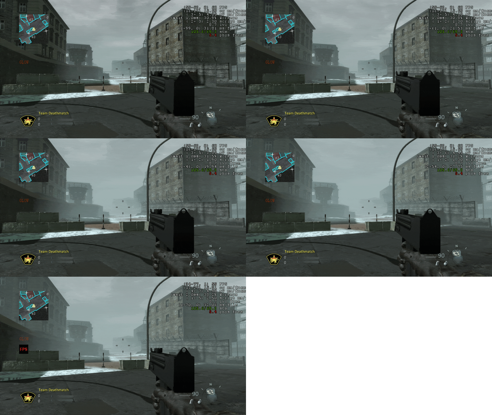
Fog for multiplayer is a challenge because players want visibility. But for lighting it's what allows a map to feel and look more cinematic and gives us a greater range. Here we play around with values to find a middle ground. In situations like these, we're better off erroring on too little than too much and working with particle artists to add where we can in the foreground to compensate. But since framerate and performance is key, we have to be careful not to overdo it.
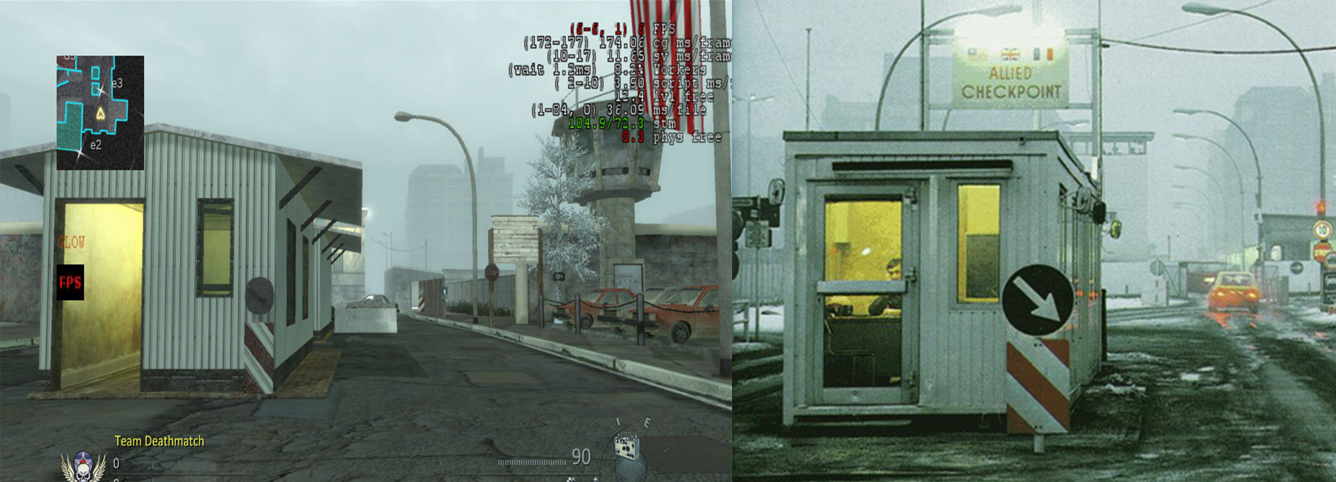
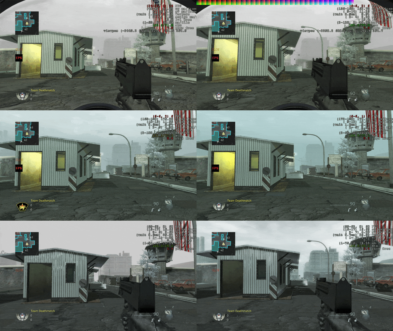
It can take a great deal of iteration to make a map look indistinguishable from a photograph. That's why as part of our first pass we'll take screenshots from the game and put them side by side with real life images to see if we're hitting the right values. It takes a lot of adjustments to get right and there's no guarantee the map feels good to play when it's done. That's why we're constantly tweaking and adjusting between gameplay and art.
Cosmodrome
Also known as "Launch", it took over a hundred of screenshots to get the bounce and fill to work well for all the interiors in Cosmo, well enough for players to feel they can see well in any corner without feeling too flat. It was an honor to see this map live on as a zombie map in Ascension.
The "Amber lights" were a major staple in this level, also used in Jungle and Summit. It's a very particular golden yellow-orange that took a good deal of iteration to get right so it would look good, feel genuine, while being useful for player visibility for the environment. It's a color we're proud of to this day, best showcased in Summit but first introduced in Cosmo.
We don't remember the dusty settings that shipped with the game. Most of our focus was more on a day time setting with cool hues and subtle warms. The palette used in this one was based on outsourced art direction, so we were also a bit limited in our approach. Looking back, we should've used our PaletteBox tool to simplify our swatch. Autonomy isn't always afforded but we did the best we could despite having to sort conflicting directions.
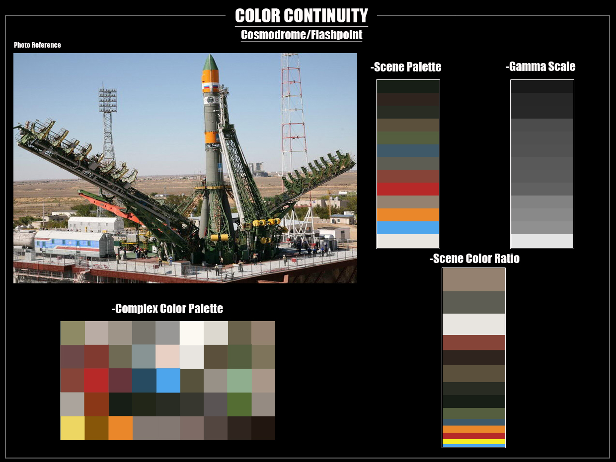
If there's a lesson to be learned with Launch, aka Cosmodrome, it's to always keep color palettes simple. Even if it takes extra work, the effort is worth it. Luckily a majority of maps we got to work on gave us the freedom to keep in one direction and iterate as we went along.
Crisis
It was cool to see Cuba featured in Black Ops and to go as far as to have it's own MP map. Crisis was fun to work on, though it went through a lot of iteration, especially in the interiors. Time of day was changed at the last minute, you'll notice a lot of work in progress using a later, or earlier, time of day.
For a majority of the time we worked on this map, the block mesh remained low poly. It was a bit of a challenge to take it further since it didn't come together as far as it could have until later in the production. As a result, we had to create a lot of makeshift components and modules as well as environment details until the final art came in. It happens more often in games than one might expect. Gameplay is king and queen.
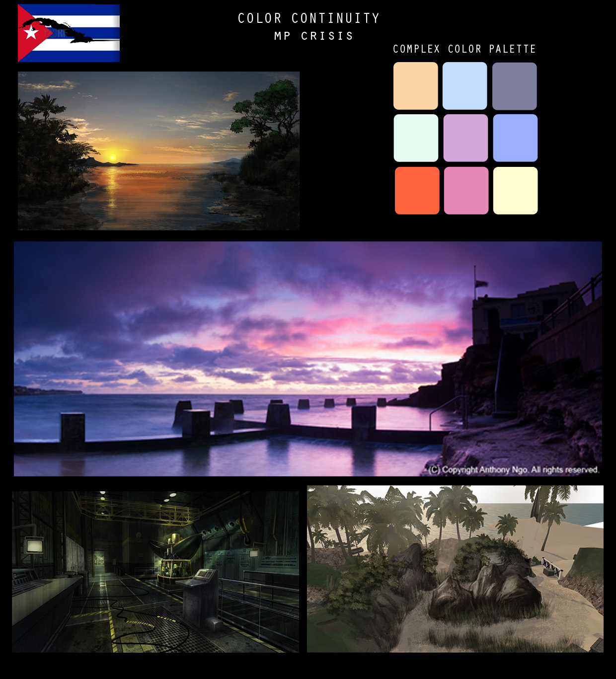
In retrospect, it's unclear why we didn't push more for magentas except to say it's often a tough sell and getting approval for dramatic palettes can be a challenge. Perhaps we had to tone it down? But as you can see in our work in progress screenshots, we tried!
Anecdote
During the Modules, an early dev process where we would brainstorm ideas for Black Ops to figure out how to make a great game without the use of modern weapons. It was mission impossible for the team. But we had to figure something out.
A few days after our initial meeting, My dad called to share a history lesson about the Bay of Pigs invasion and the Cuban Missile Crisis. He recalled how the Cuban exiles in Miami trained hard in hopes to take back the country with the backing of the U.S. government. In the middle of the invasion after months of grueling preparation, President Kennedy gave the order to withdraw. The exiles felt betrayed. It's the reason why most Cubans are pro-republican, they never forget the betrayal they felt from the Democrats on the night the were abandoned.
It was a powerful story that felt worthy of putting in a game so we submitted it on a 3 x 5 card and our idea got chosen. It was a great moment. We also got to pick out the soundtrack for the Single Player Havana mission, "Quimbara" by Celia Cruz. It was an honor to have it in the game.
Sadly we didn't get credit for our idea and had a limited participation the single player campaign. But we put all our heart into this map and it was a lot of fun to work on.
Duga
Also known as Grid, a great deal of work went into two major things with Duga. First was the color palette and second was the interior areas near stairs. In particular there was a brick texture in one of the building exteriors that wouldn't work with any of the lighting and sapped all the bounce. It would look to crushed and flat. The solution was to use a fake bounce light along with some negotiating for complimentary textures in the material palette to balance it out.
Also, given the large interior areas, some fills had to be expanded up to 200 meters in order to give the illusion of direction from the windows without making the level feel too flat. It was a lot of work but it paid off. Large interiors, especially long hallways, can be challenging.

Lesson learned: A texture palette is really critical to quality art and great lighting. It's true in real life with architecture, interior design, fashion, and graphic arts. Going further, the initial creation of a level shouldn't have more than 9 textures. If a level needs more than that, it's time to get creative either with layout, reflection, geo, or lighting. Limits are our friend. When the palette is set for textures and lighting a level comes together like magic.
Firing Range
The light wood material in Firing Range made lighting a dream. Since it was a daytime level with massive planks of this material, it was easy to get bounce and fill to work well. The challenge was in getting a palette to stand out compared to other levels. It was tempting to keep it generic and perhaps at the end it somewhat was.
Hanoi
Night maps are a nightmare for multiplayer lighting. But with Hanoi we were lucky to have plenty of runtime light fixtures outside the camp and within some of the interiors. While we're content with the end result, in retrospect we would've pushed for more puddles in key areas, shiny objects like metal trash cans, and more reflective surfaces to make it more interesting and give it more depth.
It would've been cool if we had a broken fire hydrant that would spray water and create spill, (maybe even slow the player down by a fraction of a second for gameplay) to reflect the lights from the camp. It would've been a great way to add more color and depth to the level.
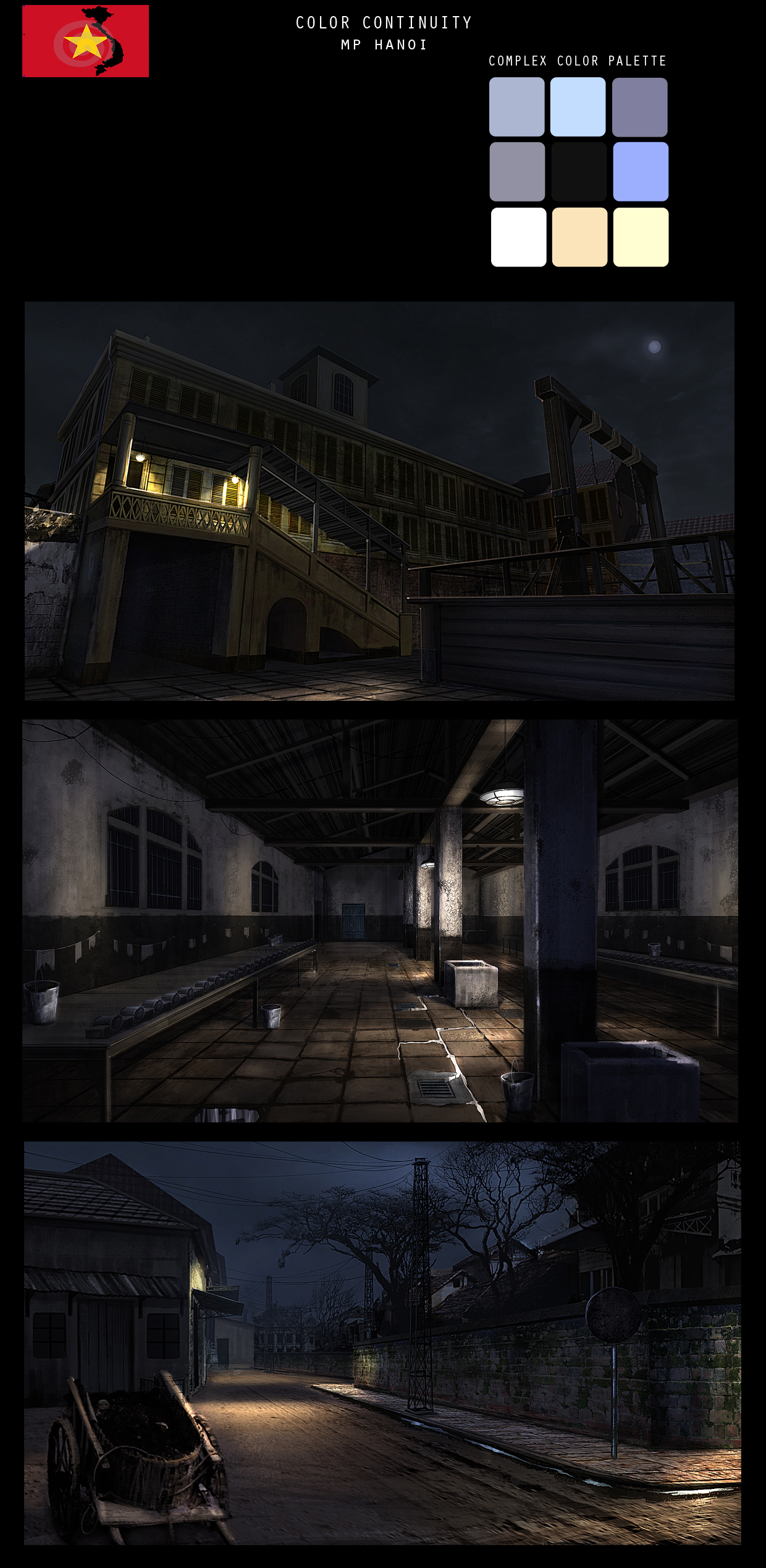
For Hanoi, we built from some of the work done on Nightfire as well as Der Rise from World At War. This time we agreed with concept art not to use fires anymore since they were overused in previous night maps. Instead, we went for a more muted palette. In retrospect, wet puddles, and shiny objects in heavily shaded areas would've made this map really come alive. But an emphasis on strong cool moon lighting and semi-warm eclectic light interiors worked out for the better. But darker maps are always a challenge for multiplayer. No fire barrels were used in the making of this level.
Havoc (Jungle)
Renamed Jungle, not to be confused with the original (see below), Havoc shares similar enough values with MP Banzai from World At War. In certain areas one might confuse the two from screenshots when placed together. It's possible they shared similar assets and textures. They also have the same time of day. If it wasn't for the actual gameplay and map layout, they might as well be.
Lesson learned: make sure your texture and color palettes stand out. But given they're from different projects, if it works, don't be afraid to renew, reuse, and recycle!
Jungle (Canceled)
Havoc was renamed Jungle, whereas the original version of this map may have been scrapped. We don't remember what happened but in combing through screenshots, we don't see this in any of the original Black Ops archives. Nonetheless, foe historical reference, we added it since we're also proud of how it worked out, lighting wise.
Inevitably, there will come a point where one's labor might feel in vain, especially when working hard on a canceled map. But in all labor there is profit and many of the ideas as well as approaches to this map were paid forward in Havoc (renamed Jungle) as well as Hanoi. It was neat to match photo reference in the initial pass for Jungle, especially the sky and fog values. It's a shame the tech doesn't allow us to push photorealism without insane amounts of iteration but in the early part of this level it came close.
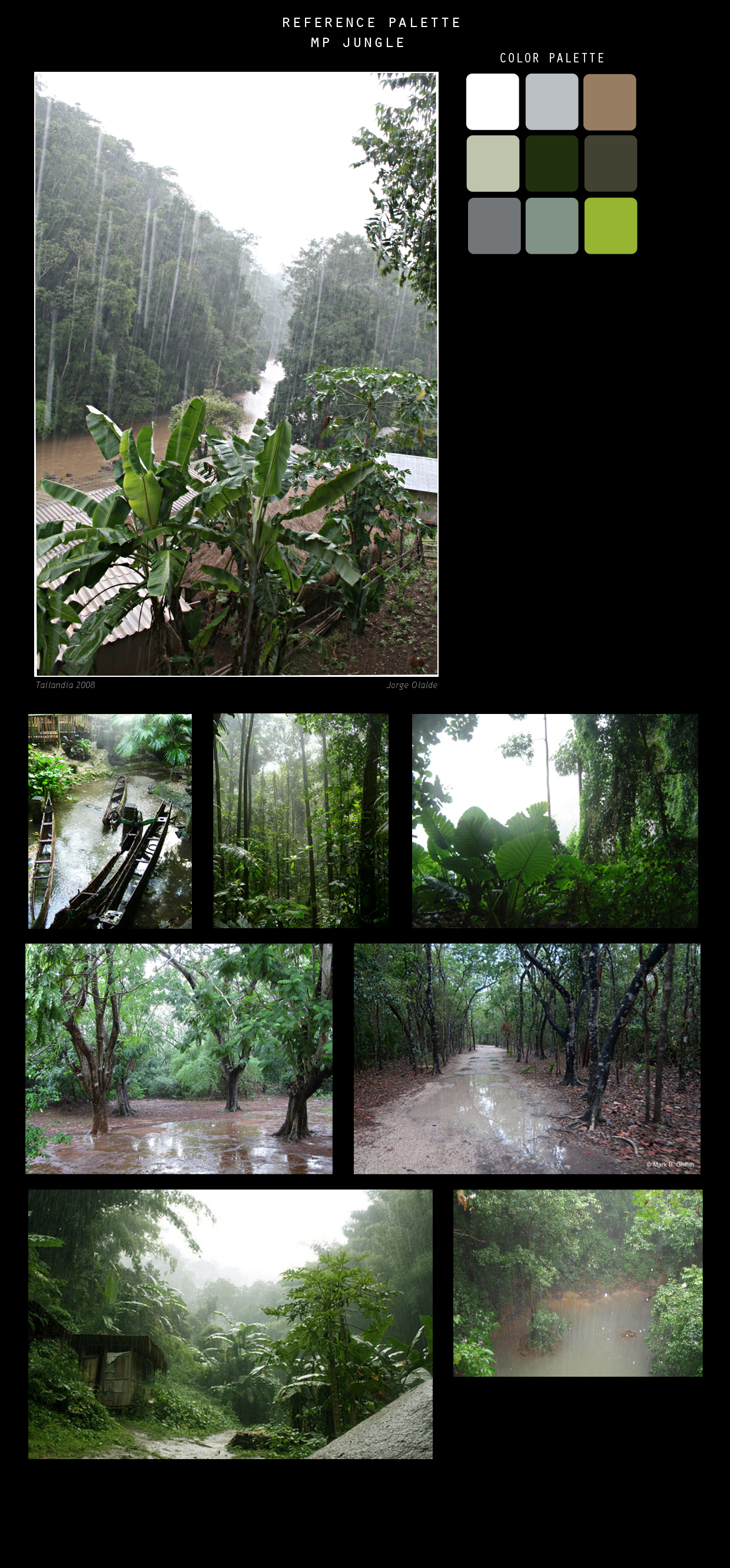
The following was a color palette and reference file put together for this level. Strong warms contrast cool hues from the overcast weather for depth. A dominant green with saturation against muted blues and greys capture the feel of a sweltering jungle in the rain. We also borrowed the Amber lights from Cosmo and Summit to liven up and contrast some of the interiors.
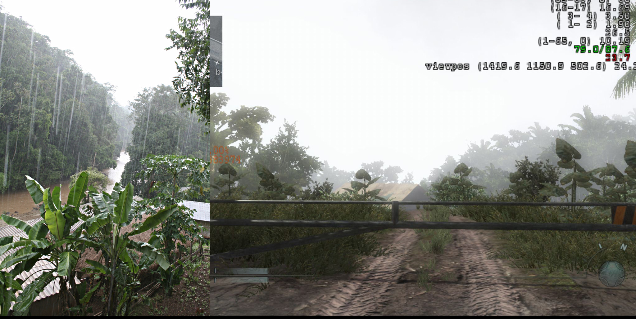
We went to great lengths to ensure the look of the level had been as close in values to a photograph as much as possible, as you can see in this shot-by-shot comparison. As production grew to a close, a lot of changes had to be made and with multiplayer one needs to make sure players can see well from any angle and corner, therefore some compromises had to be made.
In the end, the map was canceled. We don't remember if it was later used in DLC or not. It had potential. If it hasn't been given a chance, it deserves one. Play-wise, it was fun.
Mountain
Renamed "Summit", Mountain was a favorite. It shared a similar color palette with Jungle but with cooler blues thanks to the deep sky and snow. It's also nice to get whites that bounce nicely. Lighter value tones and hues in the material palette is a lighter's dream because of the amount of bounce and fill one can get. The interior reference were more for examples of what can be found in real life, especially the falloff of light fixtures. But in-game we took it with a grain of salt and went with a "less is more" approach.
We also make full use of the amber lights in this level. They do sometimes fight the serrated sheet metal walls but as long as players can see around corners and entrances from a distance while making sure the level doesn't feel flat. It's a win.
In retrospect, it would've been nice to push FX and have more smoke particles grazing concrete floors from the snow and interior entrances. It would've added more depth and atmosphere to the level. But time and performance were prioritized. If this ever gets revived, it would definitely be something to consider.
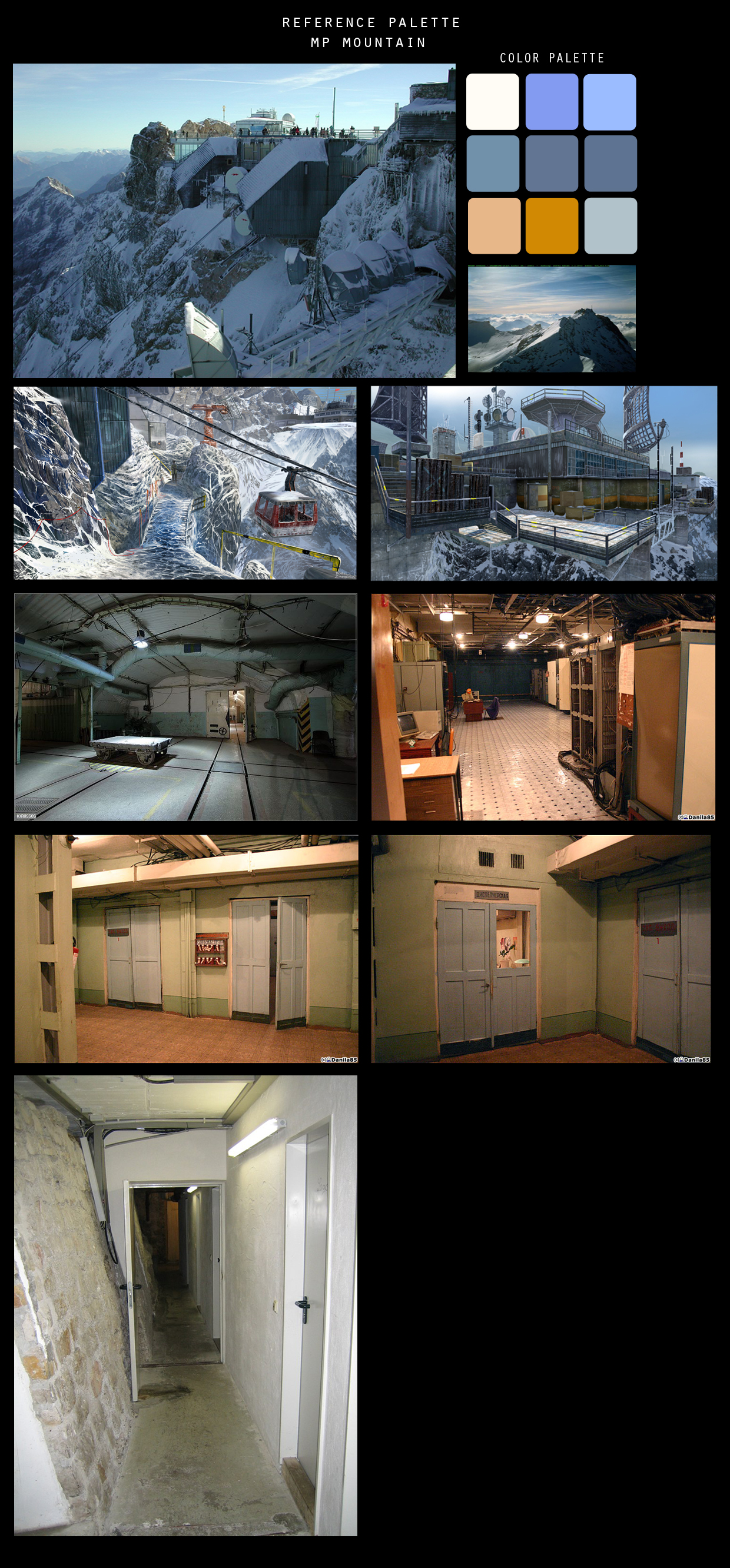
Blues, blues, blues, the ultimate hues. Thanks to the snow and sky, we could go for a more monochrome look and push daytime lighting which isn't done often due to high-contrast except in bright levels like this one. As mentioned before, this helped us use the Amber lights as a contrast, making angles and corners pop where available.
Nuketown
By far the funnest level to work on in our career. It was justified this ended up being one of the most popular maps of all time. The tst dummies and artificial set piece motif made lighting fun and easy. From the first pass it held up really well.
Since the map came together as a concept and late in production, there wasn't much time to consider art direction, we just had to run with the map and go. Since we liked the palette used for Mountain, aka Summit and the nuclear theme seemed cheeky, we thought it would be a great compliment.
In retrospect, we over-lit the interiors and should've toned it down. But to limit negative player feedback and avoid shadow camping, we errored on the side of too bright than dark. With so little time and so much to do before shipping the game, we thew some settings together and played around with it.
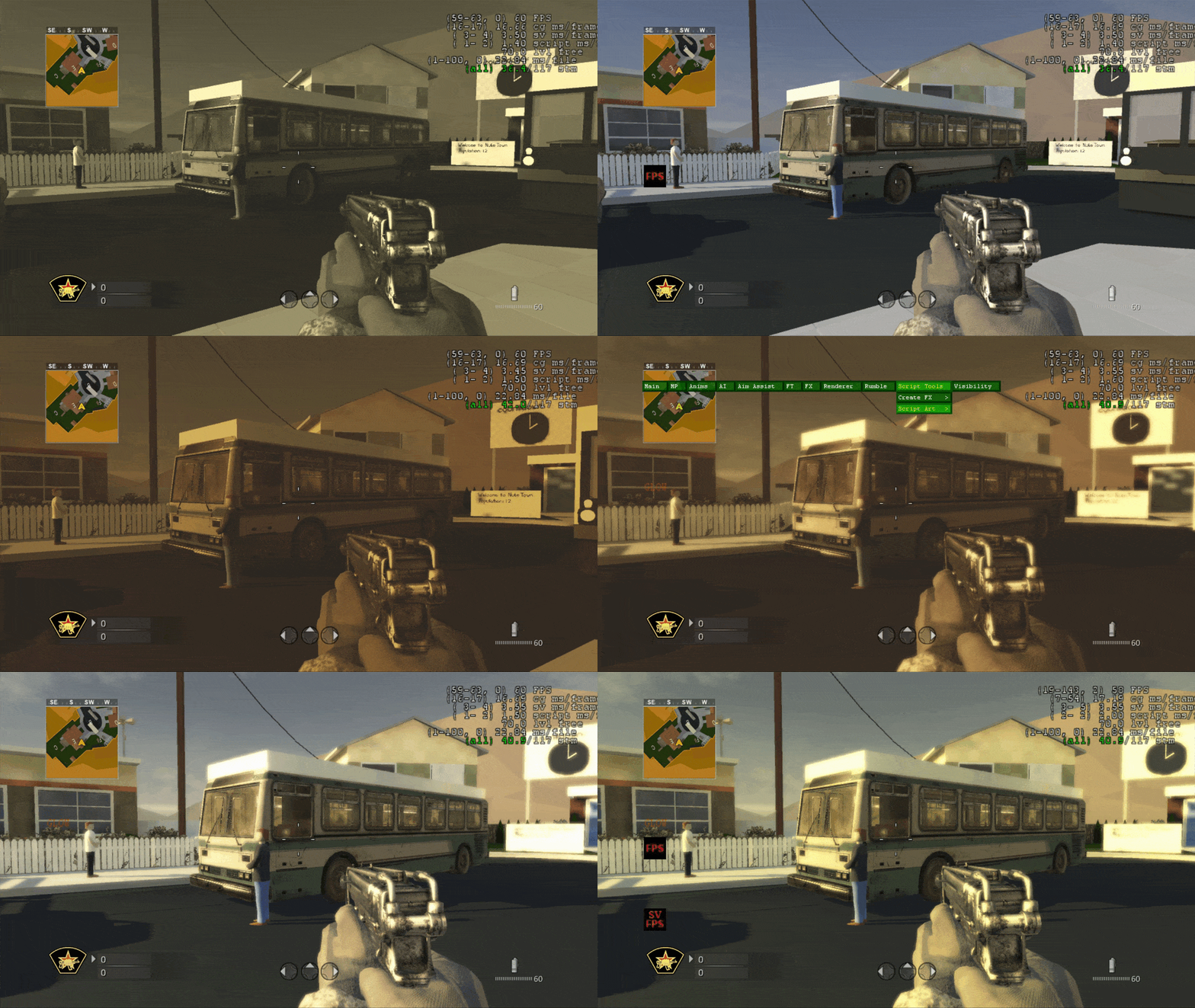
We experimented with a darker, muted, muddy version of this map. It didn't have the same impact and can't remember if it made it in game or not but may have inspired a zombie level.
Oddly it was hard to come to a consensus. This is probably why Nuketown went on to publish with various themes, values, and colors. It's not just a fan favorite but a darling even among devs.
Radiation
This was a very tough map to light due to the varying elements of the environment as well as high contrast material palette fighting muddy values against the daytime and sky. While it worked out and the funnest part was iterating on the red lights that scripted on and off with the factory trap door, it was a challenge to get the bounce and fill to work.
Another staple in this map were the fan lights. It was neat to have contrast, shadow casting lights behind animated blades that gave a larger-than-life feel to the level. We also threw in some rays bursting through vents as a bonus. We were lucky it didn't affect performance ...too much.
If we had a chance to go back and do this all over again, it would've been ideal to work more with the material artist in order to improve the harmony of color and texture contrast. While there was not much we could do about it, reflections might have helped a little. We learned our lesson and carried it forward in Bill's Town on The Last of Us and later Madagascar in Uncharted 4.
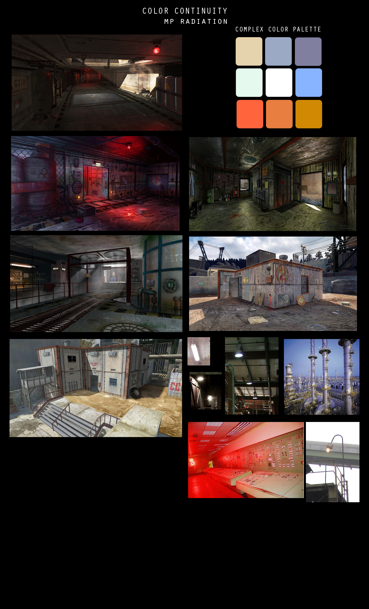
The following are color palettes for MP Radiation along with reference images. The dark hallway and strong red lighting attracted us among all the key art we received from the concept department. We made that key art our primary focus and built our palette around it. Since the trap door mechanic was a staple in this level, we wanted to build around it. A majority of reference images we found didn't help as much other than factory interiors.
Misc
Most of these are either bugs or lighting experiments to get familiar with the engine. We have no ideas what they are. The process of figuring things out is an art in of itself.

Some aspects of making games can be ugly. That's why we've included some of the work in progress shots for the levels as a reminder that it's okay to have a messy process. It's part of the job.
Retro
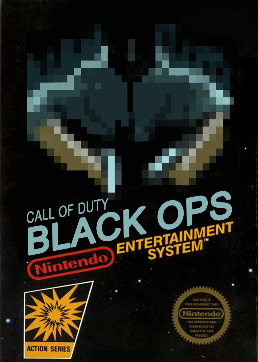
Can you imagine what it would've been like to play Black Ops for the NES? As an homage to the past, we made a mock cover of what it might've looked like. It was fun to make along with the authentic fonts and layouts from that era. Who knows how Black Ops in the 80's would've turned out?