Peleliu
The following are a series of details during our time at Treyarch on Call of Duty: World At War. It was probably the most fun yet grueling schedule we had in making a game. We loved and hated every minute of it. A lot was done and in the end, the team accomplished what could be considered a AAA miracle at a time when the fans and the press wrote negative comments in our attempts to make this project happen.
While the circumstances were understandable, at the time Infinity Ward wanted to continue keeping ownership of the franchise but the publisher at the time felt it would be better to share the work and release annually. This led to public backlash and while we had nothing to do with higher decisions, it was our job to make the best thing we could.
Against all odds, we did it. We made a game that was fun, had a lot of content, and it a blast to work on. We had nothing left to lose except our pride. And in the end we won it all. We look back on this moment with fondness and pride. But it's also a shame we can't go back and fix the issues we had with lighting. Many comments and notes are written in retrospect. Hope you enjoy :)
Little Resistance
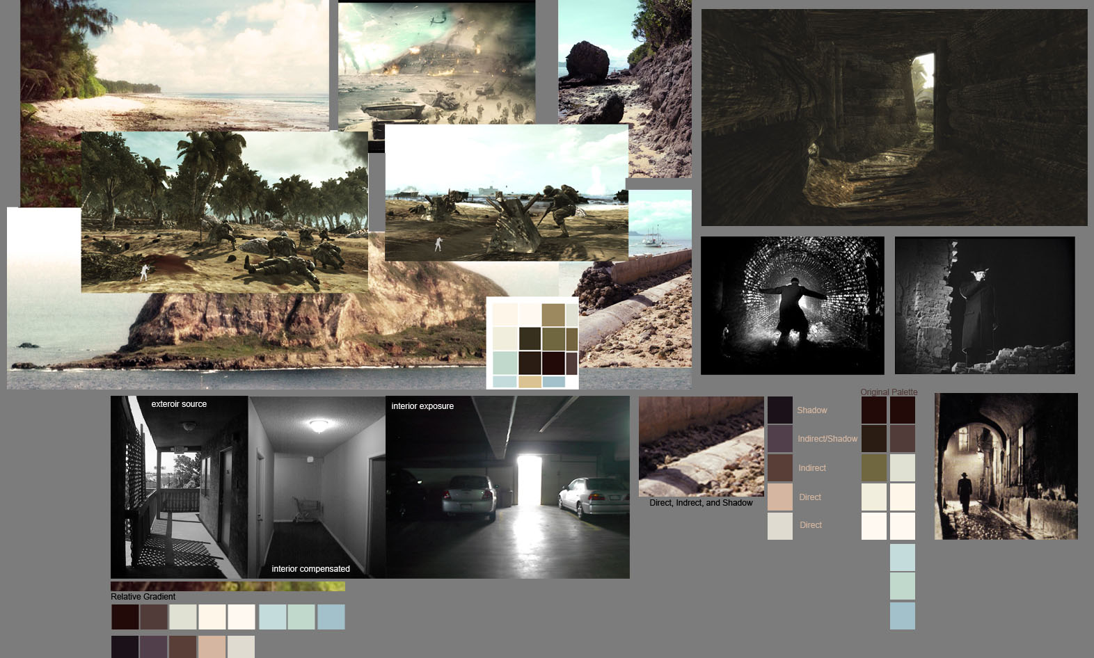
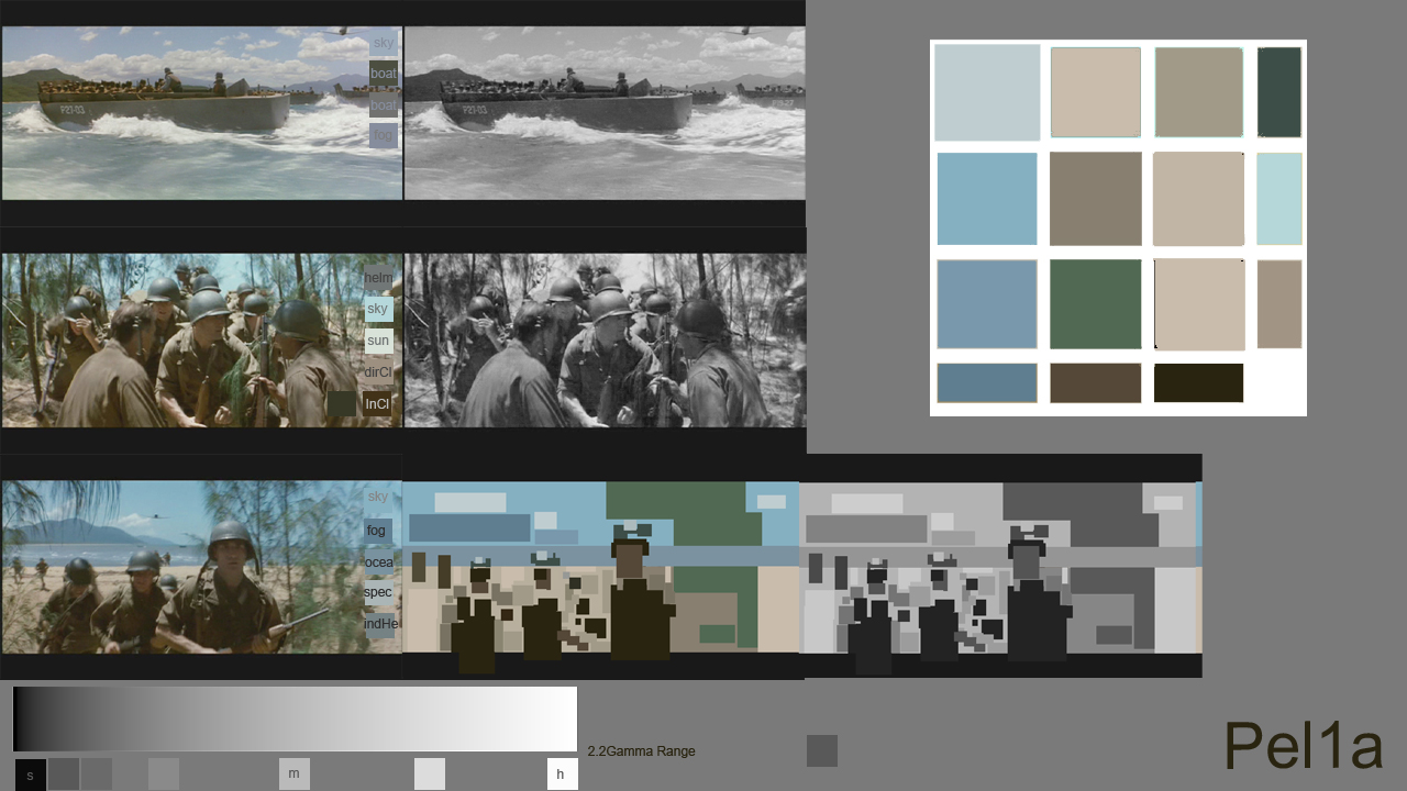
Peleliu can be broken into four missions: Little Resistance, Hard Landing, Burn 'em Out, and Relentless. We did our best to match colors and post processing from old world war two footage. By doing so we added some subtle haze, noise, and shifted hues toward the warm and sepia tone to match the 8mm film of the day. To contrast the warms we pushed muted blues and subtle cool greens in shadow. You'll see from one of the mood boards we put together how screenshots from in-game match the reference film almost verbatim. That was our starting point.
The following are some of the mood boards we put together for the level. We used these to guide us in the direction we wanted to go.
Burn 'Em Out
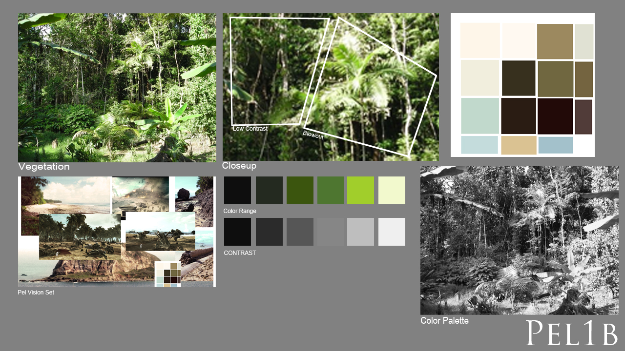
Burn 'Em Out, aka Pel 1a and Pel 1b, became a muted version of Pel (Peleliu) with a more overcast sky and less saturation. It shares similar palette and assets with Hard Landing. should default to less rather than more to make it work.
We also could've varied the color palette more and create areas of cool to break up the warms but given the time and constraints we had, it's all in retrospect. Fun level!
We also could've varied the color palette more and create areas of cool to break up the warms but given the time and constraints we had, it's all in retrospect. Fun level!
Relentless
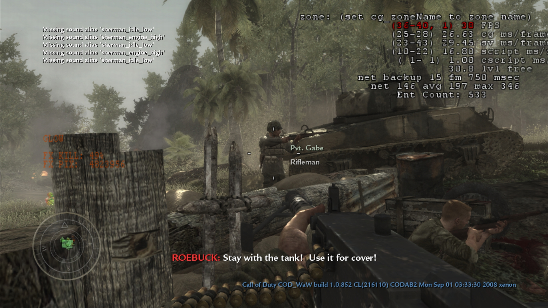
While at the time it seemed ok, (the tanks were fun) in retrospect the glows were pushed a bit too far. It wouldn't be until much later during Uncharted 4 we realized glows were something to be used sparingly and when necessary. Or if it must be done, to make sure all other values are balanced so it doesn't look too blown out. One
On the plus side, glows soften hard edges and give more of a rendered look. When done well, it makes games look and feel more pre-rendered. It's a double edged sword.
Okinawa
Originally, Okinawa was broken into 'day' and 'night'. Below are examples of both missions along with the work in progress leading to the final. Weather changes to script with the gameplay alongside lighting were are biggest challenges.
Blowtorch & Corkscrew
It was a dark and stormy evening. This was the first time we dealt with overcast clouds with minimal sunlight. Since there were already too many fires in the game and an excess of warms in other levels, this one kept a cool palette. Most of the directional lighting came from a very subtle sunlight, sky fills, and bounce from strategically placed lanterns.
To keep the mood feeling dark, cold, and stormy, we reduced the lighting range and worked mostly with fills where we could. The textures were a bit too high contrast and dark for certain areas, requiring double the work to make them smooth out. While the result worked well for the mood of the mission, in retrospect we could've been smarter about placing mud puddles in the right places and push for more reflective surfaces to really make the most of it and give it more depth.
Bonus: Breaking Point
Admittedly, Breaking Point was a blur. This may have been almost entirely handled by Rich Farrelly. But we do recall working on the castle portion, in the trenches as soldiers approach, as well as the areas around it to help with bounce lighting, shading, and ensure it's consistent with other levels. Since there's not much in terms of screenshots and work in progress for this level, we left it as a bonus.
Most of the same Worldspawn and runtime settings from Okinawa and Peleliu were used here. It might have also been converted into a multiplayer map later on but can't recall if it shipped with the game. Good times!
Multiplayer
The following are a series of details, techniques, approaches, and anecdotes from our time at Treyarch working on Call of Duty: World At War multiplayer campaign.
Airfield
It was a blessing to work on this level since it would later be used as the basis for the first zombie map, Nacht Der Untoten. While time was of the essence and one can say the color palette and direction for Peleliu paid off in terms of reuse, in retrospect it's perhaps a bit too muddy.
One of the issues tackled later on in retrospect was how yellows have a limited range so when they mix with blacks, shadows and midranges get muddy. If we had more time on this map, we would've gone for a warm bounce from the sky and stronger, directional cools for the interiors. Going further, we could've done a half-gradient sky of sepia on one side with subtle cools on the other so the front side could blend well with the warm sun while the shadow side would have cooler fills.
This would've made the color range more pleasing the eye and give us a chance to add more bounce and fills for player or enemy visibility wherever needed. . Maybe we could've added more fires, that would've been cool too, but the game had so many. Still, it was a fun map to work on
Asylum
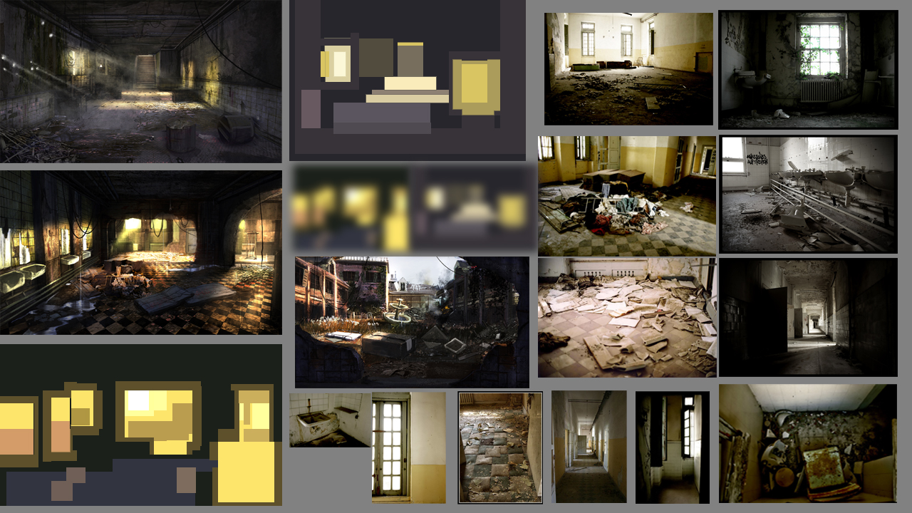
This was a favorite map both for multiplayer and later zombies. We were lucky enough to light for both. In this case we went for a yellow/azure color palette with a strong bounce from the sky. We were also fortunate this had a great sun angle to hit as many areas for the interiors as possible, which allowed us to capitalize on godrays. The swiss cheese environment details made this an enjoyable map to light and we didn't have to push fog more than needed.
The following are some of the mood boards we put together for the level during early development. We used these to guide us in the direction we wanted to go. In all labor, there is profit. It was too saturated for multiplayer but PERFECT for it's ancestor Verrukt.
Brandengate
Also known as Breach, we intended a cooler palette but due to constraints we had to go with a warmer one. It would've also been ideal to thicken the fog art-wise but it didn't go well with the long range attacks from the map's layout. It's a shame but also a good example how sometimes gameplay takes precedence over cinematography.
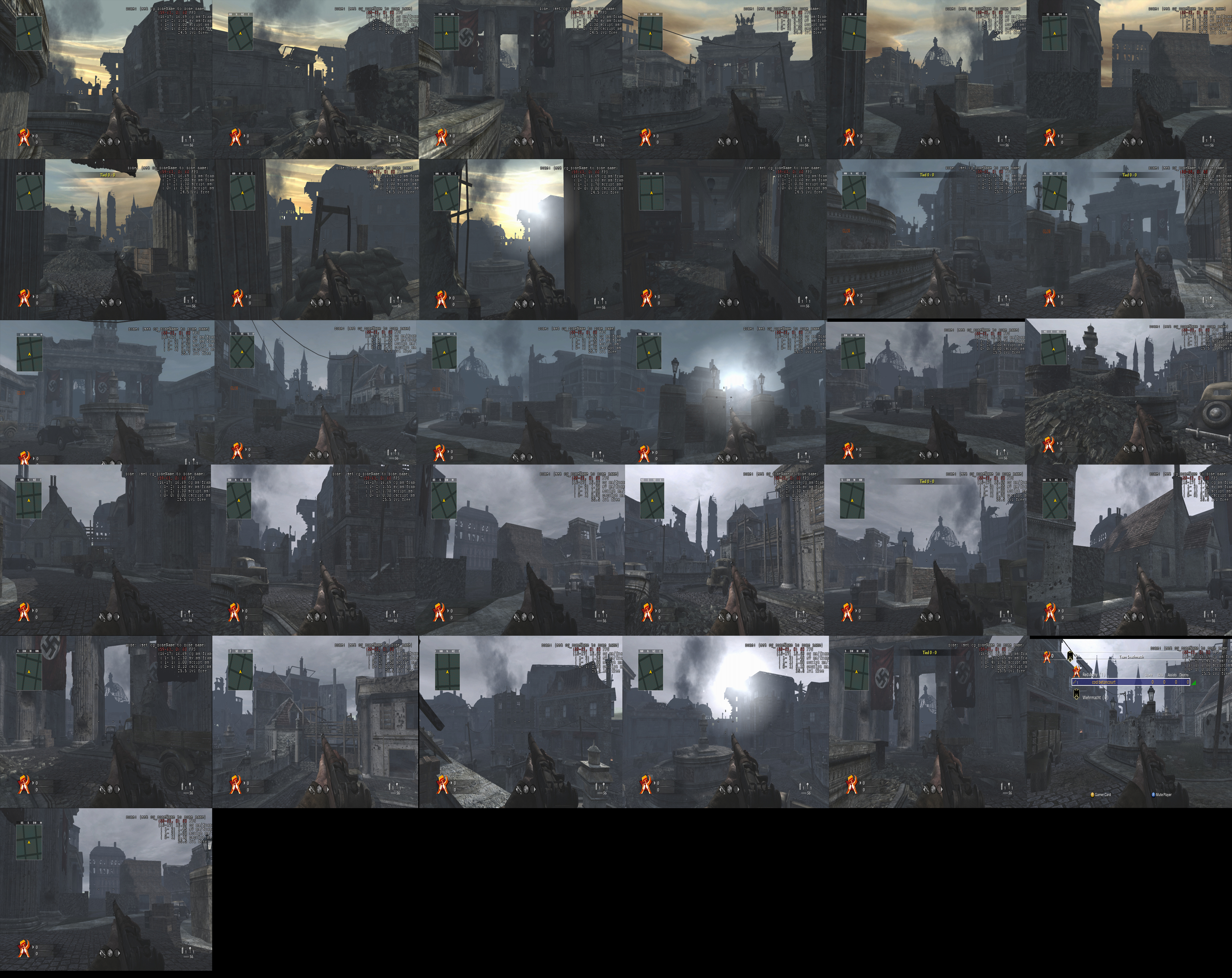
On a side note, we also collected various screenshots with various vision set settings to get an understanding of how our color palette would work out as a whole, as well as explore if we were going in the best direction. It gave us a good understanding if we were better off going with cools, warms, or a mix. Also, it helps to know if the contrast, shading, and overall look works well for the game.
As tempting as it is to get all fancy with color and contrast, we often have to dial it back and reign it in for the sake of gameplay, especially for multiplayer.
Banzai
This was a fun map to work on. It was a challenge to get the right balance of color.
Castle
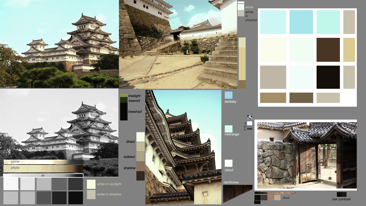
One of the funnest maps to work on, Castle was a straightforward, daylight sunny 16 map. The blue skies and warm sun complimented a balanced color palette thanks to the dark woods, white walls, and midtone cobble stones. Some of the brightness had to be toned down to give it the sense you're playing old WW2 footage, which meant some of the bright colors would be lost, but overall most of their relative hues and contrast held up against the tonemapping.
The following are some of the mood boards we put together for the level. We used these to guide us in the direction we wanted to go.
Factory
Also known as "Corrosion", this was a challenge due to the half-overcast sky with dark textured interiors and little chance to add bounce. We had to embellish using bounce from metal pipes to brighten dark walls and add depth. When it wouldn't work, then we would add fires.
While it's tempting to add human made sources, if at all possible it's ideal to build from natural sources and use bounce as much as possible. When it's not, then it's time to get creative. In our case, when it comes to fixtures and fires we take a minimalist approach. If not, you lose focus, direction, and instantaneous read which works well visually but also helps players orient themselves quickly on a map.
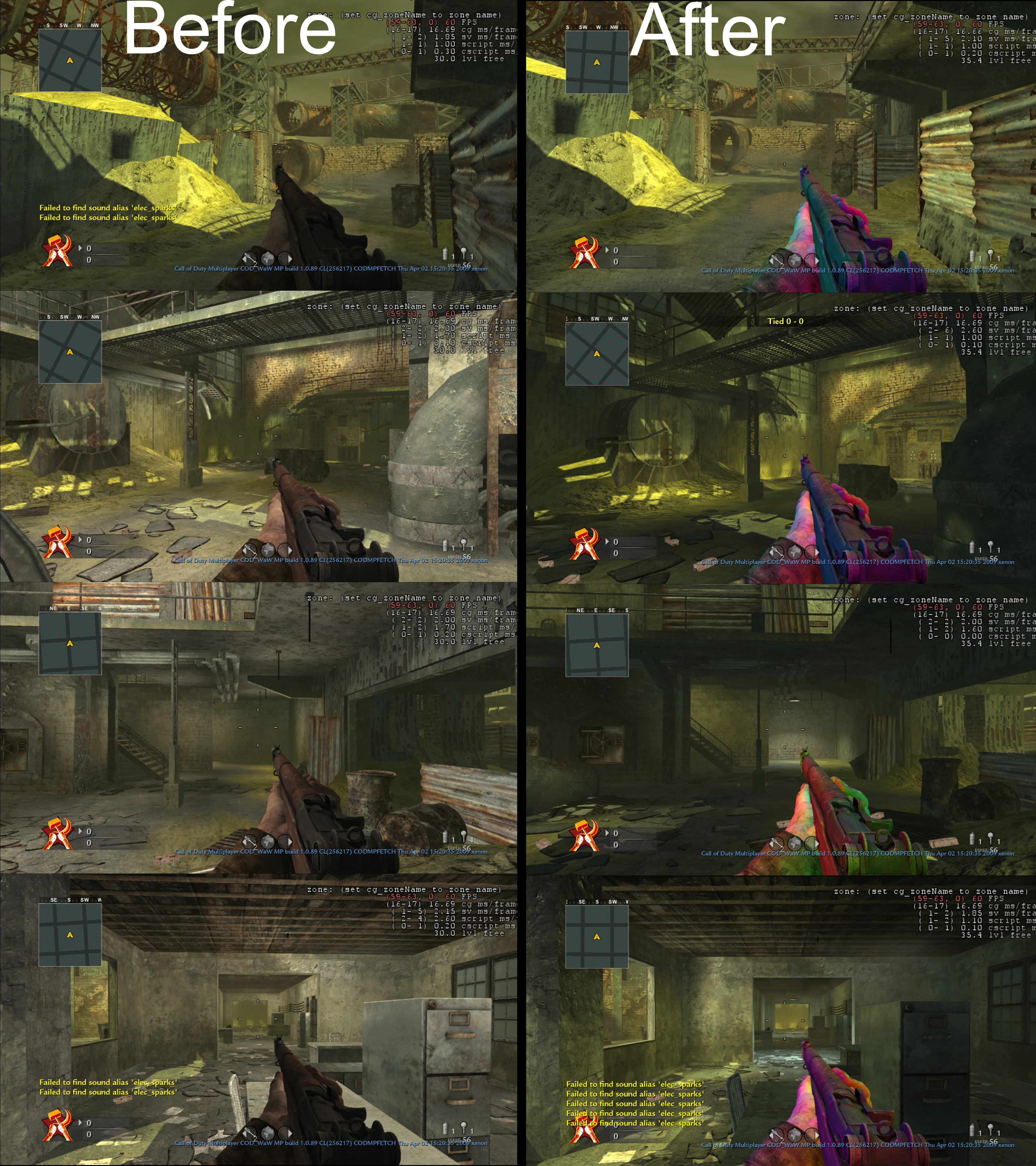
We also approached this in passes. After the initial first run with sun, fog, shadow, and bounce, we proceeded to add more where needed and sometimes even occlude areas in shadow wherever we could to produce more depth, a term later coined by Naughty Dog as "directionality".
When levels feel too flat they lose their sense of immersion, we do what we can to create a feeling of rhythm between light and dark in rapid succession to assist players with improved depth and direction as they seek out enemies.
Hangar
We probably went too far with rays in this one. It might have been the first map we worked on when we started at Treyarch and had a steep learning curve about lighting for multiplayer and first person type shooters.
One of the biggest challenges on this map and an early lesson was about when, where, and how to suit an environment for better lighting. Since the Hanger was a giant structure that wasn't open to the sky, most of its interiors were too dark to see. We experimented with removing panels from the roof and sides to figure out the best way to handle it.
Eventually we found a sweet spot but subsequently whenever someone would suggest to "break open the roof for better lighting" we would pause and look for the most natural ways to get creative with illumination without messing with the environment. Often it because a quick-fix solution at the expense of that structure and layout for the level being as natural as it could be. There are so many ways to light a level, it shouldn't be plan B to break things, it could be C, D, or E. But this was the map where we first learned that lesson.
Makin
We were lucky this was mostly outdoors and had a great moon angle along with settings taken from the single player mission thanks to Rich Farrelly. Because of this, most of the work was really in adding fires wherever needed, though we had to be careful since runtime shadows kill framerate in multiplayer. We were also able to add more bounce and tweak fog to have a nice dynamic low contrast background with high impact foreground for more depth.
There's a Makin Day map for Multiplayer but we don't remember working on it nor have any behind-the-scenes screenshots of it. The map may have been lit by Rich Ferrely if we didn't work on it, since it was originally based on the single player mission he made. We were lucky to have a great moon angle inspired by Semper Fi.
Nightfire
"We're sorry we have to do this to you," said Corky Lehmkuhl, creative director for World At War at the time. It was a night level and without knowing it they mentioned how those were the hardest to light, especially multiplayer. They were right. It took a long time to get it right. It was worth the effort because our baby was later reborn as Der Riese.
Luckily, because of the warning, we put together the most elaborate mood board we could to explore every possible form of night lighting from noir films and anything from the 1920s to 1940 including Citizen Kane, to see if we could draw a parallel and give the game as much of an authentic feel to that time frame in a modern engine.
It resulted in a great map and later all the labor paid off since it would be used to create the fourth zombie map, Der Riese.
On a side note, it was fun to work with Corky. When he didn't say anything, it meant you had work to do. But whenever he erupted with his infamous "Ohhh ... ohhh man .... ohhh ohhh my gooondesss, ohh hoohahaaa ohh!!! ", that's when you knew you were on the right track. That approval process was missed.
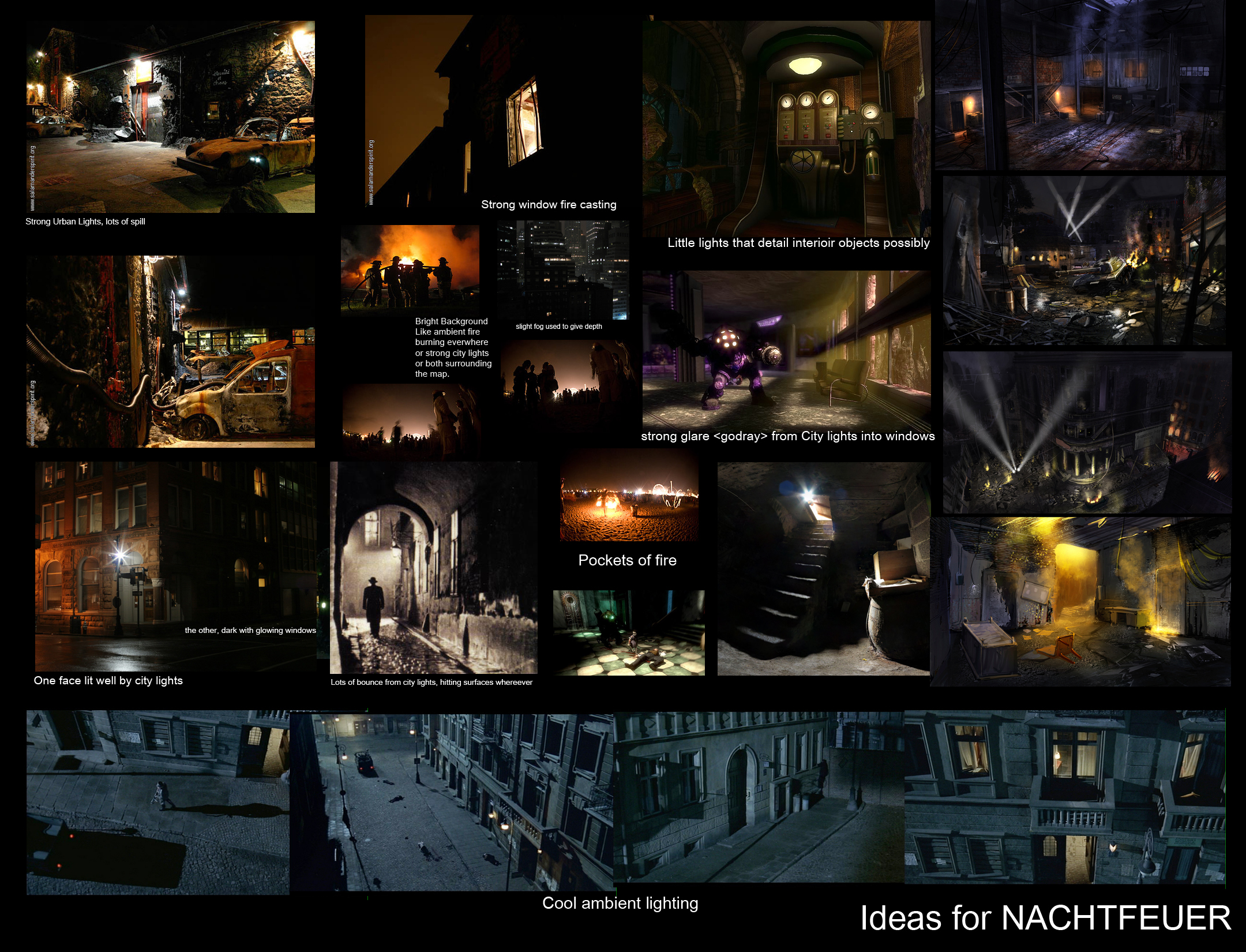
The following are some of the mood boards we put together for the level. We used these to guide us in the direction we wanted to go.
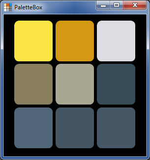
From the mood board, we used our app PaletteBox to put together the colors needed for level cohesion and believability.
Outskirts
Similar to Upheaval and Asylum, this one had that same kind of swiss cheese cover for everything from roof to walls. But with the half-overcast sky, it was a challenge to get a sense of direction with it while keeping the palette more distinct. The final result skewed toward warms and took a bit from Peleliu but in retrospect, we would've preferred this map in the cools as it was with the original captures.
With limited time, we did what we could. But in retrospect, it would've have been better to darken one half more and then use fires, lanterns, and more reflections to keep the level interesting. This is one that could've benefitted from the old wet floor, muddy ground trick.
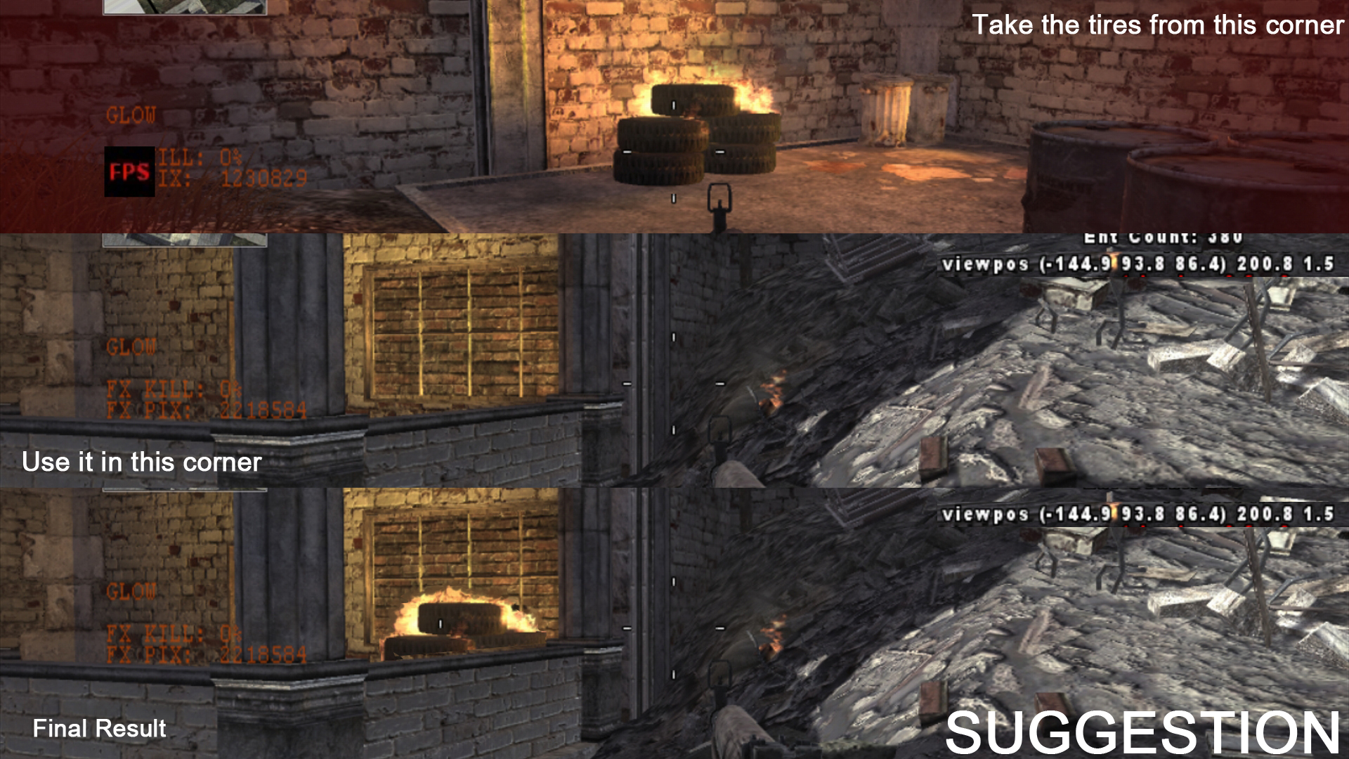
We used this technique later in zombies, but during the final polish phase of Outskirts, we went around the map to spot any areas that might be too dark or flat for players to take cover and take advantage. One area was in this front porch section. We added a light first, then sent notes to the level's environment artist to update assets accordingly. There's not always time to do this, but when it's important, the extra effort is worth it.
Suburban
Also known as Upheaval this one was meant to be a cooler hue compared to Outskirts. In retrospect they look a bit too similar in assets, texture, and their warm palettes and may have had something to do with last minute tweaks to the LUTs. We were lucky there was a but more color range in the sky and materials on this one compared to Outskirts. Our original captures show a closer representation of what was intended over the final look.
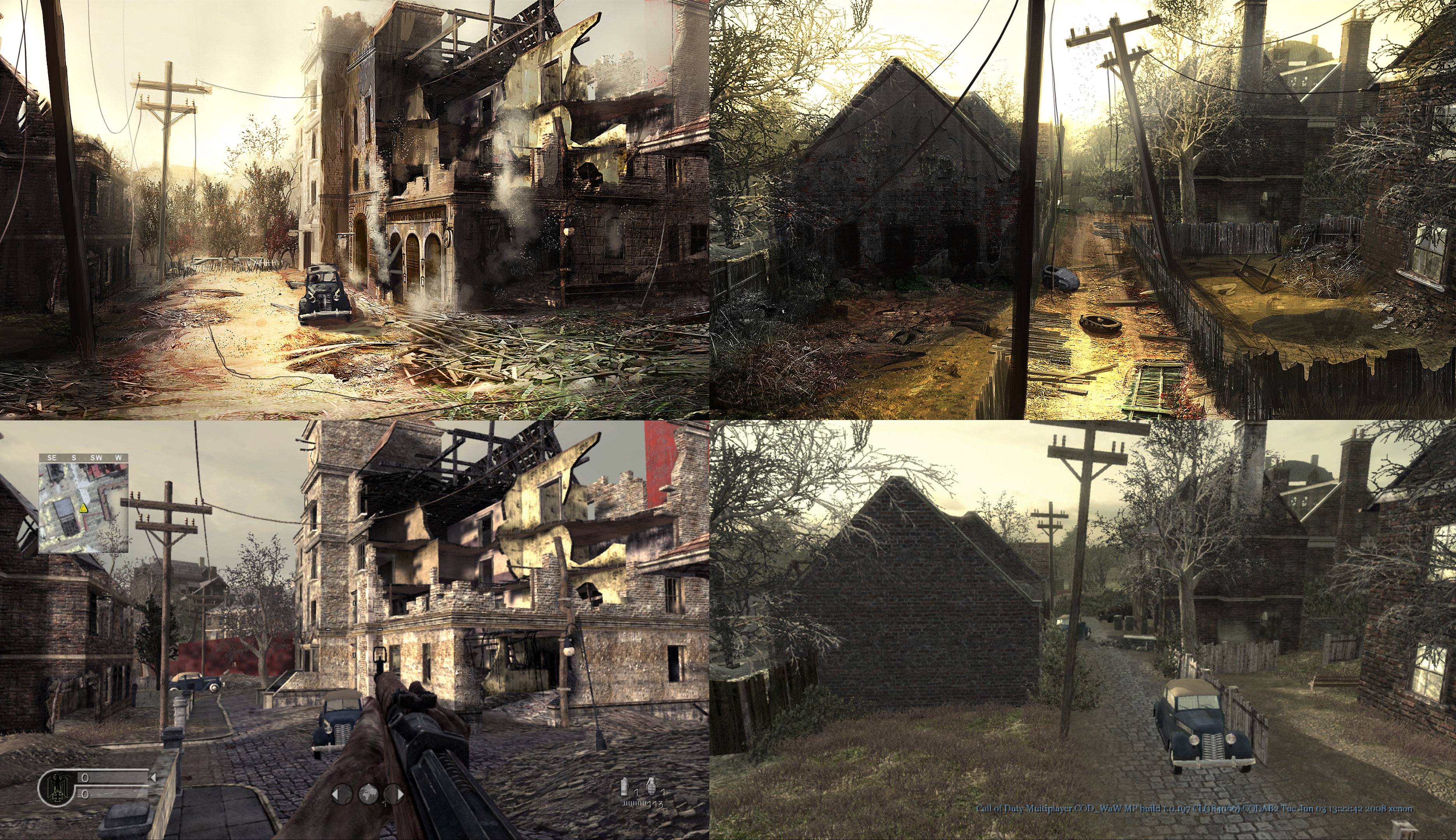
Concept artists will send us feedback in the form of paintovers from time to time in areas that can use more detail. Not all of it pertains to lighting but it's nice to see how levels shape up over time. We don't remember who made this, but it was not us.
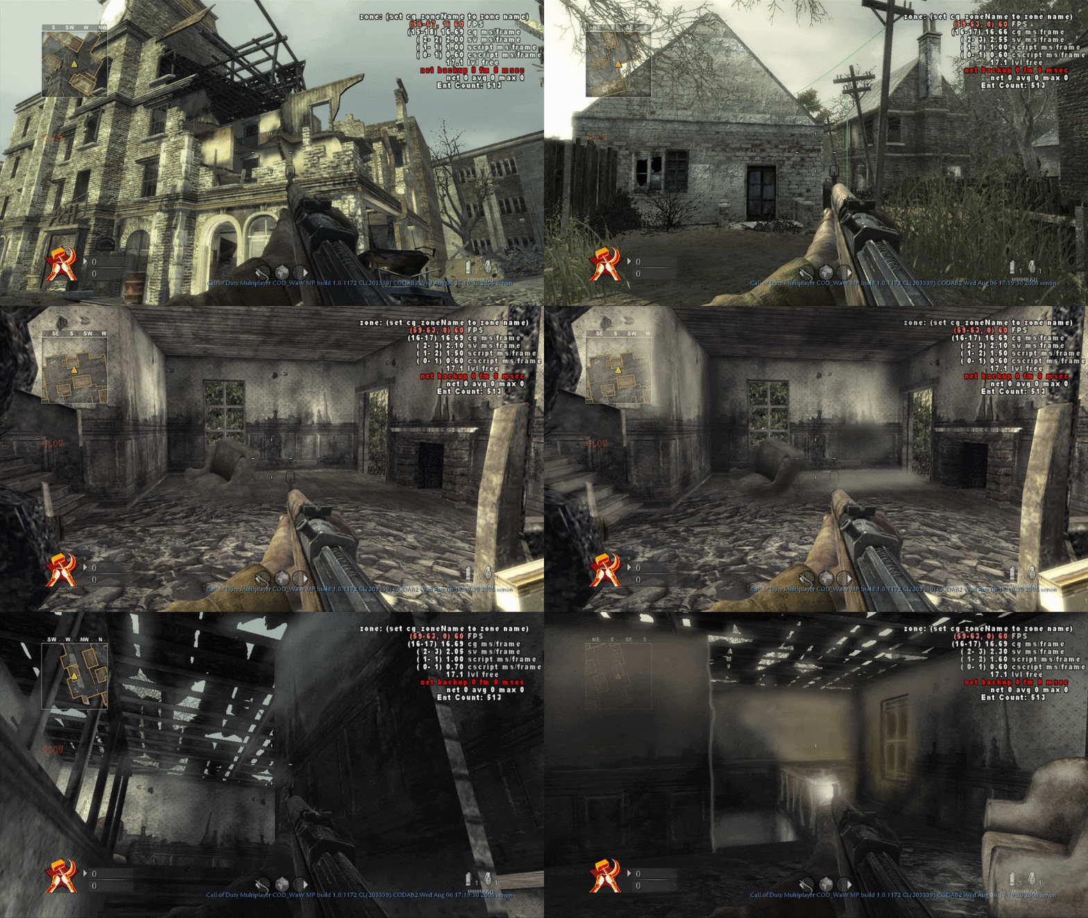
Here you can see a series of iterations. We took screenshots from the game, then made quick paintovers to help plan ways to make it better. There's not always time to do this for a whole map, such as with nightfire, let alone make is as pretty as what concept artists create, but often we use this technique for areas that feel too flat or when it's hard to determine why an area isn't working.
Bonus: Seelow
Our memory of Seelow was a bit fuzzy. Of all the maps we worked on, it's probably one we shared with another lighter on the team in order to make it work. Also, some of the interior assets as well as color palette were shared by other maps. For context we placed it here, but it might not be as credible as the others.
Honestly, Outskirts, Upheaval, and Seelow felt like one big blur, haha. Some of the work in progress shots from the others may had this level mixed in. It's hard to tell. Still, we do remember playing the map before it shipped and enjoying it :).
Misc
Additional screenshots from works in progress. These are completely random, part of the dev process and thought it would be fun to share. Some of these are examples of what it takes to take a level from concept to final.
We were lucky to get our name in. Big thanks to the Treyarch team. We miss those days.
Bonus: Vehicles/Weapon Turntables
These were part of promotional material for magazines. We took models from the game and rendered them in Maya using Mental Ray's global illumination. No modeling was done on any of these, lighting only.
There's no way to know or remember what these were or why, but it's fun to share some of the crazier excerpts from our dev process.