Tomb Raider: Underworld

It was our first true job in the industry. Tomb Raider Underworld was the moment we felt excited about work for the first time. On day one, we made some geo in Maya, exported it to the XBox360, and there she was, Lara Croft, running, jumping, and shooting, inside a level we made.

During our early school years someone bragged about the first game and what an adventure it was. But we couldn't afford a PC to play it, so we lamented and moved on. The first time we had a chance after the frenzy of graduation and the process of moving to California, it was at Crystal, holding the controller, playing our own level. It was a dream come true.

Ironically we were competing against another game that was unveiling that year made by some of the folks that used to work at our company. It was joked as "Dude Raider".

Uncharted, our greatest competition was released weeks before our launch date and went on to break sales records and rapture our audience. It was a humbling experience, we were caught with a huge gap to make up for. It was crazy timing.

Our journey of discovery in this started with Tomb Raider. For Details, see Our Process

Kraken

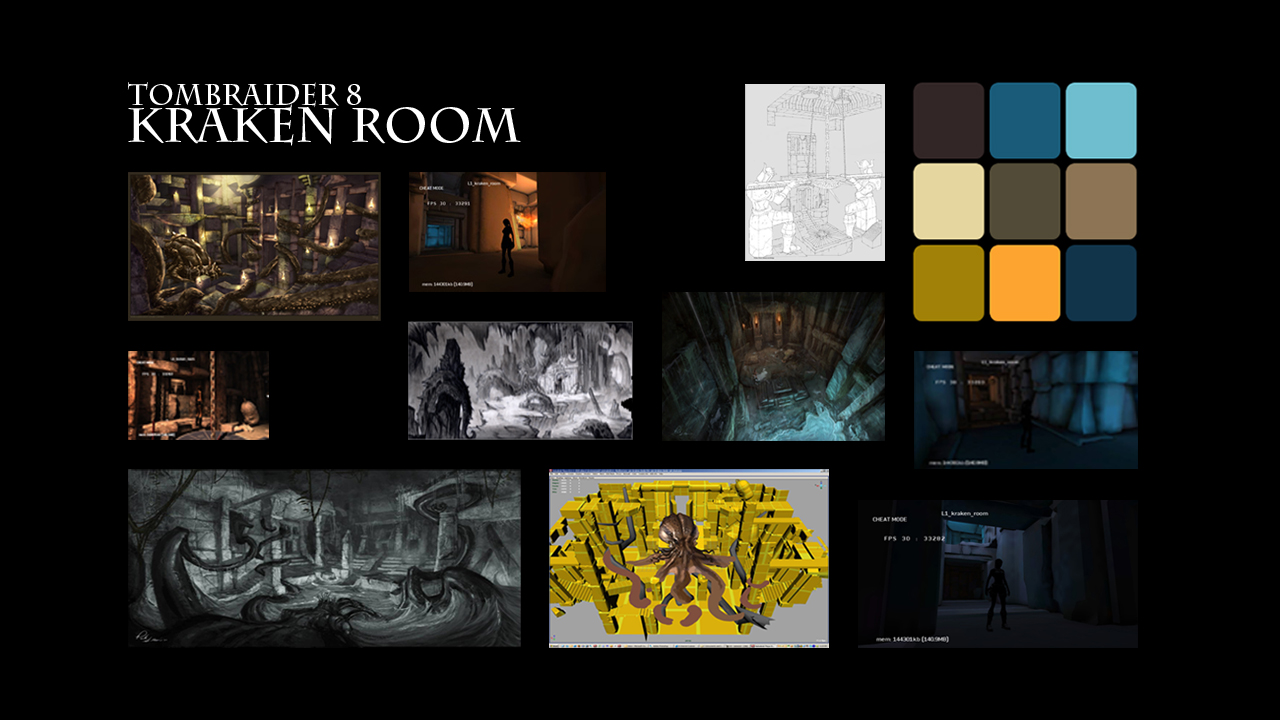
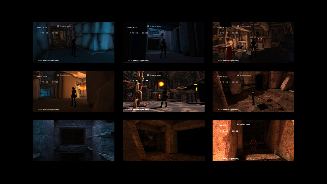
The Kraken was as much a mythical threat as it was a monster level. There were many interiors in the maze and we had a hard time understanding how to approach it. While detailing it was most our work, the key lighting was ... too symmetrical.

Pat Sirk, art director and probably one of the most gifted and well-rounded people I've ever met in games, taught how symmetry is a killer. When the Player first enters the courtyard where the beast is discovered, there are two entrances. It would make sense to light straight down on it and allow players to choose left or right. But Pat pointed out it was not engaging enough and while Players can choose, it's an ideal opportunity to suggest a path forward. If they go in the opposite direction, they subconsciously know they're in for a challenge. The Players wanting an easier path would go the other way. Once we realized that we started understanding the unique relationship lighting had with gameplay and how in many ways we use value, brightness, and colors to connect with Players and engage with them, communicating on a subconscious wavelength. Pat moved the key light toward one of two opposing paths, the rest fell into place. We polished it to death and learned our lesson.

That's when we started understanding the major difference between lighting for a shot versus a game. A gaming artist dealing with lights and materials has to be cognizant of gameplay and cinematography. It's a delicate balance.

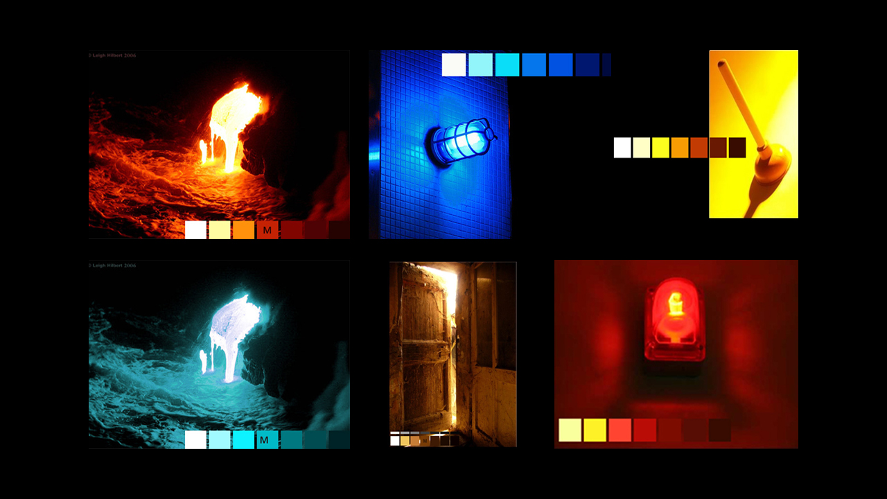
We took some time to study color and values for the look of the Kraken level.

Mansion

Lara's Mansion was on fire and so was our schedule. We had little time to get it done as the level was also being worked out and figured out at the same time. For the most part we worked from concept part but decided to split the level between warm and cools with the key light coming from the blaze's origins and fills from the azure sky.

Given how saturated a lot of the major light sources were, we counterbalanced with midrange to dark greys. It helps to give a sense of relief and balance once Players are able to get away from the danger. We added hints of green to the high-tech lights by her office and computer gear in order to give it both an artificial feeling as well as a bit of nausea to compliment the distress of the situation.

Mexico

Mexico was a first in terms of dealing with large outdoor areas and dense foliage. While it was meant to be overcast, it wasn't interesting enough visually to make an impact for the E3 demo. It was decided to break open a hole through the clouds and have a strong directional light coming from one side while the rest of it would remain dismal.

Here we learned how you can increase color saturation in overcast but when the direction of art doesn't fit the level requirement nor help sell the feel, at times a rule needs to be broken. Subsequently, we'd later find out breaking holes in things, roof, sky, or any canopy is often the defacto solution to flat lighting. But it's not ideal.

If we could go back and do this over, we wouldn't change it, because the sun ray worked well. But we could have gone with a directional overcast, high reflections, and a strong shadow as well as silhouetting to one side to compensate and give it more depth. We could've also messed with scripted sun intensity variation to fake a passing cloud to keep it interesting.

Ship Room

Most of our work on this level was actually in the materials. While it was popular to do all the work in a shader's color channel, we opted for a different method. In this case, we felt the best way to work with metal was to start with full reflectivity and work our way backward. We also discovered a great way to fake smeared metal was to take the reflection maps and lower their resolution. It gave it a nice smeared look without worrying about framerate.

The funnest part about this level was the day it was unveiled in the theatre room. There was a collective gasp. It was awesome. We never got that response in anything we ever did after. But we're always hoping someday to accomplish that again.

Sadly, it was cut from the game since it didn't fit with the original design document. Here we also learned a major fundamental difference between studio philosophies. On Uncharted, years later, under a similar situation, the team ignored plans and went with what felt right. It was a great lesson in decisions versus outcomes when comparing the two.

Thailand Temple

The Thailand temple was a prototype to gauge the look and feel of the level. It was kept simple by sticking with the Sunny 16 look, a term used in photography for outdoor lighting. It was difficult to get any sky bounce to work in these levels and it's unsure if the answer was found. If we could go back and do this all over, we would probably boost the sky levels and get some warm bounce off of the textures.

We could also try to use one of the screenshots, create a concept, and Demo how we would approach it now.

Underwater

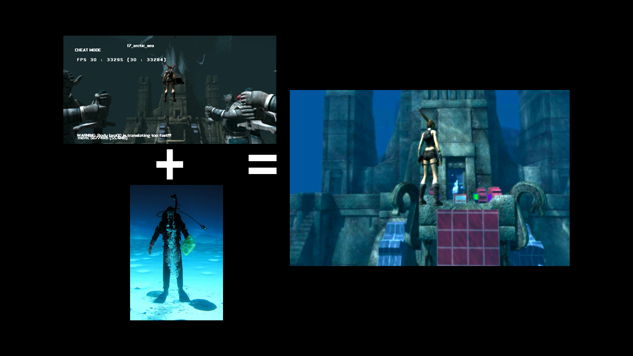
This was our first attempt at creating an underwater level. Many of the techniques and attributes used to make this work would go on to serve it's purpose in Uncharted 4. This was the basis and foundation to how we understand better ways to make an underwater look happen.

We start by creating heavy fog and then add a strong directional light. We then add rays from the sun if any, glows to simulate a bit of the haze that occurs when deep in the ocean, we tint the fog, glows, and rays to cool colors to match the water. Then we push depth of field as hard as we can.

We cheat using rain to create the sense of bubbles and plankton found in the ocean, at times even adjusting it's sprite texture and value, which helps a lot in creating a sense of depth and parallax moving through wet space. If there's wind, we use it at the slowest setting to simulate a sense of current on plants.

The hard part is getting all of the attributes to work together in concert. With so many of them, each with different colors, we try not to rely on one but a combination of them so that values modulate as the Player moves around the space and as the camera reveals details.

We ALMOST NEVER tint the screen. While it's tempting and at times necessary, it's a last resort. We prefer to use the environment to do the work for us. We don't want to lose the color and values that are natural to the scene and it's nice when you can get full saturation when looking at objects up close. We do, however, crank up saturation in post by a minor bit in order to get a bit more color range.

Valaskjalf

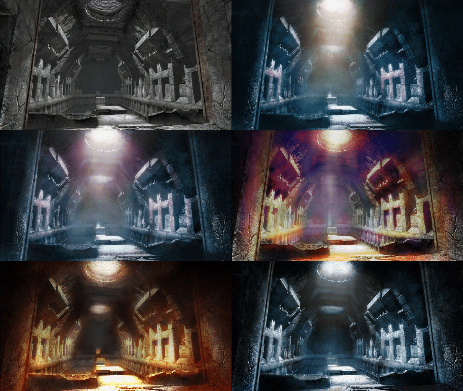
Also known as Valhalla, the hammer temple, was a fun nightmare. In the end it worked out well as a favorite in the early days. But it was a moving target and art direction hell for some time. Valaskjalf could have gone in so many different directions.

One of the biggest challenges was keeping within the constraint of believable reality. There were certain areas where Lara's flashlight wasn't going to work and we needed some ambiance. But without some kind of magic or supernatural element it seemed impossible.

We also have color palettes shifting across levels overall so whether this would end up a warm and dry cave or cool and wet kept changing. Whatever the case, it took some time to figure out the identity of the level until it worked.

We also embarked on testing a series of paintovers through the level to see what would work

Rose Temple

The first level we ever lit for a game was this one. We had always wanted to push the boundaries as hard as we could in terms of color and value to make a level look as convincing and photorealistic as possible. While not perfect, for a first try in games with an engine, it was encouraging.

Process

Overview

Before we begin a scene we look for reference. Along the way there's usually a conversation or meetings with the art director and game designer to both get a sense of the mood and feel as well as learning about what's in the mind of the level's creator to get a sense of what they want to stand out, what they're trying to accomplish, ways they'd like to lead the Player, and then formulate a plan that allows for a cinematic experience while also using brightness, hues, and post to make certain things more obvious than others and truly make a level stand out.

The best lighting is all about one thing. Once you choose what that is, then comes the key light. Everything else becomes secondary. It's very hard to do. It's easy to get lost in the weeds and try to make everything look good. But if you can choose one thing, then everything else becomes easier.

Too often, levels lose their focus. Even with open worlds, points of interest need to occur in order to guide players for a better experience and for everyone to focus their attention on what's most important. It's true in real life also. Humans build cities around landmarks and central hubs in order to create a sense of orientation and direction in a boundless world. It's the same with lighting.

Once we focus on our subject or key element, the next is our main color. This is the color that will be most prominent in the scene. It's the color that will be most obvious and stand out. Once this has been decided, all other decisions fall into place. It's not easy, since one can be torn between different styles, but ultimately sacrifices have to be made for the overall look and direction to work. It requires massive discipline but those committed to this mentality always have a strong and compelling result in the end, resulting in a great gaming experience.

Tools

If you'd like to see more, the Tools page shows more crucial parts of our development process. Created over the years, these have been instrumental in streamlining workflows, automating processes, and improving efficiency across various projects. It's a glimpse into the expertise and innovative solutions that have enhanced production pipelines we've been lucky enough to partake to deliver high-quality results.

  • Tools Gallery >