It's hard to explain just how amazing, incredible it was to work on Nazi Zombies. It lives on till this day as the flagship title born from Treyarch. Jesse Snyder cooked up a miracle in the kitchen of madness and deadlines. It was a dream to be part of. The following are a series of screenshots and anecdotes from our time working on it.
Theatre
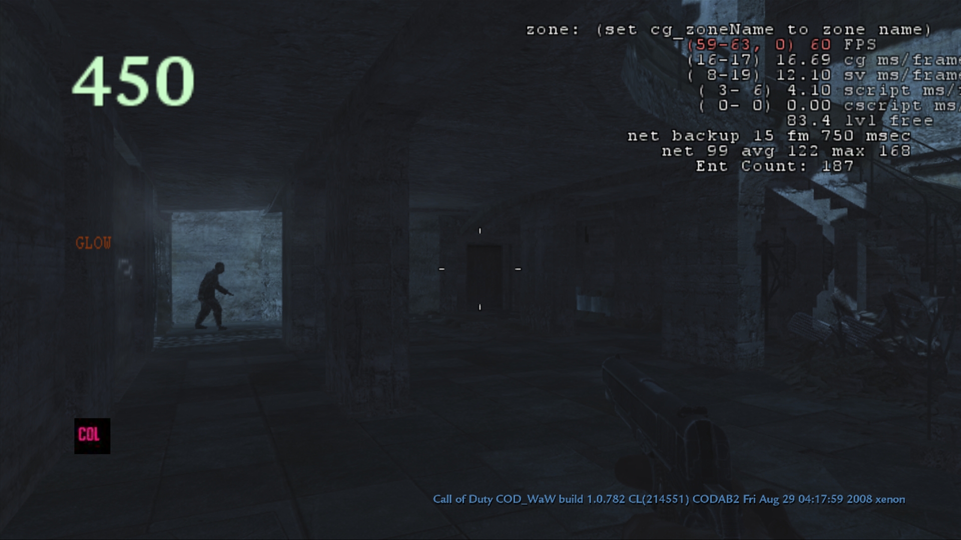
Part of the greatest challenge for Zombies was it being the first custom made map for the genre. Up to this point, no map had ever been made without it being based on an existing multiplayer level. It's part of why there was a struggle to figure out direction. It's the first time in our career at realizing we could use the power of lighting and post effects to guide design in the right direction. It was a risk that paid off.
One breakthrough making it possible was to map the values and colors between the 360 and wii so that they would have approximate parity. Through a tool we wrote for worldspawn, we invented a 32 to 16 bit color palette converter, taking gamma into account, and was able to succeed in approximating values well enough to match the two if they were to account for screen resolution. In other words, the Wii would end up looking like a blurred version of the 360.
Once we figured out the right settings to make this possible, we then proceeded to light, design, and push this all the way with the risk it would be cut. But it paid off. When the 360 team saw it was finished, they were willing to take it on and finish it on their end using our work as their direction.

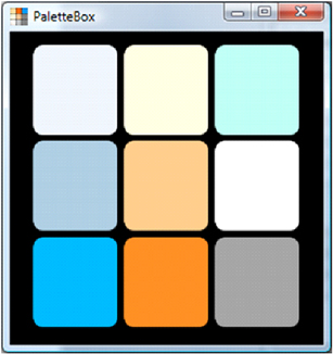
We put together a color palette using our self-made tool PaletteBox to gather the right colors and values for the game.
On a personal note, while it was more insane to pull off than it sounds, given how for a whole generate of players this was their first zombie map, it was worth it.
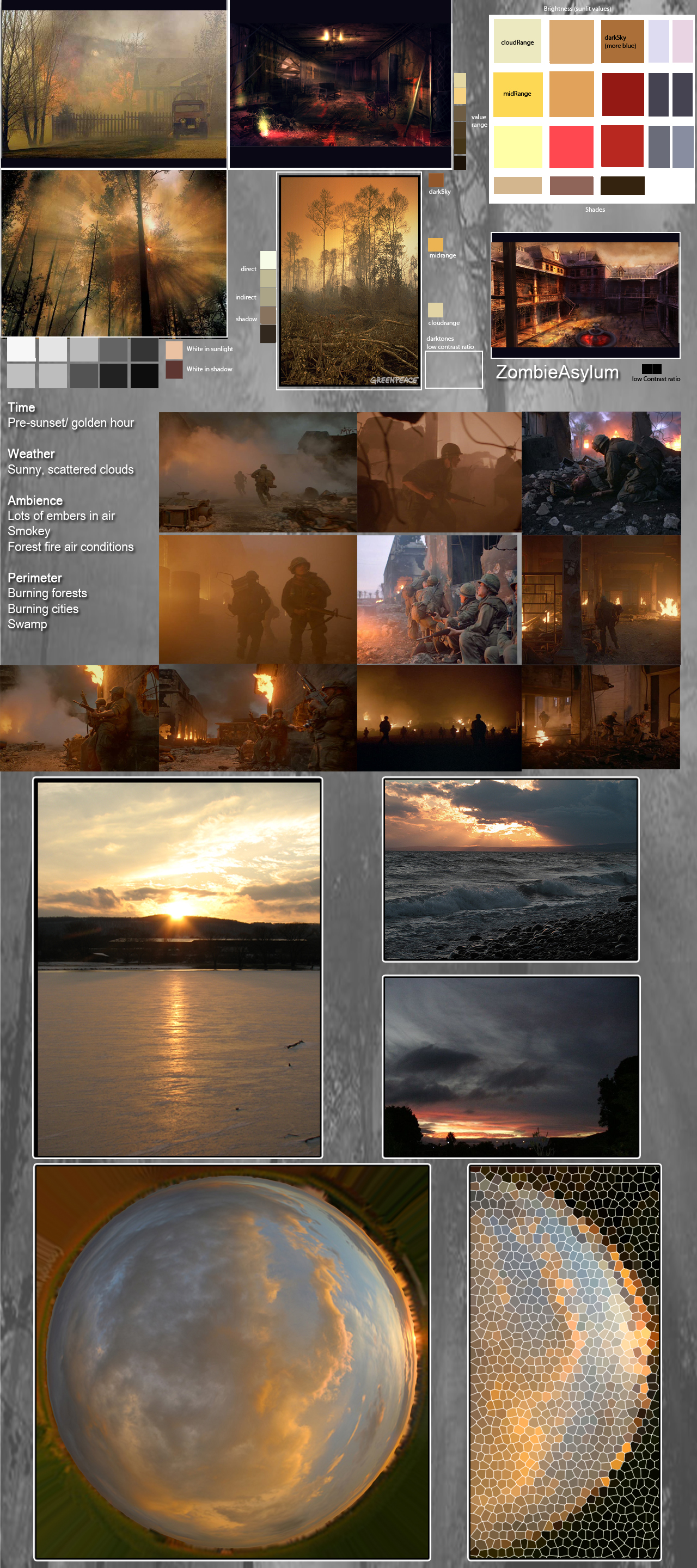
Here we've included concept art (pictured above) which we DID NOT make, if we could remember who made them, we would give them credit. We want to demo how concept art translates into the final product. Kudos to the Treyarch team for these amazing works!
Factory Z
Nightfire is back! Also known as Der Riese, German for The Giant, it was discovered, by this point, the best way to make a good zombie map was to port a multiplayer level due to all the angles and possibilities for cover. Who knew our world at war baby would end up becoming a Zombie classic?
The challenge was to balance the moonlight sky with bounce and strategically placed fires while making sure every corner was visible from a distance. More so, we wanted to make sure we could aim key lights from angles where creepy shadows of zombies about to burst through windows would be visible. Doing so without killing framerate was indeed tough.
There were also quite a few scriptable lights due to gameplay events. It's around this level we started getting more involved with design than ever since Asylum. The more spawned enemies there were, the less runtime lights we could have on. It was worth the trouble but a pain. A lot of fake rays were also added.
One lesson learned too late was how night maps should make good use of high reflections. Whenever possible it's great to have puddles of water where one can as well as shiny surfaces. If we could go back and do it over, we might also see if we can add broken shards of mirror and use them in the bedrooms as both a way to give scenes more depth and a good excuse for more motivated bounce. We would've also asked to break some fire hydrants and have water spill near fires. Though it might have tanked the framerate, we could compensate either by faking the reflection with a low-res image as well as being more aggressive with runtime light cutoff distances.
Lighting the teleporter was fun.
Asylum Z
Also known as Verrückt, German for crazy or insane, it was the first game where we had a chance to be a designer and not just lighting artist. It was based off Asylum, which we also lit. Designed by Chris Pierro, the pivotal moment came when originally the level's objective was to turn on the flickering light at the end of a doughnut shaped level taken from multiplayer. Players would be separated by a steel door, the switch would turn on, and then zombies would come flooding.
It was a crazy idea but it worked. The dev team really pushed gameplay around this dual framework and it paid off in a big way. We were lucky to have designers who were seasoned veterans and knew how to make it work but it was a first taste in being more involved with game dev and lighting-based gameplay.
The dual map, power on/power off, minimalist to maximalist lighting mechanic that became a staple in the zombie series was born here.

But from a lighting perspective, we thought it could be more. First, while Asylum was more of an early afternoon with muted cools and warms, strong shadows, and light bounce to give only a semi-creep feeling with rays of hope in key areas, this would be considered our homage to a horror film classic, with dark contrast, blood reds, and rust shadows. But there's more, what if it were TWO games in one? What if the start of the game was Night of the Living Dead, minimalist, high contrast, blood colors and Earth tones, forcing players to remain close to windows, and minimizing the weapons or perks they can use in a survivalist horror mode. Then, once the power came on, it was Evil Dead, massive runtime lights, saturated colors, and a chance to use all the weapons and perks they could afford. The flood of zombie attacks were matched by the massive bonus given to players once the power came on.
Prototype
Based on World At War's MP Airfield, Nacth der Utoten, night of the undead in German, was a lucky break to work on and take to polish. Designed by Jessie Snyder, the first iteration was actually done by Brian Anderson but then we were given the chance to light it and make it our own. In hindsight we should've used Brian's rig as a base. While it was a bit rushed and on the overtly-illuminated side, it had cool shadowing in corners from zombies, we got rid of most of them in favor of a minimalist horror approach, something more cinematic. This led to a conflict where the priority of gameplay versus cinematography were at odds and we were trying to push the envelope in both directions.
In hindsight, using Brian's rig as a foundation was the right call and sadly we had to get rid of all our first pass lights and start over, blending both our approaches to get the final result. It was just a matter of polishing and moving on but we wanted it to be epic. We got carried away. The map itself was so cool and fun, it was tempting to go crazy with it. We did get in trouble for this, learned our lesson the hard way, and it was from this we improved on balancing gameplay with cinematography alongside being more cooperative when our rig was at odds with the overall.
Anecdote

Pictured above was when the "prototype" was about two or three days old. We got to witness Zombies born the day after it was made, known as "prototype". We asked Jesse the night we first saw it how it came about. He said he was solicited to make a bunker defense bonus game where soldiers would defend against waves of enemies and they they would have to survive as long as possible. This was a response to what Infinity Ward had included in Modern Warfare 2 with the bonus airplane mission.
According to Jesse, he was putting together a test map and set everything up correctly, or so he thought. Since animations exist in a file with index numbers, he intended to use the value for solider running but was off by one number. That animation was "wounded solider". When he ran the map, he freaked. To see a rush of wounded soldiers at top speed spawning toward to player looked like a zombie attack. For some reason, Jesse decided to joke with it and add glowing red eyes, turn the map into night, and make a fun spoof out of it.
Then the team saw it. At first it started off as a fun gag. People kept adding to it. Then they kept adding, and adding, and adding. Max Porter at the time had been messing around with a sci-fi gun he liked working on to combat boredom from all the weapons we was working on and somehow Jesse decided to use it in the game. It became a perk. Then one of the FX team members added visuals for the sci-fi gun, another started to improve the reload animations, and before everyone knew it, a fraction of the studio was as much infected by the virus of creative passion and what started as a joke turned into a full blown game.
It was the most incredible experience of our career to witness. It was also a lesson in how to make a great game. Oddly enough, Treyarch had an idea for a zombie game called "Dead Rush" that was highly anticipated but never made it to production. In some ways, maybe this the 'ole spirit of Treyarch beckoning us to make this. It remains a hallmark of the studio since.
Nostalgia & Magic

While the success of Nazi Zombies was unexpected, perhaps it shouldn't be. Not only was there a talented team behind it but you could almost say it might have been destined. Grey Matter, the folks behind Return to Castle Wolfenstein had integrated into the Treyarch family in the early days. Pictured above, you can see some aspects of their previous project before joining on Call of Duty. You may notice a familiar resemblance with Nazi Zombies.
But Treyarch had always had a zombie game in it's heart. As they say, things happen for a reason. It's possible the studio may not have seen the success it did if it weren't for the opportunity to do so with Call of Duty; fortunes come with time and chance. Dead Rush (pictured above) nicknamed "Grand Theft Undead" or "Grand Theft Evil" was canceled in 2004 with disappointment from fans as well as developers from that era.
Each moment a Zombie map was worked on, it infected the studio. In some cases it even took too many resources away from the main project and required a lot of "motivation" to keep everyone focused because the temptation to drop everything for zombies was always too great. In a way, Treyarch always had that kind of game in it's DNA. It's with tears of disappointment but also gratitude as a fan and dev to see how a major setbacks can be reborn as major successes in the right timing.
Whenever Treyarch makes a zombie game, it's really a tribute to the spirit of Dead Rush, and in a way, perhaps maybe that's why there's a bit of magic behind it you might not find anywhere else. We were so lucky to be a part of it. Cheers to Treyarch, Grey Matter, Wolfenstein, and Dead Rush.
Update
As fate would have it, Warzone Zombie Royale was released in 2020. It's probably the closest spiritual successor to Dead Rush we've seen in a long time. It's a fun game mode and we're glad to see it happen. The franchise has come a long way since its humble beginnings.
Zombietron
Also known as Dead Ops Arcade, we forgot to mention this. At the last minute of the last hour of the last second, this zombie mode toward the end of Black Ops production came online. We actually wrote a special script both for the lighting to work with this top-down shooter as well as the different looks, colors, and sun directions per rounds. This was a fun one to work on and honestly didn't think it would make it into the game.
In order to break up the monotony of rounds, we decided to try a time of day cycle divided by 4, or 5 but we had to make an exception for special level condidtions such as the ending and mystery room, each with a different color palette. The first round was morning, the second was noon, the third was evening, and the fourth was night. Choosing a good sun shadow where there was limited geo to cast from was a challenge but we made it work.
The color palette was taken from Black Ops to keep it in unity with the whole game. An exception was made for the Room of Fate, where no lighting ocurred except from local sources to keep it more creepy and mysterious.