One of the hardest things about this portfolio was to fetch and find the original screenshots from what we did on PlayStation 3. While the release of Remastered and later "Part 1" on Playstation 4 and Playstation 5 subsequently built on the foundation we laid, it didn't seem right to present what we didn't work on. By the time those projects started, we took a sabbatical. No doubt the artists who worked on Remastered had done a great job and in their collections you'll find higher, crisper, sharper, and more richly detailed resolution images than the ones presented on this page. It was tempting to steal and take credit. But we wanted to be raw and honest about what we did and present the work in its original form. All of these images were captured from the Playstation 3.
BILL'S TOWN
Modeled by Johnny Chen and textured by Adam Marquis (in loving memory), Bill's Town was originally lit by Vivian Ding. We joined the team half-way through production and Vivian gave it up to focus on supervisory responsibilities. Most of what had been laid down in terms of color palettes and values were preserved but a majority of the labor came from the absurd amount of last minute polish given the ever-constant changes to gameplay up to the final hour of shipping.
Forest
Our proudest piece would be Bill's Forest. At the time, Game Director Bruce Straley would often be too attention limited to focus on individual guidance. After a week's worth of my squeezing the forest's color palette as well as mood and tone to the utmost, he walked by, stopped, tweaked some settings, and all of sudden, these gorgeous rays shot through the trees. He dropped the controller without saying a word and walked off. Most of that setting remained in the game since. Later someone said he never does that unless he approved. It was a funny moment.
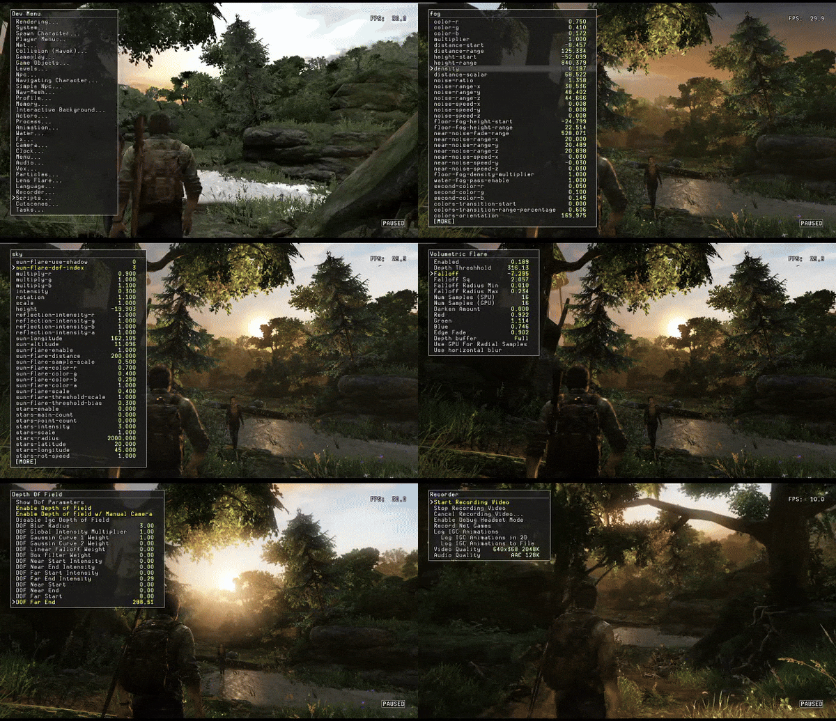
The hardest part was getting shadow shapes from the trees to work at runtime while keeping the look of the forest intact and framerate down. While beyond tough, it worked out. Part of the effort involved iterating with Johnny Chen on turning off shadow casting for trees. To save graphical overhead, we instead created fake runtime shadow cards with leaf textures and then strategically placed them to align with trunk positions to make it appear as if they're coming from the same source. It was a pain, but the advantage was more artistic control while saving framerate. In some parts it tanked almost below 25fps, yet barely noticeable. Most folks blame their consoles and for the sake of art, we're ok with that. There's no combat in this area, so we agreed as a team the risk was worth reward. QA had no issues with it. :)
You'll notice some shots in the forest have harsh contrast; dark, strong, shadows among immense foliage while others appear a with softer look. This was to show differences in post effects combined with lightmapping. Since some of these were taken before the game was final, it was interesting to share variety and broaden range of what the forest could have been if not for the bounce lighting and extra tweaks to get it right.
Main Street
Also a daunting task was keeping dynamic ranges of hue and values with lightmaps and post processing. The Playstation 3 was limited in its ability to produce the kind of subtlety this project required and in many cases we struggled to employ contrast and depth while wrestling severe brightness and color issues. Given the visual direction by John Sweeney and Bruce Straley to push the palette as believable as possible, there was little choice but to exceed limits and experiment with a variety of tricks to hit our target.
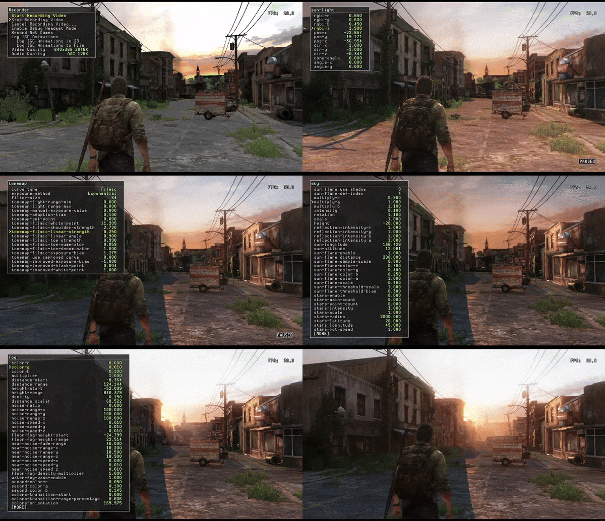
Whereas most of our work tends to be an explosion of color and value, The Last of Us was all about mastering subtle range to get it right, even if it meant forcing the hardware beyond its specs. In some cases, to invent more range than what existed, we had to cheat using fog values overlapping darks or sometimes add subtle glows to dither sharp pixels, giving the illusion of a pre-rendered frame. As a bonus, by cheating with post effects, the look of the game came out much more rich and dynamic than otherwise. In a sense, the PlayStations 3's limitations were used to our advantage.
Side note: Hue Pass
One major breakthrough technique Bruce proposed that we still don't often see today is the Hue pass. This is where design mesh are assigned solid colors to reflect semi-final material values in-game and adhere to strict rules as one would in graphic design. This way, color schemes would both dictate art and be exploited for gameplay at the same time. Combined with lighting in early stages of development, it becomes a powerful tool and makes the game feel further along while weaving several departments and disciplines together at the same time. It makes the game look cohesive and unites team direction.
A specific advantage of the Hue pass is how it aligns material artists with lighters on textures that would best reflect the environment as well as gameplay. Oftentimes, pixel maps fight lighting and vice versa. Too much contrast can make an environment appear broken given the way games render lightmaps. The hue pass ensures a consistent look and feel across the board, making it easier to spot issues and helps designers come up with a language to divert player attention to (or away from) important areas. You can manipulate player choice without compromising a natural look with a consistent palette.
Unfortunately it was abandoned and today not often practiced in the industry. Most artists and designers want autonomy over their work whereas the hue pass is often seen as a limitation. But limits are our friend. Also, it takes time and most folks are under tight deadlines. If not planned, it can derail a schedule and cause inconvenience. Yet the time it saves toward polish is astronomical. Most folks don't see the tradeoff, yet its results are hard to dispute once implemented to get the game right.
Making a hue pass work boils down to an agreement between designers, art directors, material artists, environment artists, and lighters. It involves several people and a heavy handed understanding of shape design as well as color theory, which most developers are reluctant to adopt. But it's a great way to get a game to look and feel right from the get go. Highly recommended, it truly played a vital role in the look of our game.
Garage
It was a surprise to find out later during our transition toward the Playstation 4 that we had pushed the limits of PS3's hardware so much, the extra polygons we were hoping to get were miniscule. We moved forward making next-gen games after this by using level loading tricks as well as better post processing and material rendering techniques to get by. It made us appreciate just how much we scraped Playstation's specs to make this happen.
Bar
Cutscenes for Bill's Bar laid the groundwork toward lighting direction. Hues and palettes for this area were established by Cinematic Lighting Lead Leandro Amaral and Level Lighting Lead Vivian Ding. Both made this area seamless in transition from cutscene to gameplay for the initial demo unveiled for E3.
We inherited this afterward. Their work played a vital role in the early phases of production to establish the look and feel for the rest of the game. We were lucky to pick up where they left off to focus on unfinished areas, take all, study why it worked, then implement their rhythm toward the remainder of Bill's Town. It was a great learning experience.
As production grew closer to the end, we had to make some tough choices in the transition from the bar to the upstairs hallway. It needed to look like it was part of the building and blend with transitional areas to load and unload at runtime when players entered and exited the area. While a major endeavor, it worked out. During Beta we went back to polish bounce and post processing, building on what Leandro and Vivian started.
Church
With Bill's Church, the first level we worked on since joining Naughty Dog in 2012, the biggest feat was getting runtime lighting in the sanctuary to project stain glass refractions across the wall. We had to do a lot of gobo and camera angle work to pull it off. It was tough but worked out really well. Sadly this was only available on the PS3, for technical reasons, it was left out in subsequent editions.
Playstation 3 (Original)
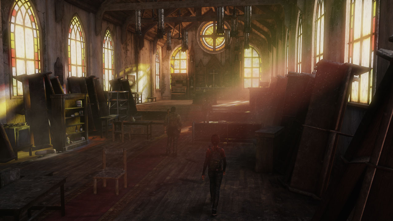
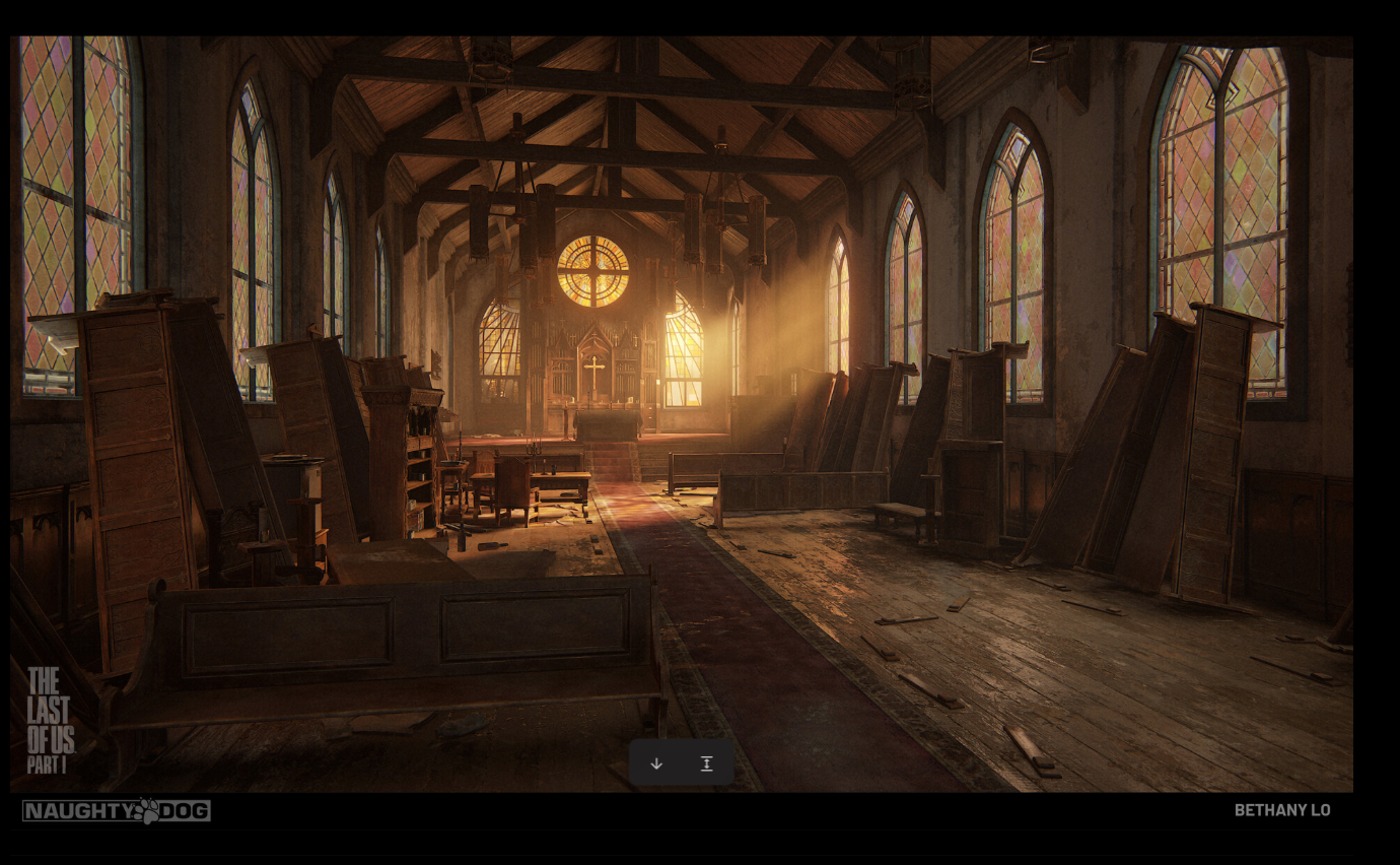
Above is the original church interior from the Playstation 3 we worked on. Below is a comparison of the remake for the Playstation 4 or 5 remastered by Bethany Lo. It's a great example of how the same scene with different consoles (and different artists) can be approached in alternate ways.
Comparison: Playstation 4 (Remastered by Bethany Lo)
Urban
The urban area wasn't actually named but for the sake of breaking things up, we called it that. This part of the level came together almost at the last minute (as with many parts of the game). Designed by Mark Davies, modeled by Johnny Chen, and textured by Adam Marquis, it was meant as a transition from the Church to the High School. The greatest challenge was ensuring we had directionality and range in shadows for all of the interiors, especially bounce from windows. Also, with so many sections in need of occluding one another, we had to make it feel like one large level in spite of it being broken up into smaller sections. Managing it it all while keeping the look and feel of the game consistent proved to be our biggest hurdle, especially between cutscenes and gameplay.
High School
Modeled by Johhny Chen and textured by Adam Marquis, the High School area came together a bit after the urban section towards the end of production. While cutscenes for the entrance into the building were done by Leandro Amaral, for the rest of the level we took his hues and values, propagating them through to the end of this section.
The hardest chore was lighting monstrous yellow school buses in the middle of the road. They were runtime objects which meant they would only accept one value overall so we couldn't get fancy with shading and transitional tones. We just had to polish it until we found that one pixel value that would hold for a giant bus and then do what we could to blend all the lightmapped areas as much as possible. Using post processing tricks and some runtime lighting hacks with shadows helped to blend the buses, we also had fun doing a lot of scripting for the bloater who comes out later to attack.
One of the hardest parts of this was the crazy amount of moments players walk in and out of spaces. It was a constant battle with exposure and tones to ensure the game didn't blow out too much or too little nor that it would feel too jarring when the camera auto-adjusted during combat nor when players would poke in an out of doorways and windows to shoot enemies. It took a lot of iteration but we got it to work.
MILITARY CITY
This level also came to fruition almost at the last minute (around the same time as Bill's Highschool). It was a miracle we got it down to the last second before the disc had to be shipped off to the manufacturer. It was a feat of game dev acrobatics to say the least. The majority of Military City was lit by Steve Cummings. We inherited the last section of it to help save time and had to blend his work with ours to make it feel like one. Starting from the Alley, we borrowed his hues but since our section was at the end, there was more freedom to push the palette further.
Alley
Modeled by Ed Lee and textured by Malcolm Hee, Military City was tricky for the amount of cutscenes it had from start to finish. The color palette took a while to get right and required a lot of last-minute scripting to fix. Besides blending rats they sell at the market during player interaction with the environment, in another area Joel ends up walking through a bus in the middle of the road that was very difficult to light. His rig was a tight squeeze for that vehicle, the camera barely fit and with a cutscene blend to gameplay the iteration became a nightmare. But once it worked it was gold!
Warehouse
Textured by Malcolm Hee and theoretically environment modeled by Ed Lee (it's been a while), the warehouse had the right palette for the lighter, brighter areas where a brawl with Joel took place. In this section, players learn to fight as they join Tess in chasing down Robert.
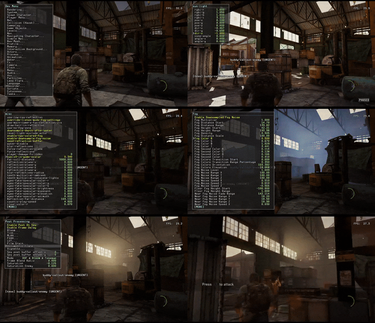
Due to the tutorial, we had to keep it simple and straightforward, pointing the sun oftentimes in the direction where players needed to go. In scene transitions, we would cheat by scripting sun directions to change multiple times. As long as the angles were negligible and occurring within a tunnel area, we were safe to do so.
Robert Chase
On a side note, dark red brick textures would often (as most low luminance albedos do) suck up a lot of bounce lighting and make shadows look splotchy and flat.
For this reason a great deal of labor went into adding careful bounce values to give the game a sense of range and depth. The fight between exposure settings and bounce were a constant iteration to get right and kind of annoying but worth it.
Bridge
Modeled by Santiago Gutierrez and textured by Malcolm Hee, the bridge section came together very close to the end of the game's production, around Beta. It's a miracle most of it aligned the way it did. Similar to challenges faced with Bill's Town, the level itself was divided into many pieces that didn't connect well with lighting. A lot of our work was not just in transitioning to a lower sun angle from earlier moments of overcast to afternoon, but pushed the sunset further, making balance of cools on one side and warms on the other a major endeavor.
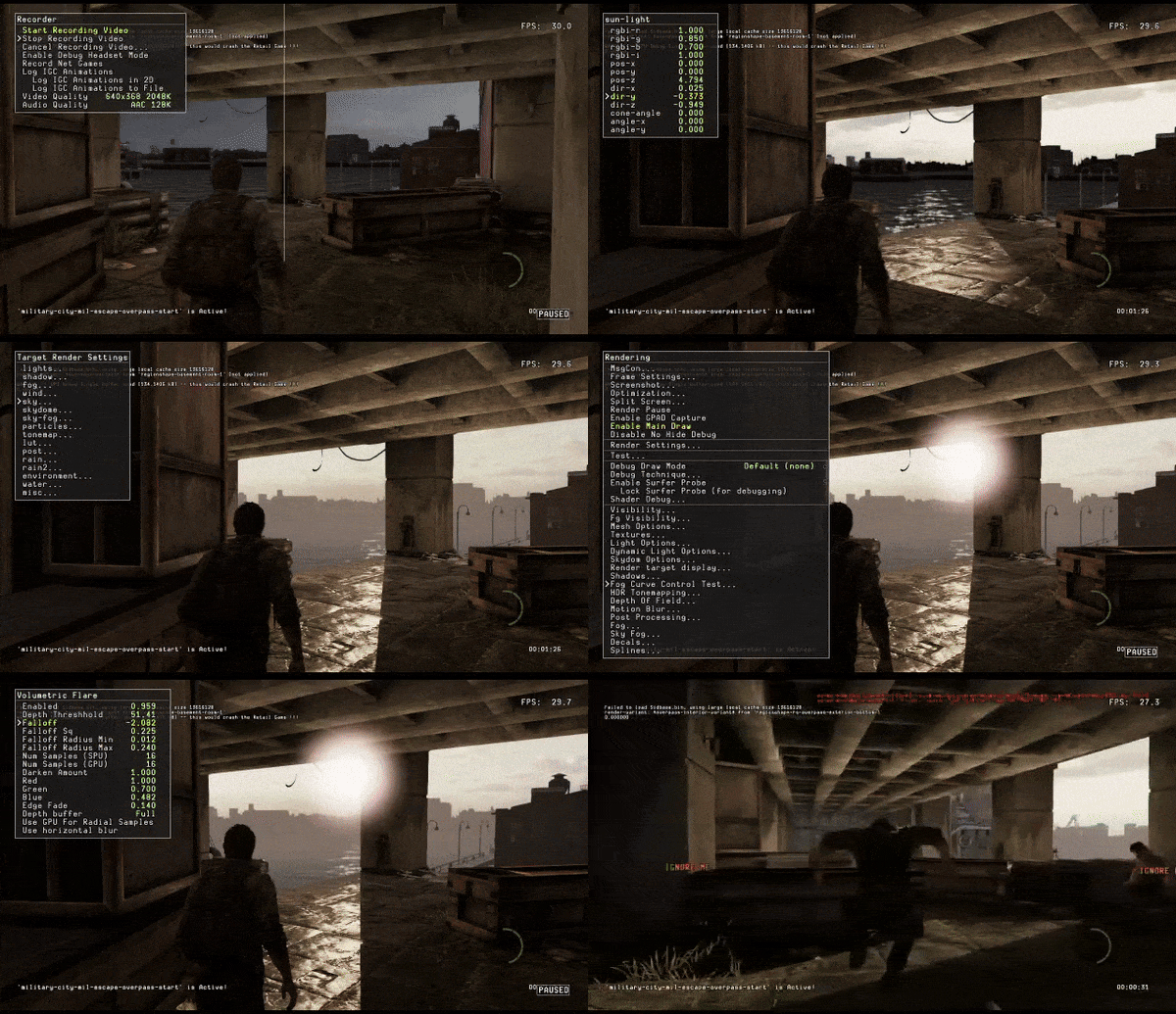
To pull off faking the passage of time, we placed a lot of bounce and shadow cards everywhere we could. It's sad how rendering engines can do an amazing job with accurate color bounce and yet we end up having to rely almost 80% on hand placed points to make it feel right, building on renderers as a base. Ke Xu programmed the directional two-toned fog that helped blend the sky with vista horizon together, really helping to complete a look beyond the bridge.
SUBURBS
Modeled by Todd Foster, Suburban was another level that came together late in the project. A lot of the work went into interiors as well figuring how to keep it interesting with such a wide open area in broad daylight with little cover to vary shadows across homes, roads, and driveways. By default it was very flat. Semi-overcast weather made it worse.
Using disadvantage to our advantage, we baked and rendered a fake giant cloud shadow to make it appear as though the sun was peering through clouds. One of the engineers hooked up the ability to project a scrolling texture to the runtime sun light. While the tech was crude and took a lot of guessing to figure out where shadows would land, it worked and gave us the ability to make the level more dynamic and visually appealing. Reflections were increased where possible to make materials stand out more and gave a greater sense of depth and range to textures. It was fun but due to the sheer size of this section render times were off the charts!
Sewer Entrance
Most of the Sewer section was lit by Ai-Fen Lo, unfortunately we don't recall who modeled or textured it. But for the majority of the areas worked on, we partnered with Todd Foster for environment modeling in the first and last half of this level. Apologies to the material artist, we don't remember who textured it.
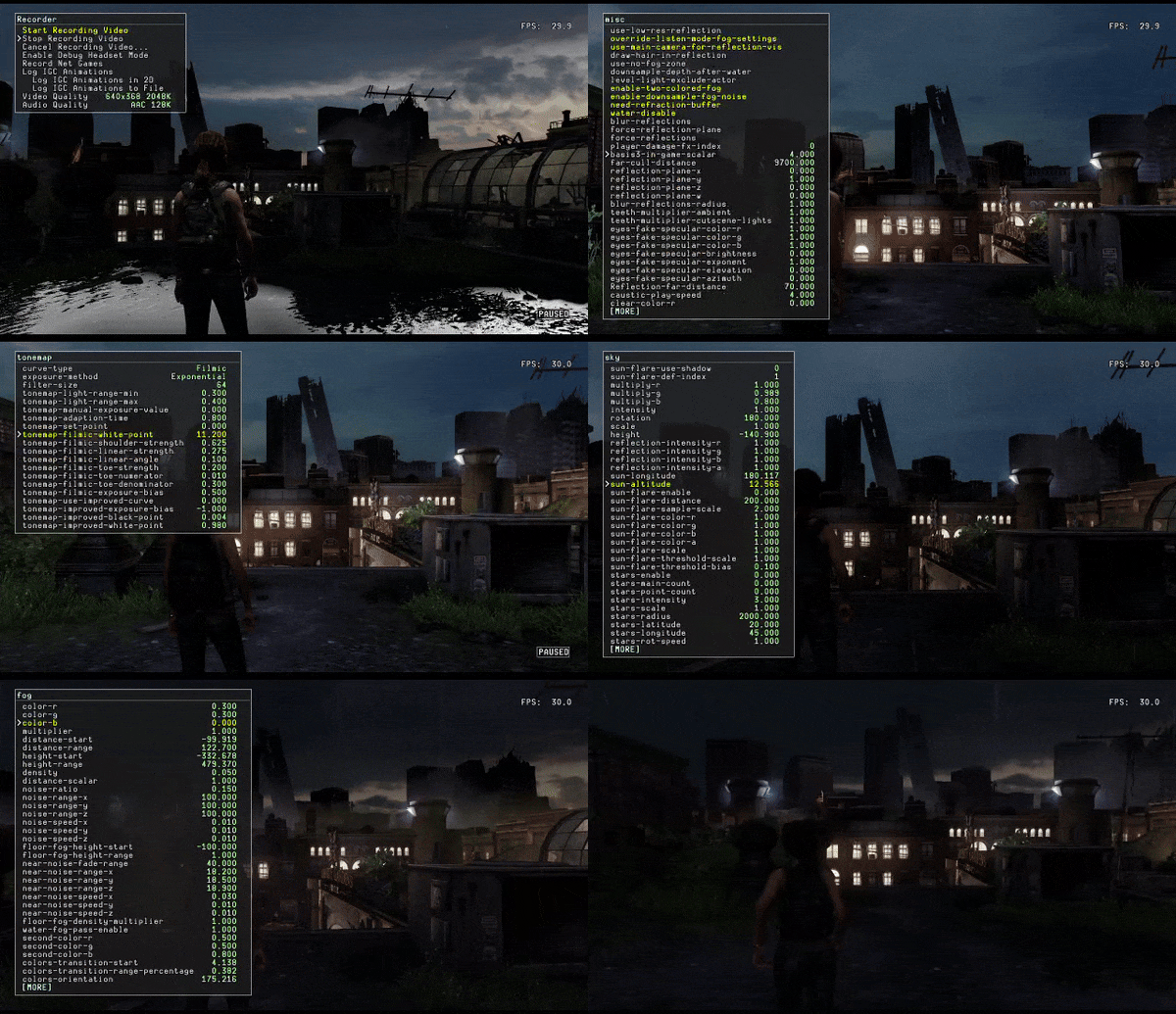
Most of the color palette from this level, as with many, were taken from the sky. A lot of what one would call "blue hour or twilight, is when the sun is under the horizon, as it gets into night time. It only lasts for about half an hour but produces some of the most amazing azures, reds, and magentas in nature. It's a tough color combo to pull off since it's tempting to go with golden hour and the range is limited, which is why we had to rely on cooler sun values and directional fills to make it work.
The interiors we left alone to keep it creepy and cranked up the exposure to make the most of limited bounce. We also had to make sure it blended with Ai-Fen's sewer interior lighting as well as level progression. We're lucky to be able to fall back on players' flashlight if it got too dark.
You'll notice some shots are warm lit. For the sewer exit, there's a passage of time from night to early morning. We took advantage of that sun angle to push it through the windows and give sense of a new day. Since most of the level was flash lights, moon beams, and dark blues with greens, we decided to give players a visual break and change the rhythm. This also meant brightening the room to the point where flash lights were an option. We leave it up to the player whether they still want it or not.
Hill Street
All of the interiors were based on the same color scheme and direction as the sewer exit area. It's what I call "shoebox lighting". If you took a box, poked a hole, and let the rays shine in, as well as tweaking exposure, to make the most of its bounce, you'd have an ideal picture of our approach and visual direction.
Most of the work went into interior bounce and exposure changes. There's no electricity and we wanted to give it both a sense of peace but also abandonment. That means overexposing the windows and then using them as our key lighting for interiors, tweaking post processing while doing so. When it came to stairs and hallways, it was a pain. There's a lot of spot light tricks to push light further into the darks, giving them just enough value to see range in detail despite being dark space. It's hard to do and often one has to think like a pool player hitting balls at an angle to their target in a corner pocket to get it right. Given the limited time in our schedule, we only had a few tries to make our shot. Most of them landed. :)
Sprawl
This was the largest part of Suburbs. It's not actually called Sprawl, but we didn't want to call it "Suburbs suburbs", instead taking from the word "urban sprawl" which is what a suburb is anyway, amiright?
Environments modeled by Todd Foster, a great deal of the work went into picking a proper sun direction that complimented the final battle during a sniper event. But most of our color palette was also taken from an elevated version of what occurred in the previous section in order to further the feeling of passing time. If you think about the sewer exit as an early morning, by the time you reach this area, it should be around lunch time, noon even.
Most of the bounce work was either on large alleyways between houses or fills to compliment the blue sky on the darker side of our 70 degree sun angle. We also took material colors into account. One trick in lighting is to study what colors bounce from bakes. Then use that as a palette, where a material may be brighter than usual, to fill in darks and give corners a bit more range. We don't want to do it all the time because too much can ruin a scene's unity. Less is more, but in an area like this with a lot of darks and a limited palette, we were able to make the most of it; especially where players scavenged for items, we made sure to give all homes extra love. No regrets.
Lesson Learned: Treat Overcast levels as you would a night scene
Overcast lighting is often flat. But instead of relying on sun rays shooting through clouds, it's ok to run with it. You can make the most of a benign area by treating it the same as a night level. In films you'll notice Directors of Photography using water hoses to spray a set with puddles everywhere. This technique makes the most of limited bounce and gives a sense of depth and range to scenes of limited luminance.
It's the same with overcast. Wherever it looks flat, add reflections, mud pools, or anything that can shine so that it breaks up the monotony and makes the most of existing bounce. Also, it makes objects pop and gives a feeling of magnitude and spectrum to a scene. As a bonus, you can show off reflective materials and direct the player's attention to (or away from) important areas.
LAKESIDE
In Lakeside, we had an opportunity to develop snow with post processing. Previously it was a bit flat and bright with heavy contrast. We tweaked settings for rain, changed the sprites, then played with noise to scale for it to feel windy. It took a while to get the direction, speed, and distance right but once it was in, the rest of Lakeside came together.
The original lighting rig for this area was done by Steve Cummings. Due to time constraints we helped out by taking ownership of this small section to help deliver on time for the next milestone. It was fun to work on but will admit ... snow was hard. You want the drama without obscuring visibility past a certain point and it's in the falloff we end up spending hours to get right. If it's believable enough to feel like snow without losing playability, it's perfect. But they're often at odds with one another. There was also a meat locker that proved troublesome than expected. But it was a pivotal event in the game, and well worth the extra polish. This came together almost at the last minute, alongside other levels, days before the game shipped.
If by chance you're looking at all of these thinking "they all look the same after a while", you're probably right. But to be fair, we did break up certain parts of the level with fires. Also during the dark locker reveal, we pushed for pitch black as much as possible so you'd have to rely on your flashlight, making that pivotal moment extra creepy. Blair Witch Project was a great reference, Silent Hill also takes the same approach. It's a great way to build tension and make players feel like they're in a horror film.
LEFT BEHIND: LIBERTY GARDENS MALL
QZ Mall was part of DLC after the release of The Last of Us. The tricky part here was swapping levels when the power came on so we could keep a lightmapped version for bounce when it was enabled, and another non-lightmapped set when it was off.
Admittedly, some shots are too dark and it's somewhat on purpose. It was during this time when gameplay was a bit more linear and story driven we had the rare chance to push blacks to their utmost, something that is often a taboo in games. Players obviously want to see all details yet art is never pushed to limits when it comes to how far we can get away with it.
Later on, we go further with Uncharted 4's Passage, but this was our first time in testing possibilities with darks. It's not as bad as one thinks, people often tend to have their preference in display settings. But admittedly, it was a pain since TV presets are a major moving target and several times we had to calibrate every display we tested these levels in to get right.
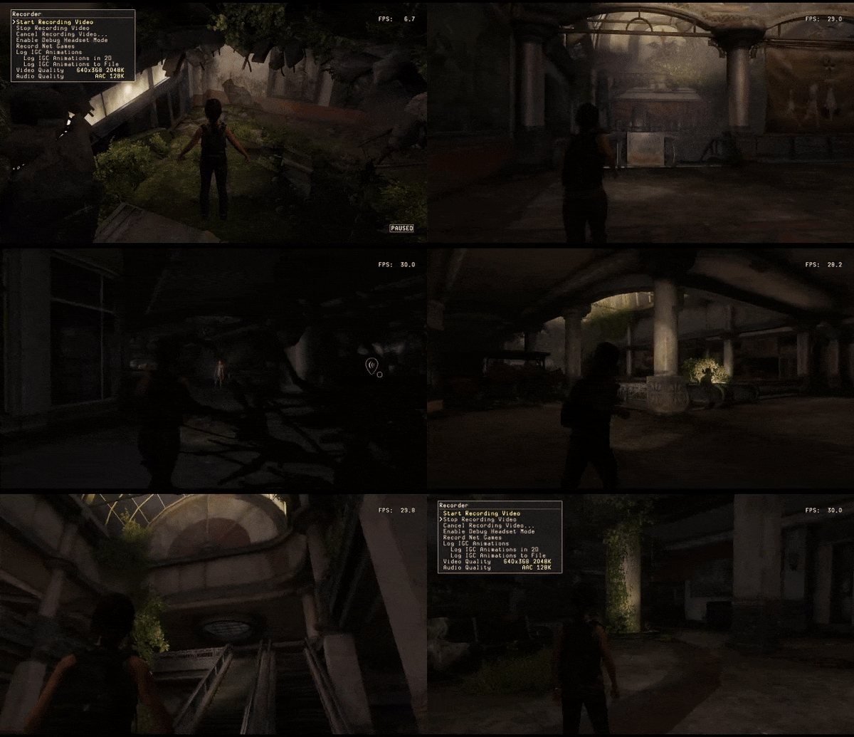
Honestly, it's in the blacks that lighting artists truly prove their rank. It takes a long time to polish details in areas when there's limited value and texture brightness can get in the way. Luminance levels from materials, monitor settings, and game presets end up becoming these three headed hydras artists battle daily to ensure safe passage on the voyage to Gold Master. Even then, a creature or two ends up sneaking on board, at times certain areas still appear a bit too dark for gameplay but not enough for it to break progression or fail QA.
We love pushing the limits of black but doing so is also playing with fire. Beware!
LEFT BEHIND: RAJA'S ARCADE
The arcade was our favorite part. We cranked up the textures to obscene color values in order to fake, in the bake, the illusion of it being lit by neon signs. Once it was established as a base, we added helpers to fill darks and then used arcade screens as an excuse to place runtime lights. In general one should have a single key light and for whatever reason the big, vibrant, blue of the store sign felt enough qualify.
Playstation 3 (Original)
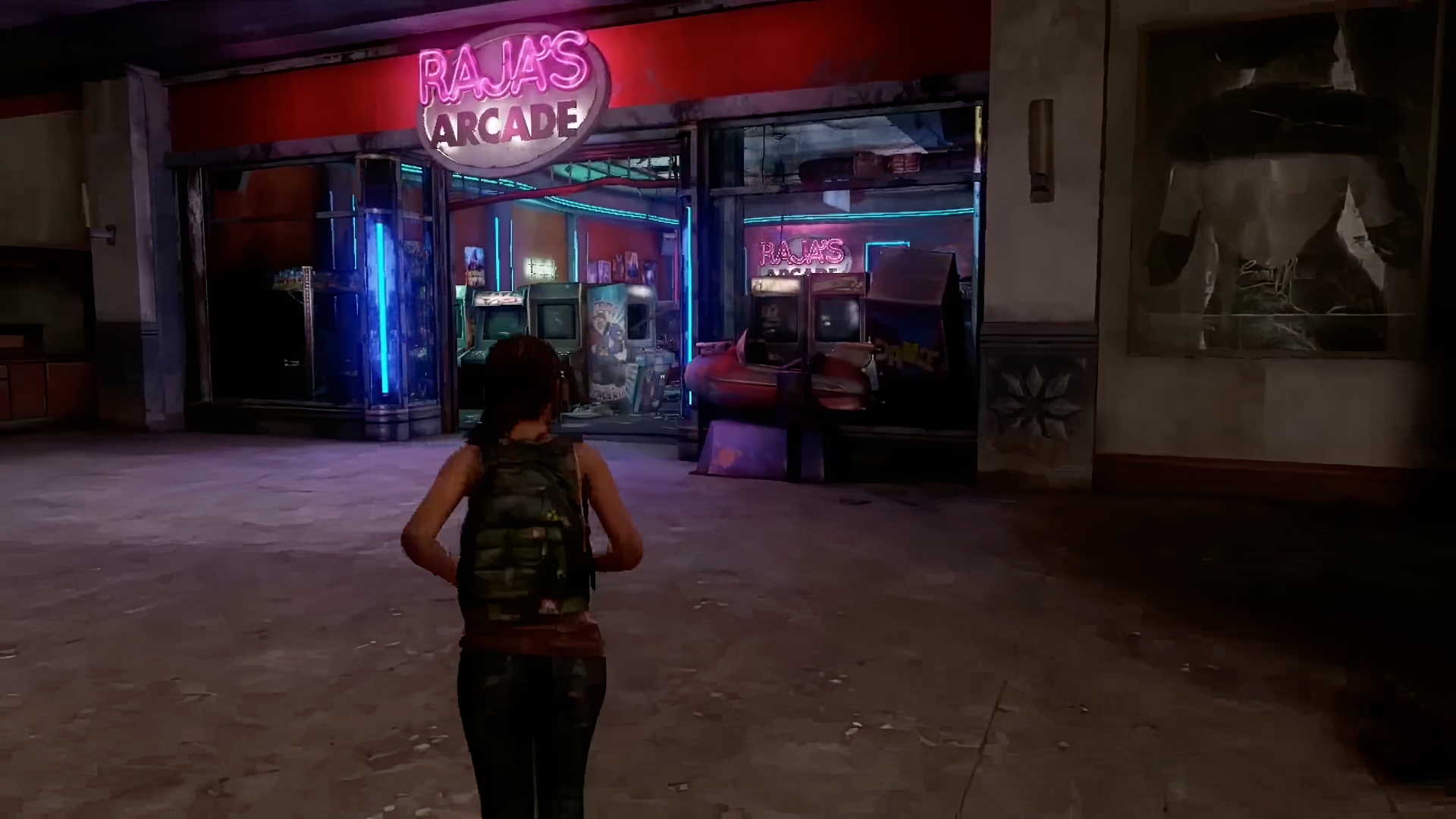
In 2022, The Last of Us was remastered for the Playstation 5, entitled "Part 1". The arcade was featured in a DLC update lit by Bethany Lo (see below). You can see a comparison between the original work on the PlayStation 3 and subsequent ones since, how it evolved over time as well as different approaches to the same scene.
Comparison: Playstation 4 (Remastered by Bethany Lo)
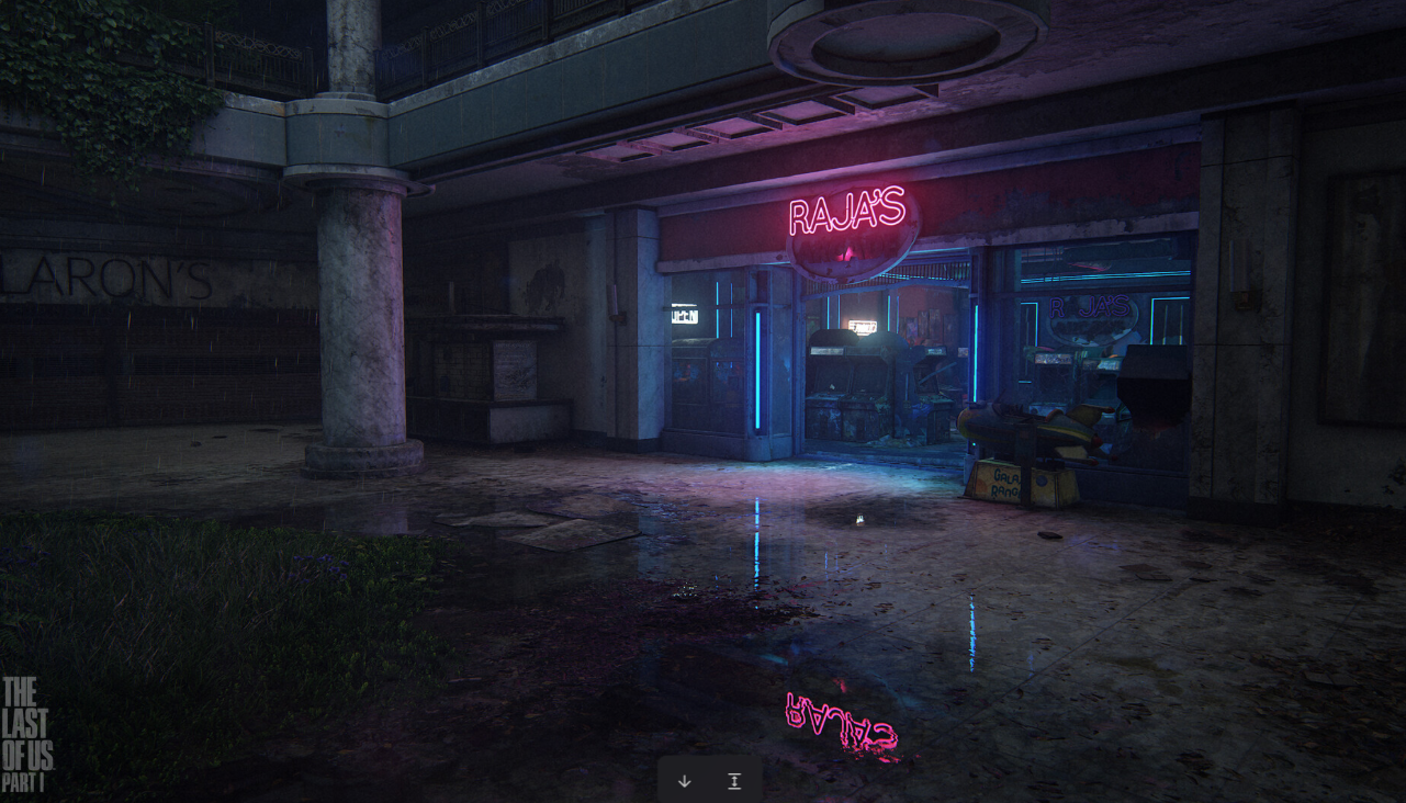
and HBO's Netflix TV Series
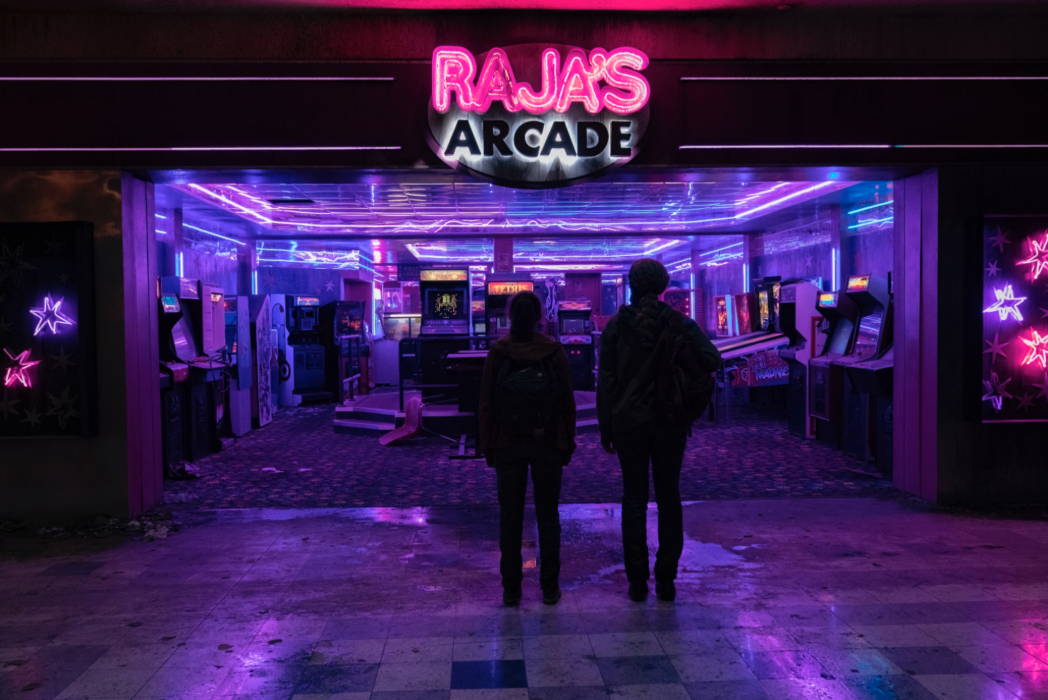
In 2023, HBO released a series based on the game. The arcade was featured in one of the episodes as a pivotal moment in the story. It was an honor to see our work on the big screen. Notice how an eerie white glow sprawls behind the word "Arcade" resembling a phenomena in our original pass. At the time, we didn't have enough lightmap resolution to make it look the way we wanted. That sign was a splotch of pixels resulting from over 20 tiny point lights (4 behind "Arcade" and the rest in front of "Raja's") tracing each letter with a high intensity and low falloff. While it didn't look the way it was intended, there was an illusion of flickering power, so we kept it. Neat how the DP took that idea and ran with it!