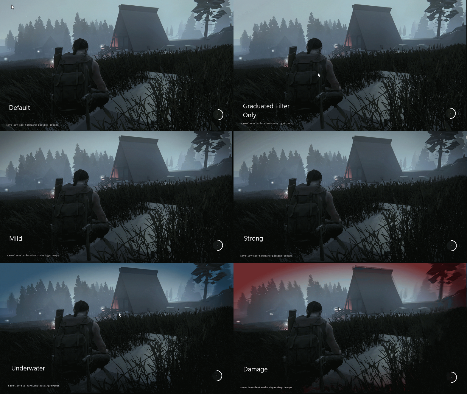
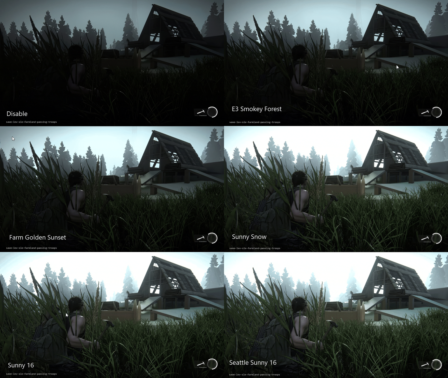
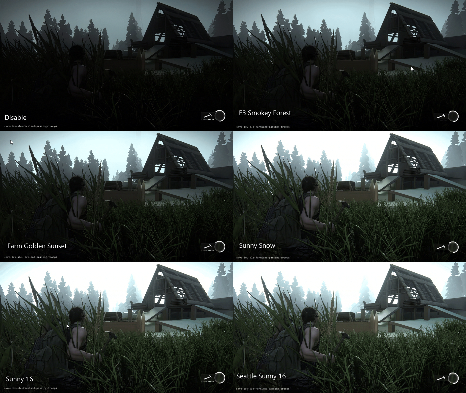
Overall
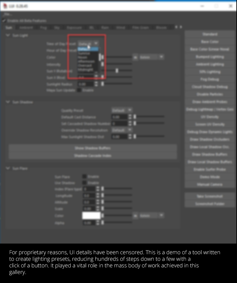
While we can’t showcase all the tools developed for The Last of Us: Part 2, we can give an idea of
how they worked. Below are examples of some in action and how they were
utilized. Post-processing in games can be incredibly complex, hundreds of variables are
needed to get the perfect look. For lighting artists, this process can take days or even weeks.
Which is why we were inspired to shift our focus toward building ones that could streamline the process
and reduce time needed to set up each level. Our lighting preset tool nicknamed "LUI" became a real
game-changer. As we continued striving, making every step as concise as possible, we counted each and
found ways to eliminate until they boiled down to a single button. By integrating post-processing,
weather systems, and dynamic time-of-day features, we managed to cut development hours by more than 80%.
The system was so efficient that it automated lighting to just a few clicks.
It also supported various display modes for debugging and helped with connecting the PlayStation to
the game editor. It was a dream come true.
But quickly, we realized one critical issue. It would require growing support as engine tech kept evolving
and doing so during production. This ended up becoming our greatest challenge.
Preset System
To make it work, we had a basic premise: send one command to the console which updates a single
variable, then retrieve it and print results on screen. If this could be done once, it would
lead to thousands of commands in fractions of seconds. Using Python, we built a system that would
automate “get” and “set” requests for every post-process attribute. This allowed us to generate a
user interface displaying available stats and their data types (like bool, float, int, etc.), and
then save these combinations into a JSON dictionary. In other words, we scripted a way to auto-generate a
UI by reading all the available commands for the game and give each a control to visually change it.
From another perspective, this opened up a new idea. One, you would get simple, text-based tech working
on its own first. Just having that accomplished was more than enough. Once completed, then you could
create an interface and connect buttons, dials, sliders, and knobs for each command. The front end
would be one thing, the back end another, and if anything was broken or users complained, we
could always enable or disable whatever was needed without affecting anything else, thus maintaining
performance as a whole.
Once a desired look was achieved, we could save it as a preset, cycle through hundreds of values in
seconds, and iterate. Thanks to Graphics Engineer Artem Kovlovs, we integrated a system that communicated directly
with the PlayStation, letting us retrieve and send post-process data seamlessly.
As a bonus, we wrote a script in the game’s editor to update objects like the sun, so it matched
direction set in the console and do the same with blockers, bounce, as well as runtime lights. In other words,
whatever a lighting artist did in the game's editor, the Playstation would update, making our process
instant! Since the game would sync with its level editor we could forward results in a bake, ensuring
everything aligned perfectly with just a click, thus hours of work, accomplished in minutes.
Oddly, we learned the hard way how often we ended up spending time on UI, more than half, because of feedback.
While the good news was that it gave us power to add neat things like mouse-hover instructions to
explain how things worked, it also opened another can of worms: feature requests. Luckily
most updates worked well across the board and we were able to keep up with user demand...for a while.
Film Presets
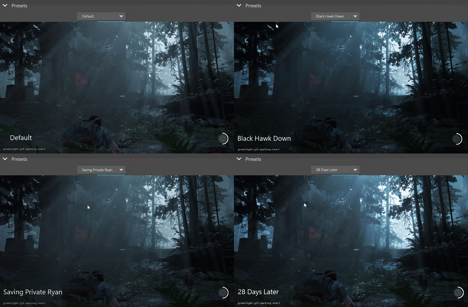
One fun anecdote of our tool system was the ability to study films like The Road, Black Hawk Down,
and Saving Private Ryan, being able to proxy their looks in the game, and have them as
presets. It wasn't just a time-saver but really fun to explore different ideas and looks in a
short time. The possibilities were endless.
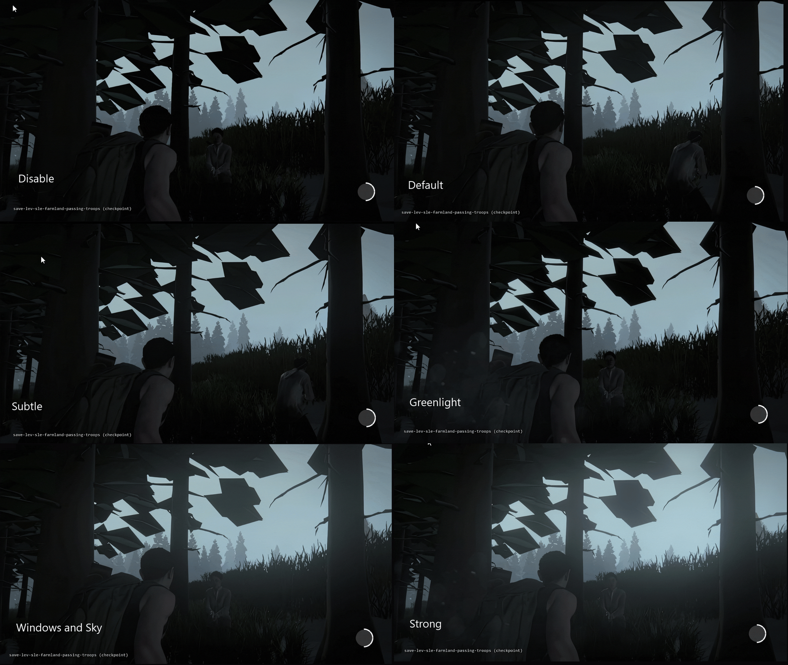
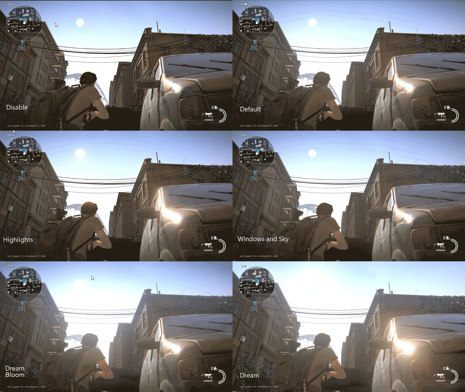
We also created samples of different presents for glows, vignettes, exposure, and apertures.
It was neat to get camera settings and things like shutter speed, ISO, and f-stop into account,
though there wasn't time to make it accurate. It was more about getting the feel of how cameras
reacted in a given situation. Nonetheless, all of these, including rain and
fog presets, proved helpful and fun. We were also proud of the time of day and
hourly presets that could quickly change a scene to day, night,
or evening, sunny or overcast, in one stroke.
Glow Presets
Vignette Presets
Exposure & Aperture Presets
But Then...
As we made significant progress, new features kept coming online from the engineering team. This meant
work took longer than usual to update, adding intricacy to the pipeline. As tools were being
refined, technology bloated, resulting in a stalemate, as massive updates continued to pile. What
used to be simple grew increasingly complex. As a result, programmers began approaching us for
assistance in ways to simplify bloating lists of parameters, to make them more accessible and
artist-friendly. It became a difficult but necessary responsibility, and with every success, our
workload grew; for each update that made things easier, new features emerged that made it harder—a
constant balancing act that felt like a never-ending technological whack-a-mole, and time was
running out. In the end, we got as far as we could, getting the job done wherever possible, but it
was clear as deadlines approached, our days were numbered, and we needed to make an important
decision.
Sadly, before we left, we didn't get to finish LUI. It worked well up to Beta but needed
more time to become a final product. Still, it was production-worthy, which is why there's little
regret other than wishing for more time. An emergency came up that required us to refactor entire
parts of our pipeline that otherwise would've made life for the lighting team impossible and put
our department in jeopardy. We had to choose between a massive, boring, but important update or let
it go and make the fun tool we loved. With limited time remaining, we chose the former over latter. While
no regrets, we do lament it took up all our remaining time at the Kennel
and couldn't finish what we started. Nonetheless, it worked well enough to get the job done and we
were proud of our achievement.
It was a shame to take a sabbatical in 2019, but we felt it was time. Naughty Dog was our home for six
years. We loved it, yet at the same time, Lost Legacy burnt us out and we needed a break.
Also, we felt a calling to work on our own projects and see what we could do with the knowledge we
gained. While we miss the team and wished we could've been there to help finish the game,
taking a furlough was the right decision, yet parting ways was bittersweet sorrow.
It wasn’t until months after, we developed a better approach for prioritizing and
managing tasks. To be fair, wearing artist
and tech hats were a blessing and curse. But looking back, we wouldn’t have it any other way.
For more, check out the original Last of Us, Uncharted 4, Lost Legacy, and our
tools galleries.
